
London has always been a complicated place, and today is probably more complex than it has ever been, and it is really impossible to comprehend what London actually is (if that makes sense).
To understand aspects of London’s history, there are a range of different data sources, and I have used some of these in previous posts to show how we can understand the city.
In the post “Bills of Mortality – Death in early 18th Century London”, I used published Bills of Mortality, weekly and annual records of the numbers and causes of death in London, to understand what caused death in London, the diseases and accidents that could have killed you in 1721. This also included a look at a book by John Gaunt who studied these records and made 106 observations on births, deaths, sickness, disease, how information in the Bills of Mortality was used, London’s population, comparison between the City and Countryside etc. The book is a fascinating window on the late 17th century, and explains much of what we see in the 1721 Bills of Mortality.
In my post, “John Snow and the Soho Cholera Outbreak of 1854” I looked at the work of John Snow who used data on the location of cholera outbreaks to pinpoint the source of the infection in Soho.
And using 1881 census information, I took Bache’s Street, an ordinary city street to the north-east of Old Street, and looked at who was living in the street, where they were born, ages, family and household size, profession etc. to really understand what a typical London street would have been like, if we could have walked along the street in 1881.
So whilst these data sources can help us understand the city, in the past, there was only a limited amount of readily available data for us to interpret today.
That has now changed dramatically, and with the use of technology, a vast range of data is now available through an online resource, the London Data Store.
The London Data Store has been created by the Greater London Assembly, and has made available a very extensive range of raw data, and information, freely available, to view and download, and to use to understand different aspects of London today, how the city has, and continues to evolve.
There is data in the London Data Store on things you would expect (such as population growth) as well as unexpected data, such as a spreadsheet of every recording studio in the city.
So for today’s post, I have used a sample of the data available, to take a look at different aspects of London, data about life in the city, data which shows how the city is changing, and data about everyday services such as the London transport system.
All is available to download and interpret, and for today’s post I have taken a rather random look at some of the data available, to produce some different views of the changing city.
If you do not want to download data and make your own interpretations, the London Data Store holds a single document: “The State of London – A Review of London’s economy and society, January 2024”. This 144 page document provides an overview of many aspects of London.
I have taken the first two tables from “The State of London”. The first table provide a comprehensive overview of geography, demography and economy statistics for London:
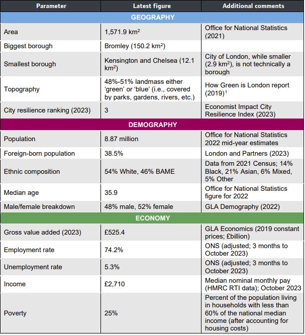
Some of these, such as the City Resilience Ranking require some interpretation. Resilience ranking is where a city is judged on a range of criteria such as good governance, environmental credentials and climate targets, and London ranks 3rd in the world behind New York and Tokyo. London score highly for its knowledge economy and tech ecosystem. The nearest European city is Paris at number 7.
The report also compares London with the top two ranked global cities, as well as Paris, the nearest European competitor (the resilience rankings are different to the above as the above are the latest 2024 figures):
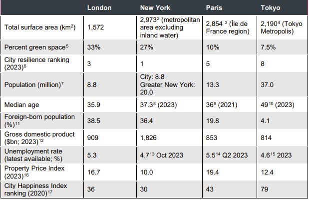
The above table shows that London is a very green city compared to some of its global competitors, and is geographically smaller and with a lower overall population.
The foreign born population percentages are very similar in London and New York, lower in Paris and very much lower in Tokyo. London is ranked at number 36 in the City Happiness Index, which just keeps it within the Gold ranking of happy cities.
Fly Tipping
The above tables come from a very high level view of London, but the London Data Store also has plenty of very detailed statistics about specific aspects of the city, for example, the following table lists incidents of fly tipping in 2022 – 2023:
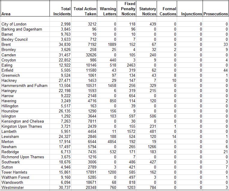
The above table shows that there were 422,078 incidents of fly tipping, and whilst there were high numbers of actions taken, warning letters and fixed penalty notices, by the time we get to prosecutions, there were only 135, so only 0.03% of fly tipping incidents resulted in a prosecution, which seems rather low.
What is interesting is that the prosecution rate does not reflect the number of incidents in each borough, so for example, Enfield had 5,505 incidents which resulted in the highest number of prosecutions across all London boroughs, with a total of 44, whilst Camden had 31,457 incidents which resulted in 0 cautions, injunctions or prosecutions.
There is obviously more behind this, such as the type of incident, how well the council is resourced etc. It also helps to understand how an anti-social aspect of life such as fly tipping has changed over time, and the following table is from the period 2009 – 2010, when there were 358,572 incidents:
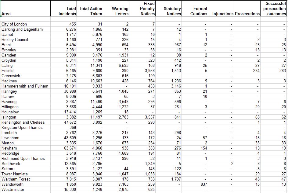
Again, we need to be careful without knowing some of the detail behind the figures in the tables, however what is clear is that there were more prosecutions in 2009 – 2010, so it could be assumed that the drop in council funding over the last 15 years may have resulted in councils having insufficient resources to prosecute an anti-social crime such as fly tipping.
The benefit of data in spreadsheets is that you can manipulate the data to show different views. I use a mapping application on the blog which allows a spreadsheet to be imported and the data within the spreadsheet to be viewed on a map.
London Museums and Public Galleries
There is a whole section in the London Data Store on the city’s Cultural Infrastructure in 2023, and the first example I have used is Museums and Public Galleries. I imported the spreadsheet into the mapping application to produce the following map (click on each marker for the name of the institution):
London Music Recording Studios
There are spreadsheets covering all manner of Cultural sites and instructions, for example, if you wanted a list of all the music recording studios across London, then there is a spreadsheet for that, which I have imported to produce another map:
London Pubs
There is also a spreadsheet of London’s pubs and bars in 2023, however with over 4,000 entries I did not want to overload the site on which the blog is hosted by importing and creating a map, so I will use a graph on the number of London pubs between 2001 and 2022:
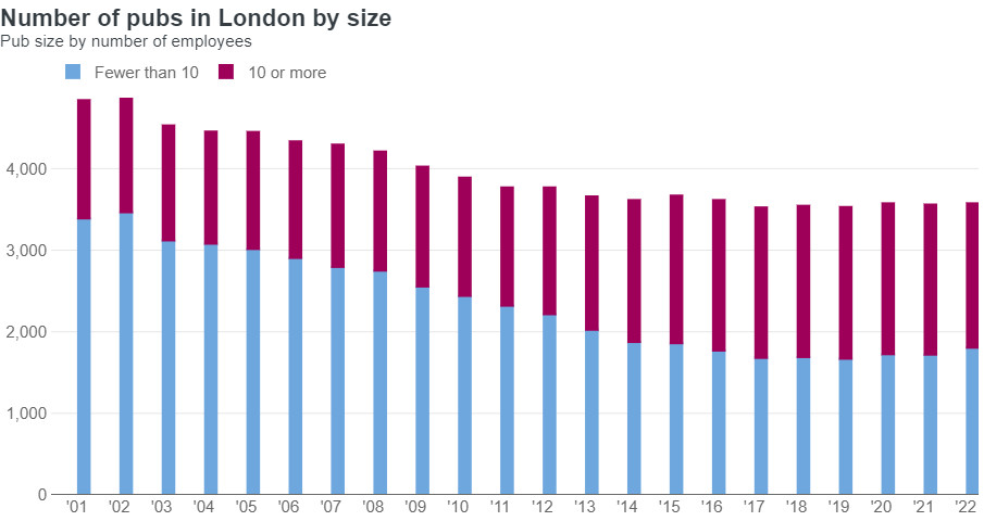
What is interesting about the graph is that whilst there has been a general decline in the overall number of pubs, this has mainly been a result of the closing of small pubs, those employing fewer than ten staff, whilst larger pubs employing more that ten have increased in number.
This can be seen on the streets, with the dramatic decline in the small corner or terrace London pub, and the increased number of pubs such as Wetherspoon’s which are generally much larger and employ more people.
As could be expected, there is a large amount of detailed information about London’s transport system in the London Data Store, and the following example show what is avalable:
Temperatures on the London Underground
Coming out of winter and with the rather chilly spring, the experience of being on some of London’s underground lines on a hot summer day may be a memory at the moment, however the London Data Store has a spreadsheet recording the temperature on the underground lines over the year, and I took the column showing the maximum recorded temperature for each month to create the following graph:
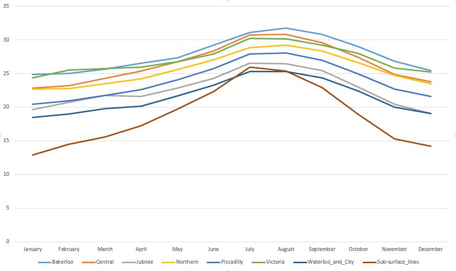
The graph shows that the Bakerloo Line reached the highest temperature of the whole system in July / August, closely followed by the Central Line.
As could be expected, the sub-surface lines (Circle, District etc.) have the lowest maximum temperatures. apart from a short peak in July where they exceed the Waterloo and City, which is probably because lines such as the Circle and District respond quickly to external temperatures, whereas deeper lines probably take more time to absorb the heat from above.
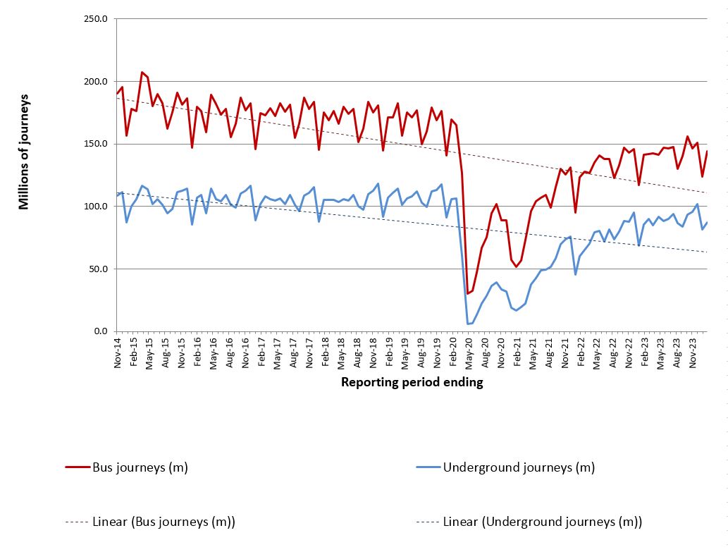
Numbers of Journeys
These graphs show that by the end of 2023, the numbers of journeys taken had still not returned to their pre-Covid numbers, and that although an initial post-Covid rapid increase had taken place, this seems now to have slowed down.
The first graph shows journeys on London’s buses and the underground:
And the second graph shows journeys on the DLR, Trams, Overground and the Cable Car across the river on the Greenwich Peninsula:
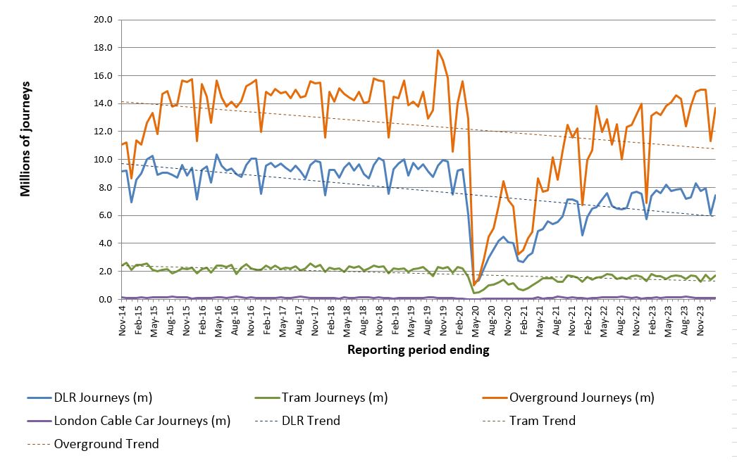
Again, journeys across these methods of transport have not returned to their pre-Covid peaks, although the Overground rail network is almost there.
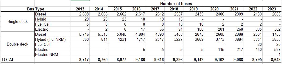
London Buses
As well as reducing passenger numbers on London buses, there has been a decline in the number of buses travelling the streets of the city.
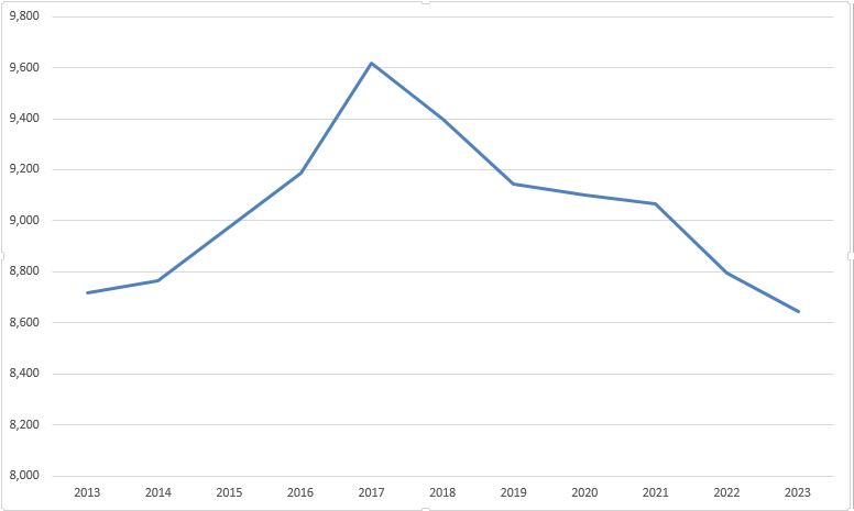
The following table shows the number of buses by type, between 2013 and 2023 and shows a decrease in the number of diesel powered buses, and an increase in the number of electric. There has also been a decline in the total number of buses from 8,717 in 2013 to 8,643, and whilst this is a very small decline, it masks a much larger drop from a peak of 9,616 in 2017:
By putting this data in a graph, the decline in bus numbers from their 2017 peak is rather dramatic:
Annual Bike Hires
There is also a spreadsheet of the number of hires of bikes within the Santander Cycle Hire Scheme:
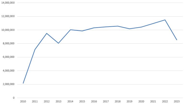
Whilst this shows an increase since the early days of the scheme, starting in 2022 there has been a significant drop off. This may be due to the significant number of other bike hire companies now operating across London, as there now seems to be so many different bikes cluttering the streets of the city.
Numbers and Types of Police Officers
Crime has long been an issue in London, and features in the campaigns for the upcoming London mayoral elections.
The London Data Store has a variety of spreadsheets with details on the type, frequency, locations etc. of crime across the city, as well as details about policing in London, and the following graph is taken from a spreadsheet of police numbers in London:
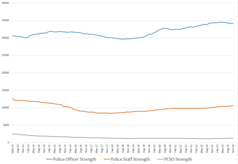
The graph does show that there has been an increase in the numbers of Police Officers in the ten years between 2013 and 2023, but there has also been a reduction in the numbers of Police Staff (those who support the front line Police Officers) and also a reduction in the number of Police Community Support Officers (PCSO).
So in 2013 there were a total of 45,835 officers, staff and PCSOs and 46,140 in 2023. A small increase, but whilst there has been an increase in Police Officers, is their effectiveness reduced by a smaller number of supporting police staff, and a reduced number of PCSO’s?
There are also other factors involved, such as:
The Growth in London’s Population
There is a range of demographic data covering London in the London Data Store. The first example I will look at is the change in the city’s population, along with comparisons with the rest of the country:
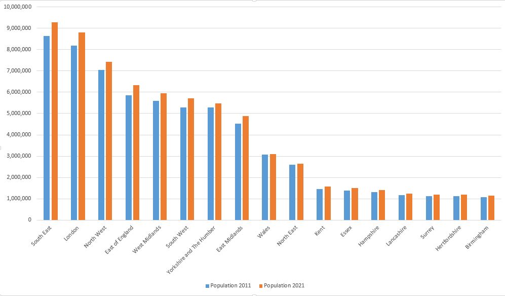
The above graph shows population changes between 2011 and 2021 in a number of regions and counties across the country.
London is the second pair of columns on the left, and in 2011, London had a population of 8,173,941, and the population ten years later based on the 2021 census was 8,796,628.
So between 2022 and 2021, there has been a 7.6% increased in London’s population. Although not exactly the same years, going back to Police numbers, we can see that between 2013 and 2023 there had been an overall rise of 0.66%.
Again, the years being measured are not exactly the same, but the data shows that there has been roughly a 7.6% increase in population and a 0.66% increase in Police staff, so assuming there is roughly a linear relationship between the two, Police numbers have not kept pace with population growth over the last 10 to 12 years.
The London Data Store contains many different views on London’s population. One data set lists the annual births in the city, and the following graph shows these numbers between 1992 and 2024:
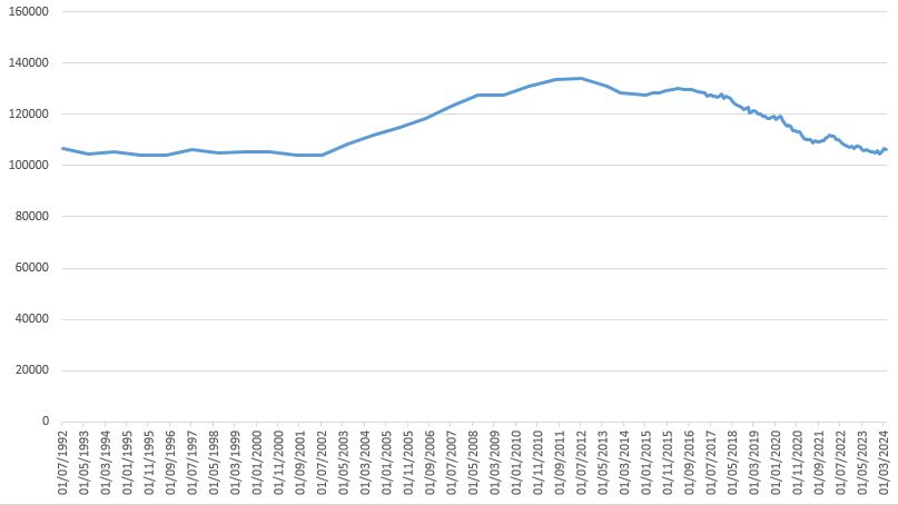
The number of births was stable between 1992 and 2002, but then had a rapid increase until 2015, when the numbers being born in the city start to decrease towards the 1992 – 2002 average.
The London Data Store also records the number of live births by mother’s place of birth, which mirrors the increase then reduction in numbers shown in the above growth, but here we can see the impact of immigration into the city:
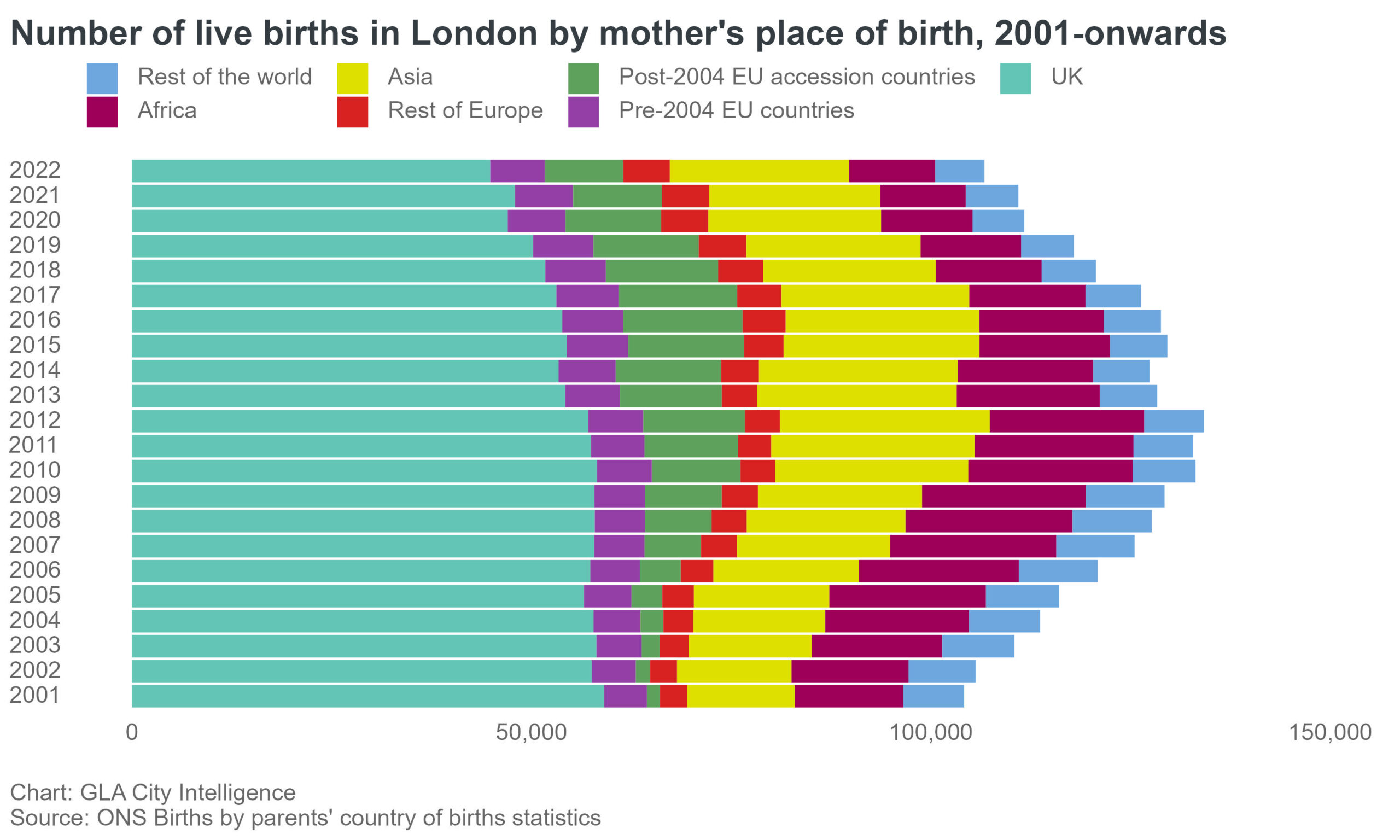
The impact of events in London and the country can be seen in the above graph. For example, look at the dark green bars which record the number of births to women from “Post-2004 EU accession countries” (Poland Czech Republic, Hungry etc.).
Births to mothers from these countries increase rapidly from 2004, then start to decrease from 2016, the year of the Brexit vote.
We can also compare London with the rest of the country:
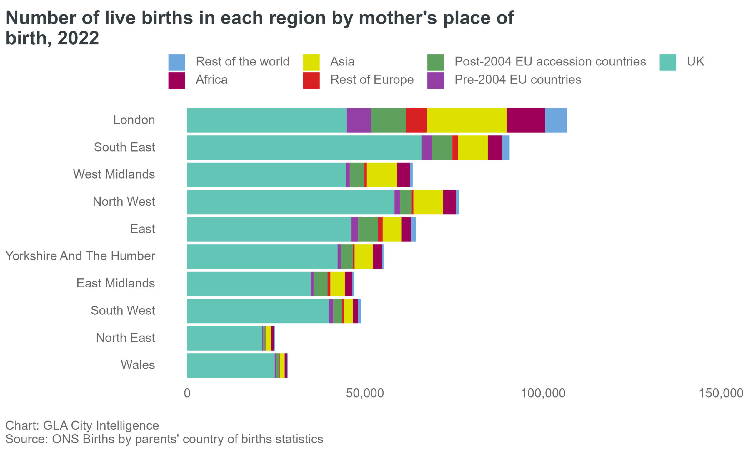
Which shows that London has by far the highest number of births, whether viewed as an absolute number or a percentage, to mothers born outside of the UK than any other region of the country.
We can also look at how London’s population has changed over a longer time period, and the following bar chart shows how the numbers have changed across inner, outer and greater London between 1939 and 2011:
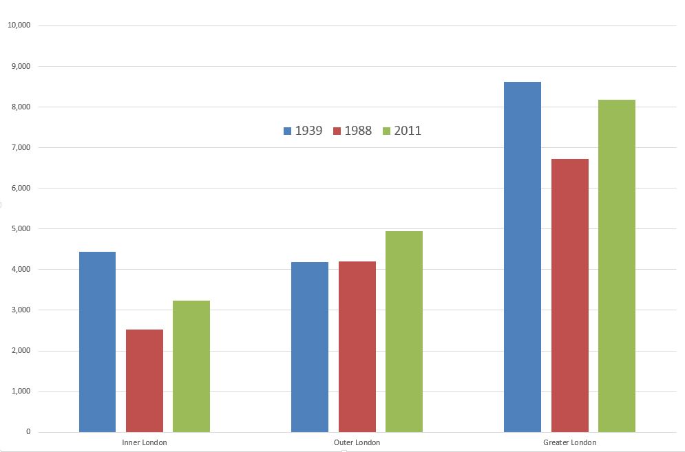
The chart shows that Inner London’s population is still well below the numbers of 1939, which demonstrates that before the last war, inner London was a really densely populated place.
The loss of the docks, industry etc. resulted in the post war population decline, that reached a low in the late 1979s and early 1980s before starting to increase.
Outer London was stable between 1939 and 1988, but has increased since, and Greater London’s overall population was still smaller in 2011 than it had been in 1939, all down to the significant reduction in Inner London’s population.
London’s recent growing population all need somewhere to live, so we can look at:
Living Costs
This graph shows the increase in weekly rent charged by social landlords or private registered providers across all London boroughs:
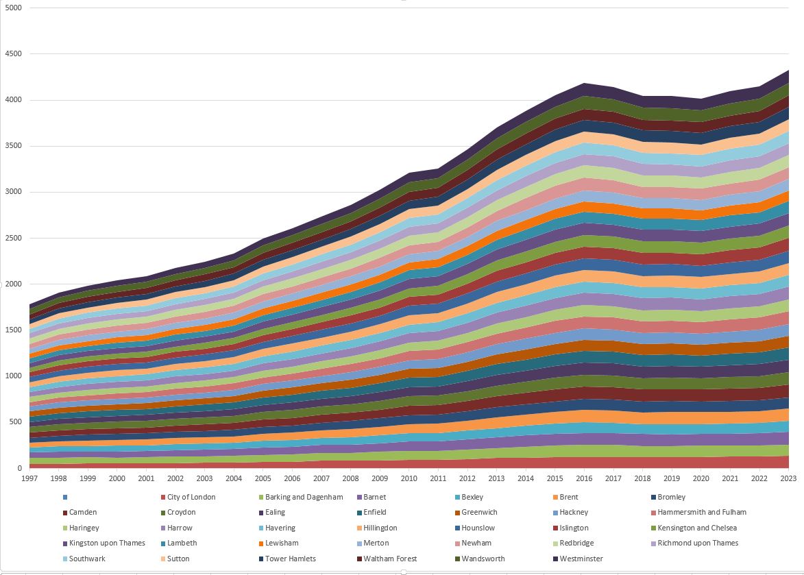
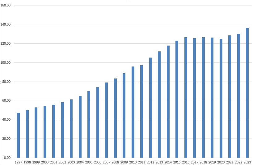
The above graph shows that weekly social rents have increased at a near uniform rate for all boroughs, we can also look at individual boroughs, and the following graph shows the increase in weekly rent in the Borough of Kensington and Chelsea between 1997 and 2023 (the vertical axis on the left is the cost in Pounds):
As well as somewhere to live, jobs are needed, and the following graph shows the number of jobs, by job type between 2004 and 2022:
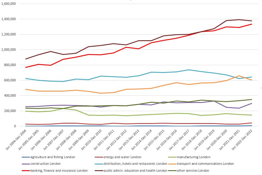
Whilst job types such as construction, energy and water, distribution, hotels and restaurants have shown relatively small changes over time and have not shown long term, significant increase or decrease, the two job types of public admin, education and health (dark brown line) and banking, finance and insurance (red line) have shown a continuous increase in the numbers employed.
All these jobs result in people being paid, and we can look at the mean income of tax payers, by borough:
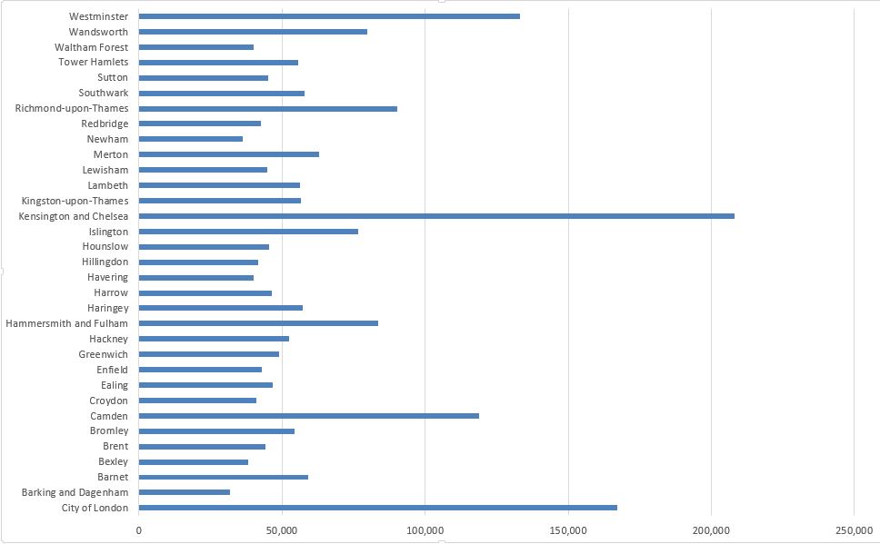
No surprise that Kensington and Chelsea, the City of London and Westminster make the top three, but what could be a surprise is Camden being in fourth position.
The London Data Store is a wonderful resource and I have only just scratched the surface of the data and information available, and the range of subjects covered is remarkable.
For example, there is a spreadsheet covering “Shut in lifts incidents attended by the London Fire Brigade”, and there are a surprising number of these. Between 1st of January 2024 and the 31st of March 2024, there were 1,409 shut in lift incidents, which I found really surprising.
The spreadsheet includes the address and building where the lift in each incident was located, so if you need to know which lifts are best to avoid, you can sort the spreadsheet based on the frequency of each address.
I covered the data on the bus types and numbers earlier in the post, and for the London Fire Brigade there are similar spreadsheets covering the number and types of fire appliances across London.
There is another spreadsheet covering 13 years of stolen animals across London. Not surprisingly, dogs are the most common, but also within those 13 years, two Arachnids, 161 Fish, 1 Rabbit, 15 Insects and 327 Birds have been stolen.
Looking back over the 13 years of stolen animal records, by far the majority are marked as not recovered.
Much of the detailed information in the London Data Store does not go back that far, with the majority covering the last ten to fifteen years, with higher level data going back a bit longer, around the last 25 years.
One of the benefits of this type of data being available is not just for the snapshot it provides of London, but also for long term trends, and if the London Data Store continues for many years to come, it will be an invaluable resource for future historians.
The London Data Store can be found here, and if you are so inclined, it is easy to waste a few evenings searching through, and playing with the wealth of data available.
What a fascinating read. I can see many nights ahead of delving down rabbit holes. Thank you!
What type of fish was stolen? Haha
((Maybe an arrowana.)
Really interesting thanks for posting
Oops. It should have read good fun.
What a great introduction to this incredibly interesting data store. I too will have goof fun exploring tangential topics and themes. I’ll be joining Sarah down the rabbit holes.
Data, data, data. It is interesting all this data but I prefer living a life and people and stories. The more data, instant, and continual information I’m bombarded with the less I appreciate or feel anything is very meaningful. Maybe all this information helps city management but what about all the energy and satellite space it takes to generate and store it. I think a camera or film could tell a better story about the different boroughs and lifestyles.
Very interesting read and study.
The first piece of data which stuck with me was the one about diseases. I have been translating the manuscript journal of a German PoW interned in Alexandra Palace during the first world war, and at one point he reports the the commandant was suffering from hydrophobia. It was no joke – rabies was a serious infection before the discovery of antibiotics, and the diarist thought it prudent not to seethe visitor he had been expecting.