Category Archives: London Books

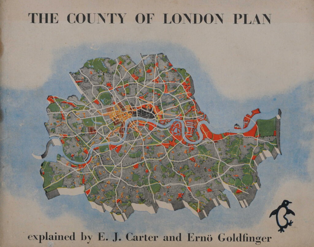
Royal Commission on Local Government in Greater London 1957-60

Two new dates for my walks are now available on Eventbrite. Walks, dates, and link for details and booking, here:

Bankside to Pickle Herring Street – History between the Bridges – Sunday 29th September

Limehouse – A Sink of Iniquity and Degradation – Sunday 6th October

The Royal Commission on Local Government in Greater London, 1957-60 was a significant investigation into the governance of London, with a target of recommending whether any, and if so what, changes in the local government structure and distribution of local authority functions in the area, or in any part of it, would better secure effective and convenient local government.

The 1957-60 report, with some modifications led to the London Government Act 1963, which resulted in the creation of the Greater London Council in 1965, along with the formation of 32 London borough councils.

The report is an interesting read, not just for its recommendations, but also for the descriptions and statistics of London at the time of the report, the challenges facing London, how London, and the governance of the city had developed etc.

I find it fascinating how, when you explore much of London’s history, many of the themes are much the same today, and the following paragraphs from the introduction to the report could have been written today, rather than 64 years ago:

“Throughout its history London has had this astonishing quality of vitality which has shown itself in two main ways. London has constantly attracted people to itself from the outside, and it has also grown constantly from the centre outwards. These centripetal and centrifugal forces have worked at varying paces at various times; but viewed in perspective the two processes have been continuous. Both forces have been working with accelerating impetus since the year 1900 and they have never been more active than they are today.

At intervals attempts have been made to contain this growth. Sometimes the Court has tried to restrain the growing power of London. Sometimes social reformers have shaken their heads over the problems of size this growth has engendered. Nowadays restriction through planning and other controls is the order of the day. If London remains true to its historic character, it will continue to attract and to try to expand; to attract for business and residence, and to a lesser extent for industry, and to try to expand outwards as its population grows and as the demand for more spacious surroundings grows, a demand which a rising standard of living gives people the means to satisfy.

Already London is leaping over the green belt which as recently as twenty years ago was designed to contain it. Many of the problems with which we deal with in this our Report are direct reflections of the phenomena to which we have referred. The fundamental question is not ‘How can growth of London be stopped?’ but ‘How can London’s abounding vitality be guided and directed for the general good through the medium of self-government?’. The problems we have to consider are the problems of vigorous growth, the growth of a living organism which has earned a better title than the cold, ugly, and in this instance misleading term ‘conurbation’. Such a term would certainly have repelled visionaries such as William Blake whose poetry perhaps brings us nearer the truth than we should get by too exclusive adherence to the prosaic details of the machinery of government:

I behold London, a Human awful wonder of God!

He says: ‘Return, Albion, return! I give myself for thee.

My Streets are my Ideas of Imagination.

Awake Albion, awake! and let us awake up together.

My Houses are Thoughts: my Inhabitants, Affections,

The children of my thoughts walking through my blood-vessels

So spoke London, immortal Guardian! I heard in Lambeth’s shades.

In Felpham I heard and saw visions of Albion:

I write in South Moulton Street what I both see and hear

In regions of Humanity, in London’s opening streets.

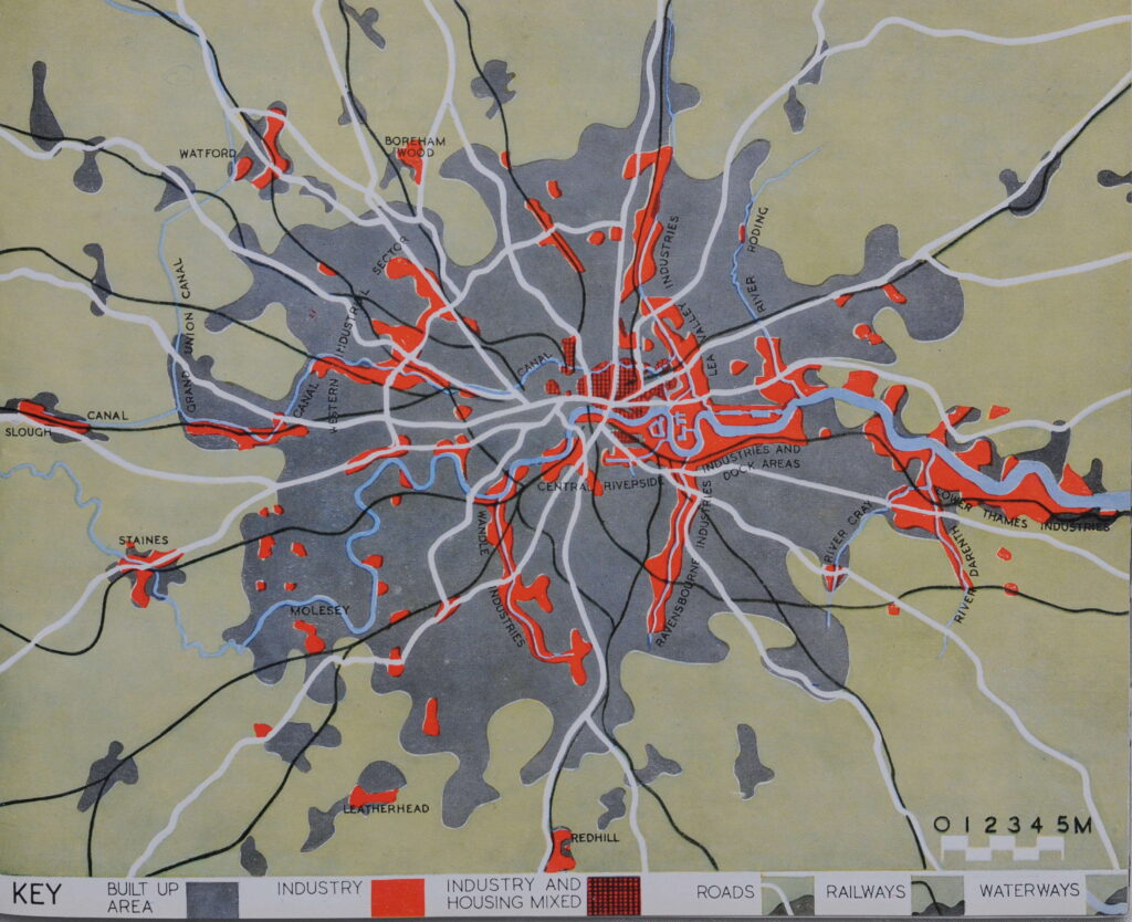
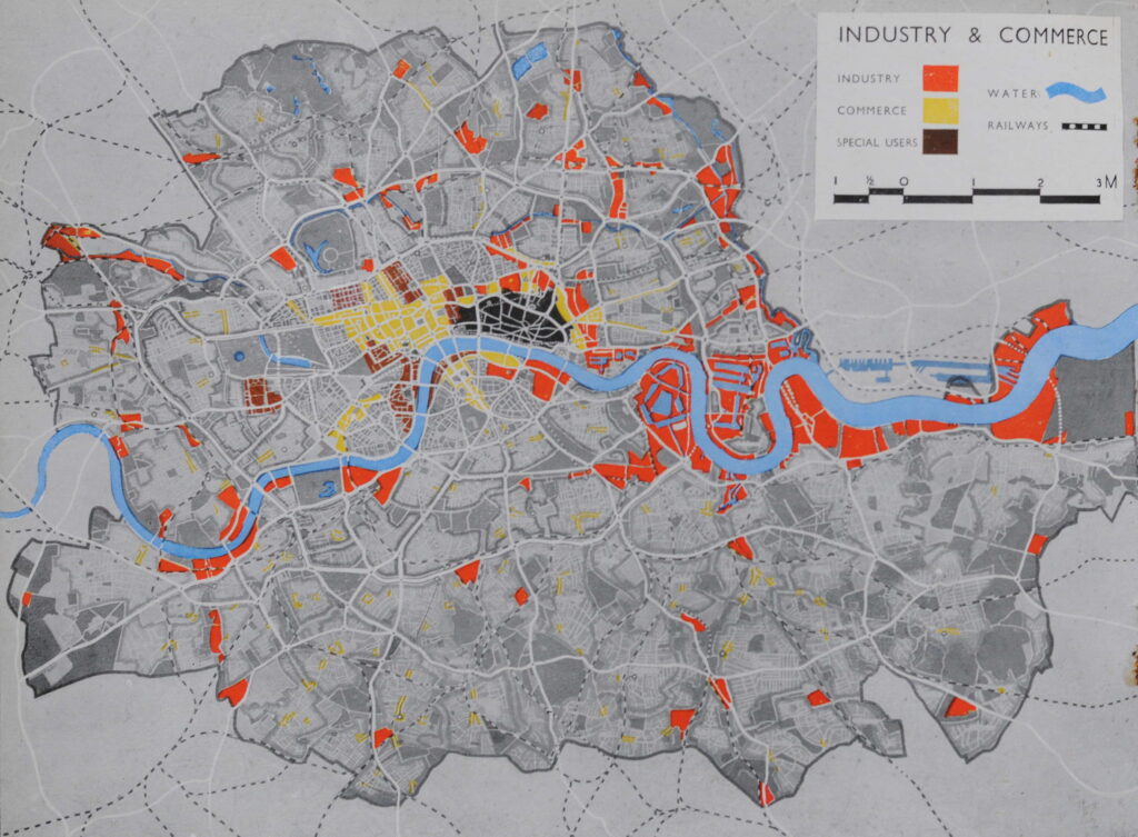
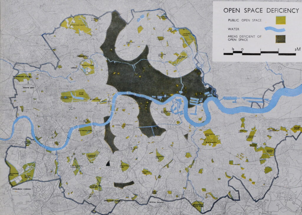
The report is almost 400 pages of considerable detail, far more than I can explore in a weekly post, however one thing I can cover are the maps.

At the back of the 400 pages is a large pocket, and in the pocket are 12 maps which illustrate the report, and also provide us with a snapshot of London over 65 years ago, the proposals contained within the report, and how London had developed to the late 1950s.

Map 1 – The Review Area

The first map in the series shows, appropriately, the area covered within the review. This was the extreme boundary of what could be considered Greater London.

As will be seen in a future map, parts of the review area were excluded from the reports’ recommendations for the administrative boundaries of a Council for Greater London.

Map 2 – Proposals for Reorganisation

This map shows how the report proposed the reorganisation of London governance, with the outer boundary showing the “Area of Council for Greater London” (and with modifications, would become the Greater London Council), along with the proposed Greater London Boroughs and their population estimates in thousands:

The thick grey line from the original review area shows that the report concluded that parts to the north west, the north and a small area to the east, should not be included in a new Council for Greater London.

Map 3 – The Growth of London

This is a fascinating map as it shows how the city had grown since the year 1800, with the land area covered in the following 155 years identified by different colours to show expansion.

The map also identifies the outer boundary of the London green belt, major open spaces within the growing city, and the planned new towns, all orbiting the growing city:

Map 4 – Where Does London End?

There is no title to this map, so I have given it my own title – Where Does London End?

I suspect an often asked question, and one that is difficult to answer. London has far outgrown the original City. Over the centuries, it has expanded and consumed all the villages that once surrounded the original City of London.

Add to this complexity, there are different interpretations of London by the different authorities and service providers involved in many aspects of London governance and critical service provision, and this was the focus of the report.

The map shows these different boundaries as they were at the time of the report, and included the boundaries of, for example, the Registrar General’s Greater London Conurbation, the Metropolitan Water Board, Metropolitan Police District, London Transport Executive Area etc.:

Map 5 – Built-Up Areas 1958 and London Green Belt

This map shows “Built-up areas, which include the residential, industrial and business areas of towns, villages and other closely developed settlements, together with the educational institutions, allotments and smaller open spaces which they envelop. Large industrial and service establishments in rural areas are also included. Golf courses and most airfields are excluded. The Greenbelt is that shown in approved Development Plans at 1/1/60”:

There has been a conflict between the green belt and the need for development for as long as the green belt has existed. The 1960 report included the following in the introduction “Already London is leaping over the green belt” which demonstrates that over 60 years ago this was a problem.

The green belt featured again in the recent General Election with Labour’s proposals for more building and the possible inclusion of areas of the green belt in a building plan.

I suspect that the conflict between preserving green belt, and the need for new development and housing will be an ongoing issue for very many decades to come.

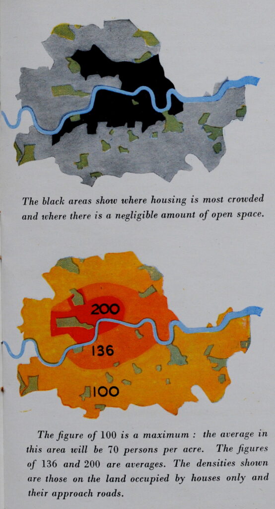
Map 6 – Population Density 1951

A colour coded map of population density as it was in 1961 is the next in the map series.

As could be expected, the map shows the highest density of people per square mile towards the centre of the city, with density reducing as you move further away from the centre.

The exception to this is with the City of London and the City of Westminster, where population density, particularly in the City of London has always been low.

Map 7 – Travel to Work into Central London

One of the impacts of the 19th century revolution in rail travel was the ability to live in the London suburbs and travel into the centre of London to work, and map 7 shows the percentage of “total occupied persons resident in each local authority area who worked in Central London in 1951”.

The definition of central London was The City of London, City of Westminster and Metropolitan Boroughs of Finsbury, Holborn and St. Marylebone.

The map shows that in 1951, the majority of travel into central London was from within the area under review, however there were significant areas to the north west (showing the impact of the Metropolitan line), and to east London, and an area to the east in south Essex from Brentwood to Southend:

Map 8 – Changes in Population and Employment

This map shows the changes in population and employment in a single decade, the 1950s.

This was an unusual decade as London was still in the process of recovering from the destruction of the Second World War, and both industry and populations were changing dramatically.

The map shows there was a decrease in population across the majority of London, but increasing population along the boundaries of Greater London.

The map also shows changes in employment, with decreasing employment in east London and to the north and south of the City, but increasing employment further out, and to the west.

The decrease in employment seems to have been more significant in the small area bounded by the City, Shoreditch, Islington and St. Pancras, with a decrease of 8,000 workers in just six years. By contrast, central London from the City of London to the City of Westminster increased employment by 136,000 workers in the same six year period.

There are large increases in employment in some of the surrounding new towns, as these start taking both jobs and people from London.

Map 9 – Classification of Service Centres

In the report, a Service Centre is a place where there is a concentration of services such as theatres, cinemas, banks and shops.

The location of these service centres was calculated using the concentration of these services as well as the analysis of bus services to identify where there were nodes that concentrated bus services as well as the banks, shops, etc. that people would want / need to travel to and use.

Map 10 – Educational Administration

The provision of education across London was a key part of the report, and the following map shows how education services were administered in 1960:

Throughout the report, there are themes and challenges which are the same now, as they were when the 1960 report was published.

The report talks about the importance of delegation of responsibility to heads of schools and teachers, the importance of Youth Services, including the Youth Employment Service and that these should be fully integrated with schools.

School Health Services were considered key, and again should be integrated with health services provided by local authorities and central government.

The report stated that “As standards of education have risen, both as to actual teaching and as to the quality and amenity of buildings, more and more subsidies from tax payers money have been needed and more and more money has had to come from the rates.”

It seems a recurring message with public services, that if you need good services you need to invest, and public services should be fully integrated to work efficiently and deliver an effective service.

Map 11 – Sewerage and Sewage Disposal

A topic which is much in the news today, but had very little commentary in the 1960 report. The report saw little further scope left for further centralisation, following the Report on Greater London Drainage in 1935, and in 1960 these services were provided by a mix of authorities, ranging from the London County Council, and various other boards within urban and rural districts, as shown by the following map:

There is no comment in the 1960 report on sewage discharges into rivers, so I have no idea whether this was a problem in the years between 1935 / 60, however today, it really is a serious problem, and for London, it happens all along the Thames.

I wrote about the London Data Store a couple of months ago, and within the vast amount of data on London available, there is an interactive map of Sewer Overflows across London.

Taking just a small section of central London, between Blackfriars and Tower Bridges, there are the following sewer overflows on the north bank of the Thames:

  • Fleet Main Line Sewer
  • Paul’s Pier
  • Goswell Street
  • London Bridge
  • Beer Lane
  • Iron Gate

When I check the map whilst writing this post, the Fleet Main Line Sewer, Paul’s Pier and Iron Gate were all recorded as “This storm overflow discharged in the last 48 hours. This means there could be sewage in this section of the watercourse.”

If you walk along the Thames foreshore, and want to touch anything, I would wear disposable gloves. If you want to check the map, it can be found here.

Map 12 – Central Areas

Map 12 shows the area that was defined as the central area of London, and the boundaries of various authorities who operated within this central area:

The report makes very little reference to infrastructure projects, which is understandable as it was a report on the governance of London, however are two specific projects which received some attention in the report.

The first was on the Narrow Street Bridge in Stepney. This was the swing bridge that carried Narrow Street over the entrance to the Regent’s Canal, now Limehouse Dock.

The bridge was 100 years old, and since the 1930s had suffered increasing amounts of damage from heavy traffic.

By 1952, the bridge was in such a bad state of repair, that it was closed to motor vehicles and horse drawn traffic. There were too many worn and rusted main girders that even after repair, it could not be operated safely without traffic limitations.

In 1955, the bridge was closed to all traffic, and during the period of closure, “vehicles carrying goods to and from the wharves and warehouses in the area, including the Regent’s Canal Dock, have had to make a detour of 2.5 miles, part of which is along a main road”.

The issue was money and who was responsible to pay for a new bridge. The bridge was owned by the British Transport Commission, but there had been discussion with the London County Council, the Ministry of Transport and Stepney Borough Council about sharing the costs of the bridge.

It seems that finally, the London County Council agreed to accept the whole liability for the additional costs of building a bridge as a special case, and at the end of 1959 approval for the work to go ahead was given.

I did not know that such a key bridge was closed for so long, when use of the docks, wharves and warehouses in the area was still considerable. Trade through the docks was still increasing in the 1950s.

The case of the Narrow Street Bridge is very similar with that today of Hammersmith Bridge, where a bridge in need of repair is closed, stays closed for a considerable period, with the issue being who covers the costs for the considerable repair work needed.

The second infrastructure project in the report was the “Cromwell Road Extension Scheme with particular reference to the Hammersmith Roundabout and Flyover”.

The report goes into some of the challenges with getting approval for the roundabout and flyover (restrictions on capital expenditure, objections by Hammersmith Borough Council etc). These were gradually overcome, with the roundabout opening in 1959 and the flyover in 1961.

Hammersmith flyover is now over 60 years old, and is the main route between central London and Heathrow, and to the west of the country via the M4, and carries around 90,000 vehicles a day.

There were concerns that it might have collapsed in 2011 due to corrosion and weakened support cables running through the structure. This required much repair work, with a second phase of repairs carried out which ended in 2015.

Around this time, there was talk of replacing the flyover with a tunnel, but this proposal does not seem to have made any progress, and would be hugely expensive and disruptive.

So the Hammersmith Flyover is gradually getting older, and at some point will become a major problem, with, no doubt, the same “what can be done” and “who pays” issues that have long been an issue with any infrastructure project across London.

The 1957-60 Royal Commission on Local Government in Greater London paved the way for the creation of the Greater London Council, a body that would only last from 1965 to 1986.

The report highlights that whilst the way London is governed and administered changes over time, many of the issues and themes at the heart of London’s development, growth, provision of services, finance, and relationship with the areas of the south-east that border London, are the same today as they have always been – and I suspect, will continue to be the same for very many years to come.

alondoninheritance.com

Greater London 1937 Highway Development Survey

Two tickets have just become free for my walk on Sunday, the 18th of August, exploring the Lost Landscape and Transformation of Puddle Dock and Thames Street, an area that could soon change dramatically. Click here for booking and details.

The 1937 Highway Development Survey of Greater London (published in 1938), was an attempt to address the rising level of road traffic and congestion in the Greater London area. It was commissioned by the Minister of Transport and was the work of Sir Charles Bressey with Sir Edwin Lutyens acting as a consultant.

In the decades at the end of the 19th century, and the first few decades of the 20th century, traffic on London’s roads had been rising rapidly. This was the result of a number of factors, including:

  • Increasing trade, both within the City and with the rapid growth of trade through London’s docks, along with expansion of the docks
  • Growth in Greater London’s population from 7.5 million in 1906 to 9.5 million in 1935 (with one fifth of the population of Great Britain and one quarter of the working population)
  • New modes of transport (underground, railways) along with growth in buses and trams and trolley-buses, as well as growth in petrol based vehicles
  • The growth of the suburbs around London and increasing travel into the centre of the city, from home to work (central London’s population had been in a slow decline due to the growth in industry, but the population of the wider suburbs had been growing rapidly)

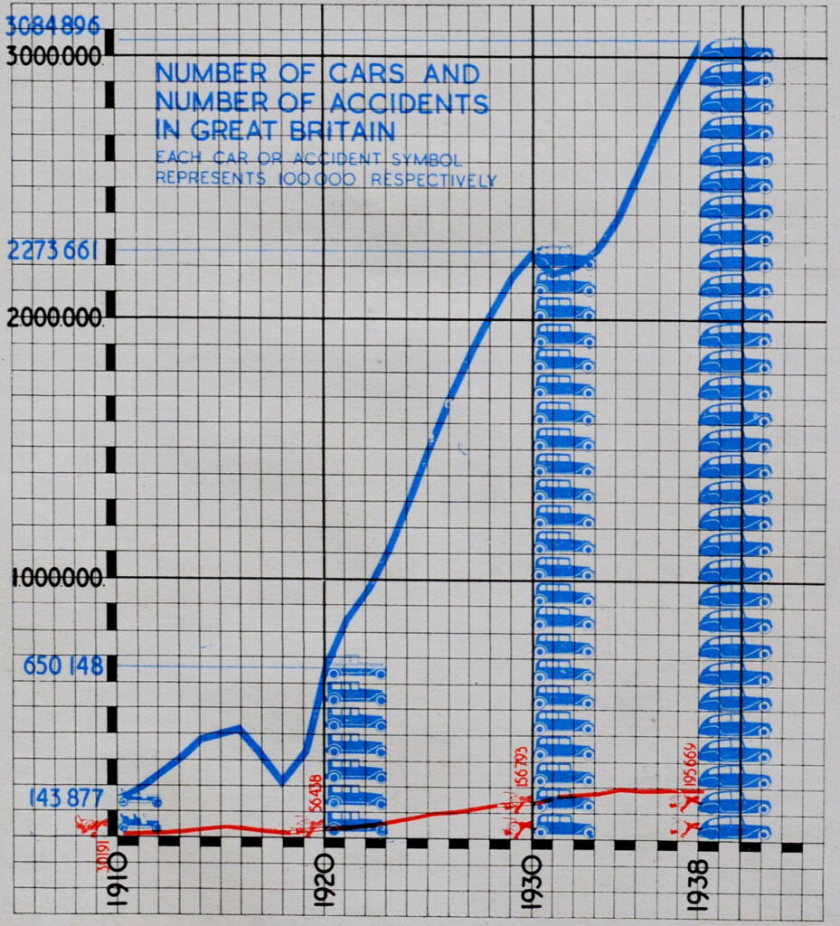
The number of motor vehicles in the country was also expanding rapidly, as shown by the following graphs from the report:

Based on a 1922 start point, the number of motor vehicles had grown by 185%, from 1 million, to over 2.5 million, whilst the population had only grown by around 5%, and the number of vehicles by mile of road had risen from 5 in 1922 to 15 by 1936.

The above graphs covered the whole of the country. The report also included lots of London specific data, including the following numbers in a table headed “Millions of Passenger Journeys”:

The majority of the report was the work of Sir Charles Bressey, who was a civil engineer and surveyor with a broad experience of the design of road systems. He was already a surveyor, working in his father’s practice in the City of London, and during the First World War, he put his experience to the construction of military roads in France whilst in the Royal Engineers.

Sir Charles Bressey:

Attribution and source: GPO Film Unit, Public domain, via Wikimedia Commons

Sir Edwin Lutyens was known mainly as an architect, designing a wide range of public and office buildings, government offices, churches and private houses. he also designed a number of war memorials, including the Cenotaph in Whitehall.

Their report was published in 1938, and contains a comprehensive number of recommendations to address the expected continual rise in the growth of road usage through to the 1960s.

The report first identifies places which were “Centre of Congestion”, including:

  • Oxford Circus – This is the focal point of Oxford Street; at times throughout the day, and particularly at morning and afternoon peak hours, congestion here is excessive, and saturation point is reached.
  • Gardiner’s Corner, Aldgate – This is probably the key point to the east end. A large proportion of the traffic from the east and the eastern suburbs to the City and vice versa pass this point. It is adjacent to the Docks, to Spitalfields Market and to the manufacturing and trading districts of Stepney, Whitechapel, Spitalfields, Shoreditch, etc. Five roads converge on the point and there is a substantial proportion of turning traffic from and to all the thoroughfares involved.
  • Hammersmith Broadway – A complex and badly arranged six way junction in which four of the converging roads are so close together that, without the most extensive alterations, adequate weaving space for roundabout work could not be obtained.

As part of the data collection process to help form the recommendations of the report, four routes across London were selected, and a 16 H.P, Austin Light-Six Touring Car drove along each of the routes every day (excluding Sundays), from 8 am to 7pm (1pm on Saturdays).

The car was “driven by a steady and competent chauffeur, who had no inducement to attempt to break records or to take risk”, and an observer was also in the car armed with a stop-watch and clip board to record times of sections along each of the routes.

Of all routes and sections along the routes, the slowest were:

  • between Ludgate Circus and Commercial Road on the west – east route where the average was only 5.85 miles per hour, while of the slowest journey, the pace dropped to 3.6 miles per hour, and;
  • between Euston Road and Trafalgar Square, via Tottenham Court Road, on the north-west – south east route. here the average pace was 7.7 miles per hour, while on the slowest journey, the figure dropped to 6.3 miles per hour.

Road improvements included the greater use of roundabouts which were seen as a way of improving traffic flow where several roads met at a junction. The first roundabout in the country was in Letchworth Garden City in 1907, but they would not really proliferate until the 1960s,

The report included several suggested designs for roundabouts, including the following two:

Slow roads were not the only problem identified in the report, there were many other factors identified, including one which showed the expected increase in air travel.

In the 1930s, there were a large number of airfields surrounding London, as the following table from the report identifies:

The number of airfields was expected to increase, with the following table identifying possible new locations:

The recommendations of the report covered new roads, city loops, motorways, street widening, changing the configuration of junctions, including the use of roundabouts, and a comprehensive list of schemes was included in the report:

and:

The recommended schemes include lots of proposals within London, such as the Piccadilly Improvement, Mayfair – Soho route etc. and the report is one of the first I have read which recognises that travel to and from London is dependent on the wider network across the country, so we have proposed schemes such as the Cambridge Road Northern Extension past Ware, Improvement of London to Ongar Road (A.113) and Extension to Norwich, and the London – Birmingham Route.

London to Birmingham would later become either the M40 or the combination of M1 and M6.

Another proposal in the list which would later become a new motorway is the Coulsdon – Crawley – Brighton route, which today is the M23 and A23.

The published report included a pocket at the back of the book in which there were a couple of very large maps.

The proposed new routes and changes were drawn on the maps, and I have reproduced these below.

It was difficult to photograph the maps due to their large size, and as they are almost 90 years old, I wanted to be very careful to avoid any tears or other damage, however I hope the following images provide a view of what was proposed back in 1937:

The above map shows the wider area surrounding London, and we are starting to get a map that is recognisable today, for example:

  • A new outer ring road for London, which for 1937 was a considerable way from the centre of the city. This outer ring road (with some changing of routing) is today the M25. Strange though that where the road crosses the Thames to the east, the north and southern routes do not meet at the location of what would become the Dartford Crossing.
  • The Motorway network spreading out from London. There are thick red lines running out from London across the wider country. These were the proposed major routes that would connect London with the rest of the country – an urgent need given the increasing number of motor vehicles of all types, both private and commercial.
  • The growth in the docks to the east of the city, with the thick red line to the right, leading north from the area around Tilbury, Corringham and Canvey Island.

The list of proposals shown on the map was included in the following key:

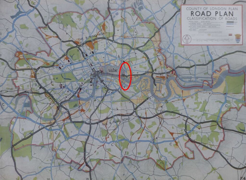
The following map shows the Great London proposals:

Along with the following key to the proposals:

Proposals included adding a second tunnel to the Blackwall Tunnel (which would not be completed until 1967), as well as the Rotherhithe Tunnel, which would not get its second tunnel, and would stay to this day as a tunnel with traffic running in both directions in a single bore.

The City Loop-Way was described in the report as follows:

“To relieve the almost intolerable pressure on the main routes which now traverse the heart of the City, converging upon the Mansion House and St. Paul’s Cathedral, the creation of the City Loop-Way is recommended, with a view to encouraging drivers to avoid the most congested central area.

The most important section of the Loop-Way would extend from Blackfriars to the Tower, thus forming a continuation of the Victoria Embankment eastwards to the Tower, thus forming a continuation of the Victoria Embankment Route, through a dingy part of the City, which stands urgently in need of renovation. From the Tower, the Loop-Way would follow approximately the general line – Crutched Friars – Duke Street – Camomile Street – London Wall to Wood Street; from here a new cut would be necessary to reach Aldersgate Street; Bartholomew Close is traversed and replanned, and a proper outlet formed into Farringdon Street, down which we turn to Blackfriars, thus completing the circuit.”

Whilst the Loop-Way did not get built, what is interesting about many of these proposals is how they, or variations of the proposals get included in future plans for London, so for example, parts of the Loop-Way can be seen in the 1944 City of London report covering Post-War Reconstruction of the City of London, where northern and southern routes around the City were proposed extending from Aldgate to Holborn via London Wall, and the Tower to Blackfriars along Lower and Upper Thames Street.

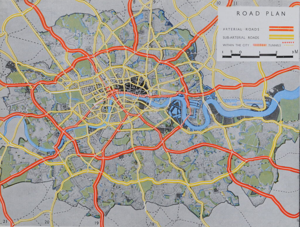
The following map from the 1944 report illustrates these routes as thick red lines to north and south:

Lower and Upper Thames Street did get considerably widened and now form a southern route to bypass the centre of the City of London, with the connection through to Blackfriars being completed in the late 1970s. All that got built of the northern route was the dual carriageway section along London Wall and part of Wormwood Street.

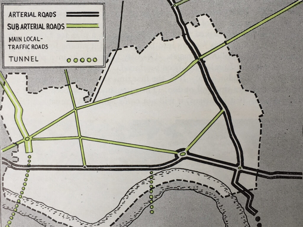
Some detail from the Greater London map shows some of the proposals. The following extract shows the area around the Victoria, Royal Albert and King George V Docks, and the Woolwich River Crossing:

These were the last docks to be built in the central London area, and their size enabled the largest of ships (at the time) to be accommodated in numbers, which resulted in a large amount of products and raw materials to be moved.

These docks were connected into the railway network, but their road connections were considered inadequate for the size of the docks. For example, the road between the Victoria and Royal Albert Docks was “the Connaught Road Swing Bridge which carries but one line of vehicles; its approaches are tortuous and interrupted by level crossings”.

To improve the roads to these docks, the North-South Lea Valley Road was proposed, although it was recognised that “considerable demolition would be required in West Ham and Leyton”.

The Woolwich ferry crossing was also a problem, and the report considered three options:

  • the construction of a high level bridge
  • the building of a barrage which might accommodate a road
  • the driving of a vehicular tunnel

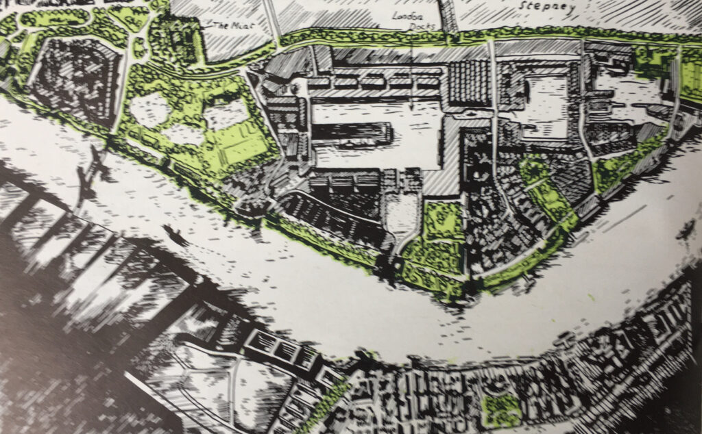
The construction of a bridge in combination with a Thames barrage was the subject of a 1944 report which included the following illustration of what it could look like:

In the almost 90 years after the report was published, we still have the Woolwich Ferry.

One proposal that did get built, and in a far more comprehensive way than proposed in the 1937 plan, was the “Cromwell Road Extension to Great West Road” shown by the red lines in the following extract from the map:

This proposal would evolve into what is today the route from where Cromwell Road turns into West Cromwell Road (by the large Tesco at Warwick Road), and then runs along to the Hammersmith Flyover, down to the Hogarth Roundabout, then to the elevated section of the A4 through Brentford, then to the M4, which runs all the way to Pont Abraham in Carmarthenshire, south Wales.

Bressey wrote the conclusion to the report, as follows:

“The discussions that Sir Edwin Lutyens and I have had during the past three years with representatives of public bodies throughout Greater London have shown how widespread is the desire that the lines of new routes should be authoritatively laid down for rigorous observance as permanent governing features in the ceaseless development and transformation of the Metropolis, where, hitherto, so much uncertainty has prevailed as to the official status of various road schemes which are protected in one area and neglected in another.”

The 1937 report was published just before the start of the Second World War which put a hold on all such forms of development. Many of the proposals in the 1937 report were included in some form in the 1944 Reconstruction of the City of London report and the Greater London Plan by Abercrombie.

Post war lack of finance held up many projects, and it was not until the 1960s when some major projects were completed, such as the first Dartford Tunnel which opened in 1963.

Bressey and Lutyens could not have foreseen the closure of the London Docks and the impact that would have on transport requirements in that area of the City, where today, as well as roads, the Docklands Light Railway has been a considerable success in opening up the area.

As usual, in the context of a weekly bog post, I have only scratched the surface of the information contained within the report. The report contains lots of statistics and information on travel across London, and although getting on for 90 years old, many of the aspects of the report are just as relevant today.

Bressey’s comment in his conclusion about how his discussions had: “shown how widespread is the desire that the lines of new routes should be authoritatively laid down for rigorous observance as permanent governing features “, could I suspect. equally apply to today.

I suspect that there is still such a desire for “rigorous observance” today. As a country, we just do not seem very good at completing large scale infrastructure projects.

For example, the last government cancelled much of HS2 and there is still uncertainty on whether it will end at Old Oak Common or Euston, the current government has cancelled a range of infrastructure projects, including the Stonehenge Tunnel, and there is continuing uncertainty over whether Heathrow will ever get a third runway.

Whether you view these projects as good or bad, uncertainty, change or cancellation just costs and wastes yet more money.

I am sure you will be able to write the same thing in another 90 years time, but it would be really interesting to know what transport infrastructure would have been built across London by 2114.

Will HS2 terminate at Euston, will Crossrail 2 have been built, will there be a new Thames Barrier, and will the Bakerloo Line finally have new trains? Unfortunately, I will probably never know.

alondoninheritance.com

London Maps in Books

I have two new walk dates available. Click on the links for details and booking:

If you have been reading the blog for a while, you will know that I am fascinated by London maps, and make use of a number of maps in many of my posts.

They can help us understand the development of London in many different ways. They are a snapshot of the city at the time they were made, showing the limits of development at a specific time. They record change, and they show features of the city, man-made and natural, that have long since disappeared under the built city we see today.

They can show different interpretations of the city, they can show how people at the time the map was made interpreted the city, what was important to them.

There are some brilliant online mapping sites, such as the National Library of Scotland and Layers of London, however nothing beats the feel of a paper map in your hands.

Many of these maps can be found in books. Large, fold out maps, or even better, a pocket at the end of the book stuffed with a number of maps. You do not find this with the majority of books published today, probably down to cost, however it was once a more common feature, and for today’s post, I have a small sample.

At the start of the 20th century, Sir Walter Besant published a series of books on the history of London, and a number of these included maps.

(You should be able to click on the maps to open a larger image)

In “London In The Time Of The Tudors” (1904) there is:

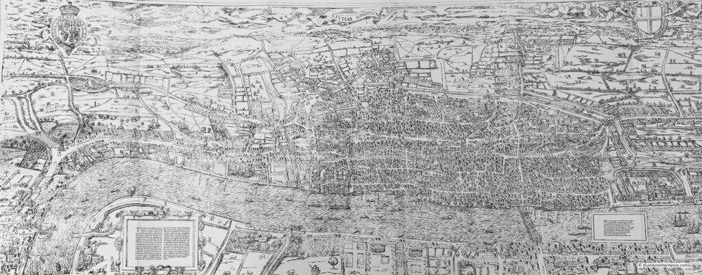
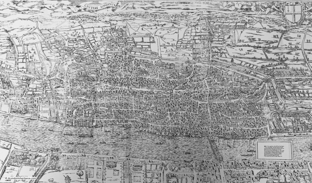
A Reproduction of the Map by Ralph Agas, Circa 1560

Although the map is known as the Agas map, it appears to be an incorrect attribution. Ralph Agas was a surveyor who lived between 1540 and 1621, however there is no firm evidence that he was the creator of the map, and the coat of arms at the top left of the map is not from the Tudor period, but is the Stuart coat of arms, and the version of the map that survives is believed to date from around 1633.

At the time the map was made, the population of the city was around 350,000, and was still mainly contained within the old City walls, although there were small areas of building outside the walls, for example the route from the City to Westminster can be seen with buildings either side of what is now Fleet Street and the Strand, and the Eleanor Cross can be seen at Charing Cross.

The following extract shows the City of London:

In the following extract, the River Fleet can be seen from the point where it enters the Thames, then heading north where the two crossing points at what is now Ludgate Circus and Holborn Viaduct can be seen, before the river starts wandering to the north:

In the next book in Besant’s series, “London In The Time Of The Stuarts”, we then have:

A Large And Accurate Map Of The City Of London (John Ogilby, 1670s)

John Ogilby was a printer and publisher, translator, Master of the Revels in Ireland, he had served in the Army, and in the period after the Great Fire of London, he created a detailed and carefully surveyed map of the City of London.

There are some significant changes to the City we see today, however there is much that is basically the same (although the buildings will be very different).

In the following extract, the Wool Church Market is where Mansion House is today, and to the right is Cornhill, with the Royal Exchange and the churches of St. Michael Cornhill and St. Peter Cornhill, and there are the same alleys between Cornhill and Lombard Street that we can walk today, although between 19th and 20th century buildings, rather than those Ogilby would have known:

The map still shows the River Fleet in the 1670s, as a channel running up from the Thames, with what looks to be walkways along both sides of the river, between the Thames and Holborn:

After publishing his map of the City of London, Ogilby published perhaps his best known work, “Britannia”, which was a map of the routes between the principal towns and cities of the country.

For Britannia, Ogilby used the innovative method of a strip map, where the route was shown running along a series of strips, with the main geographic features, towns and villages, houses, side roads etc. that could be found along the route.

The following map is the strip map for the route from the Standard in Cornhill (a water pump at the eastern end of Cornhill, and one of the places in London used as the base for measuring distances) to Portsmouth in Hampshire:

In the text in the box at the top, the distance is given as 73 miles and 2 furlongs, and John Ogilby is given the rather grand title of His Majesties Cosmographer, a title given to Ogilby by King Charles II.

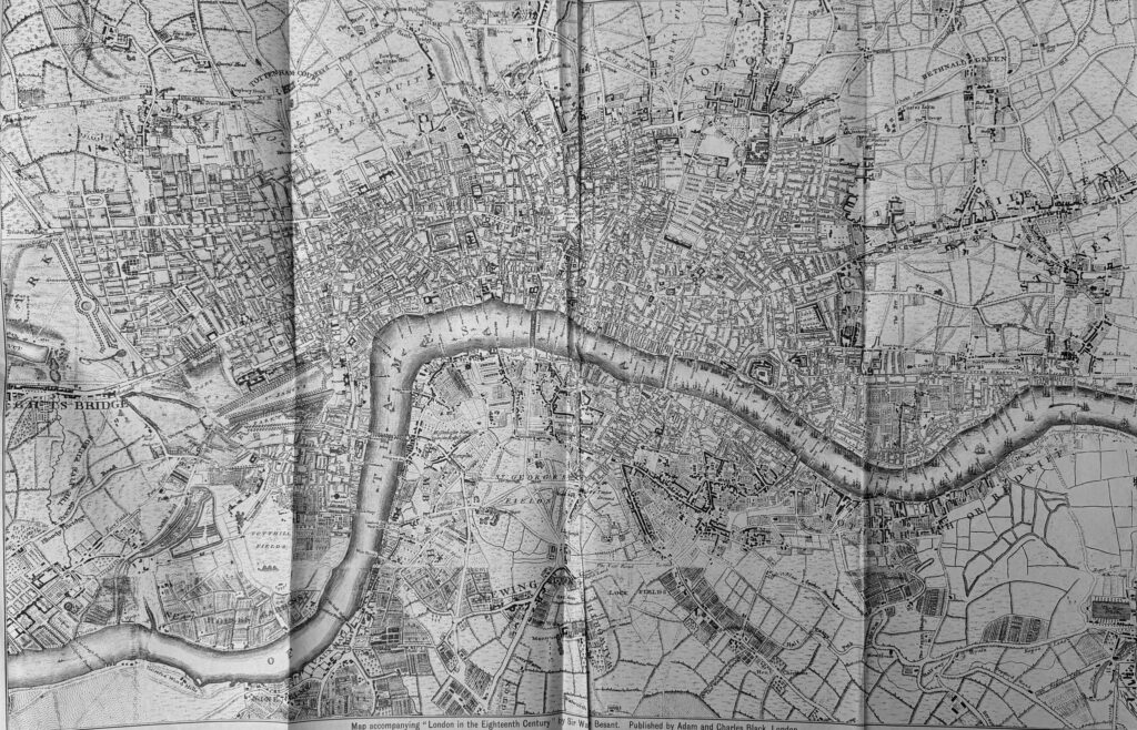
We then come to the book “London in the Eighteenth Century”, and:

London in 1741-5 by John Rocque

Rocque’s map is one of the maps I use regularly in blog posts, as it provides a comprehensive view of the city, including the wider, as yet undeveloped part of the city.

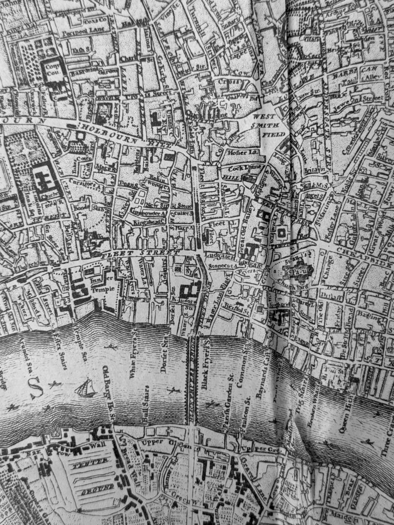
The River Fleet can still be seen, but it is now starting to be built over, and where the Fleet runs into the Thames is now Blackfriars Bridge:

Looking to the west of Rocque’s map, and we can see Chelsea Water Works (roughly where Victoria Station, and the tracks leading out of the station are today). About 70 years after Rocque’s map, Chelsea Water Works would be closed and the space backfilled with the soil excavated for the new St. Katherine Docks.

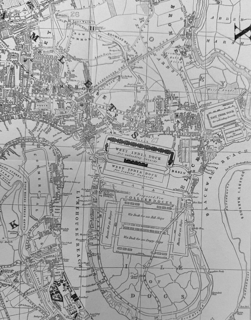
We now come to “London in the Nineteenth Century”, and the city is expanding rapidly. The time when the city was enclosed within the old city wall as shown in the Agas map is long gone. This is:

Cruchley’s New Plan of London improved to 1835

London has expanded rapidly, however there were still fields to the east and west, land that would be built on during the rest of the 19th century and early 20th century.

Part of the city’s expansion has been to the east, as trade carried along the river has grown considerably, and the original wharves and docks in the heart of the City were no longer capable of supporting the volume of goods and the size of ships.

If we look to the Isle of Dogs, we can see the West India Docks which were built in the early 19th century, and below these docks, we can see the outline for some proposed new docks, each capable of supporting 200 ships:

One of the early roads that ran through the Isle of Dogs to the ferry at the southern tip can be seen running across the outline of the new docks.

The docks would not be built as shown in Cruchley’s map, the new docks would be the southern dock below the West India, and the Millwall Dock.

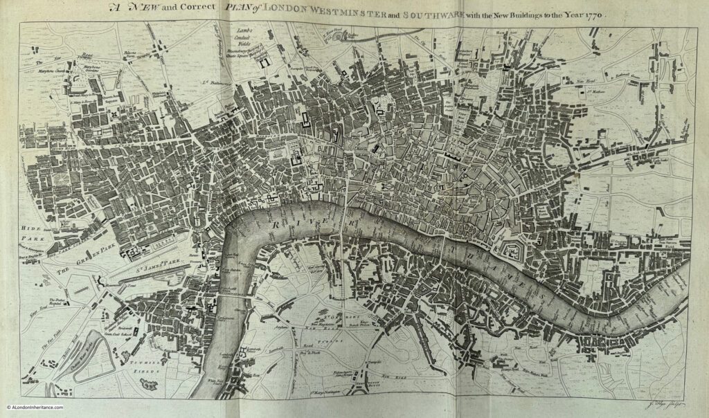
Another book with an impressive fold out map is Henry Chamberlain’s:

A New and Complete History and Survey of the Cities of London and Westminster, the Borough of Southwark, and Parts Adjacent

The book dates from 1770, and has a large fold out map of the city in that year:

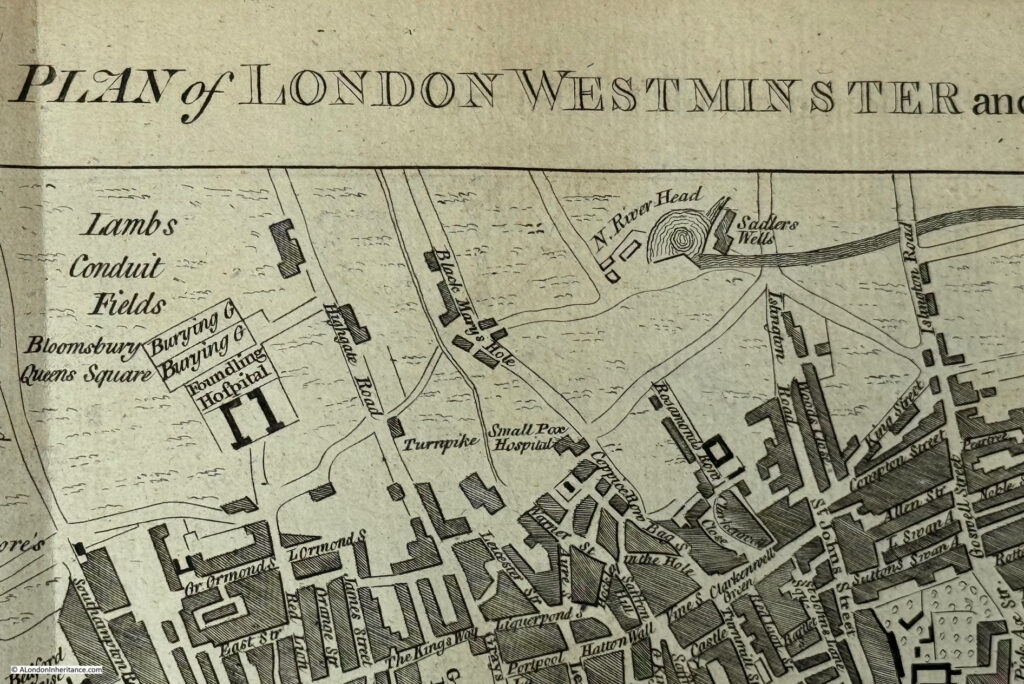
Again, there are plenty of little details which show the city at the time, and if we look at the top of the map, there is New River Head and Sadlers Wells:

New River Head was the large pond built at the end of the man-made New River that brought water in from springs around Ware in Hertfordshire, ready for onward distribution across London.

Sadlers Wells was named after a well and the first owner of the site and the entertainment venure he developed.

At the time, the land between Sadlers Wells and the city, was still open land, as the map shows, and was a risky place for those returning from a night at Sadlers Wells to their city homes, with many reports of theft across what would have been dark fields.

If we look at the area of Lambeth covered by the map, we can see at the time there were no other bridges between Blackfriars and Westminster Bridges, and we can see one of the pleasure gardens south of the river, Cuper Gardens, which is where the approach to Waterloo Bridge and the large roundabout at the end of the approach road are located today.

Narrow Wall can be seen on the map, one of the early attempts to stop the river from encroaching on the land and reclaiming Lambeth Marsh. Narrow Wall is today Belverdere Road and Upper Ground.

The next book is “A Dictionary of London” by Henry Harben (1918). This book has a pocket at the end, in which there are a selection of maps. The first being:

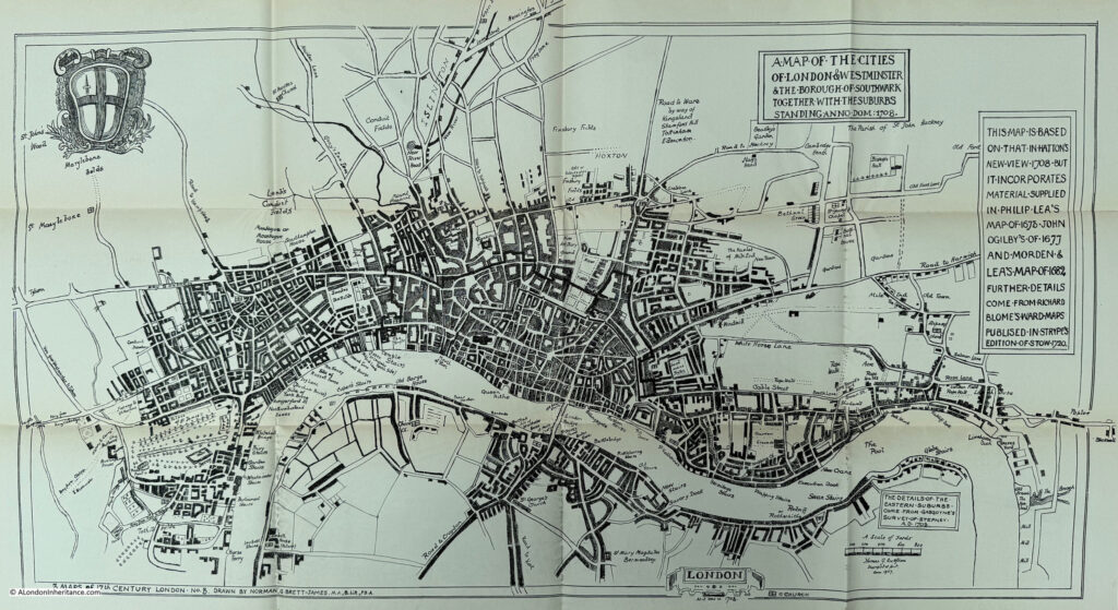
A Map of the Cities of London & Westminster and the Borough of Southwark together with the suburbs, 1708

Some of the maps in Harben’s book are based on several different maps to provide coverage and detail not seen within one individual map. The above map is based on “Hatton’s New View 1708, but it incorporates material supplied in Philip Lea’s map of 1673, John Ogilby’s of 1677 and Morden & Lea’s map of 1682. Further details come from Richard Blome’s ward maps published in Stryp’s edition of Stowe, 1720”.

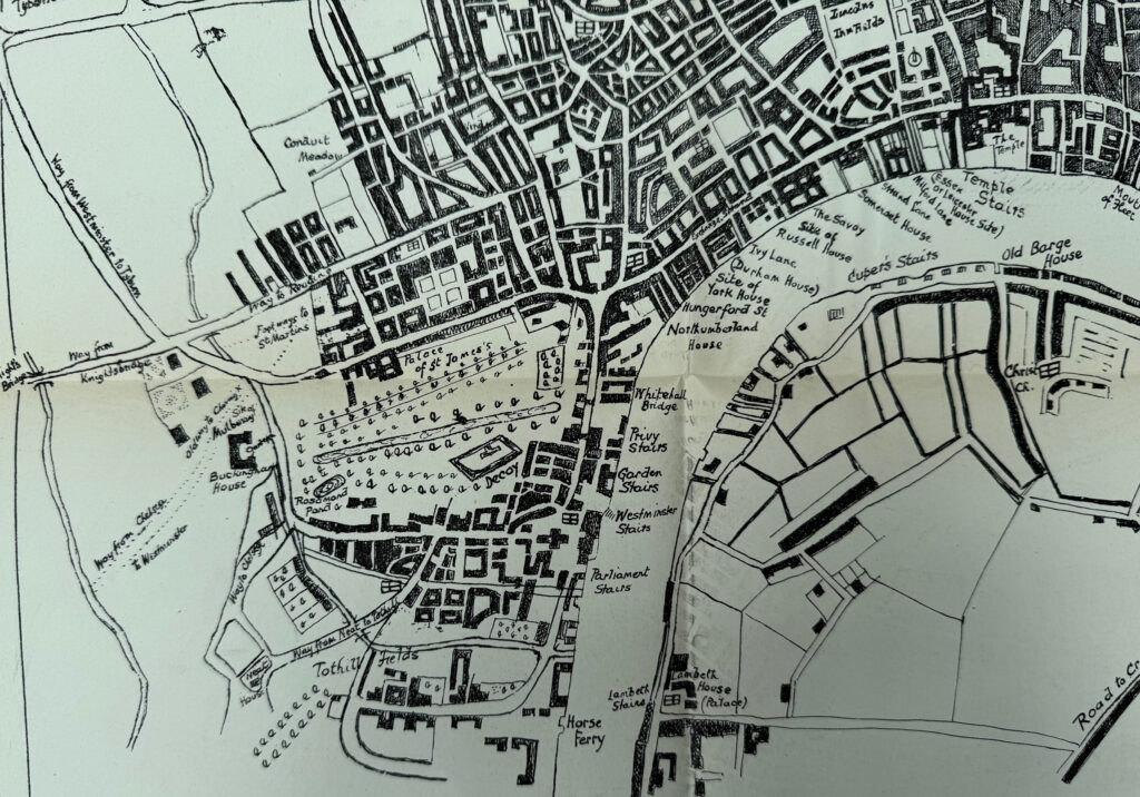
The benefit of this composite approach is the level of detail in one map, and in the following extract we can see the stairs and houses along the river between the mouth of the Fleet and the horse ferry in Westminster:

Interesting that in St. James’s Park there is a feature labelled “Decoy”. This may have been a pond where ducks, or other waterfowl would be lured into and trapped. The benefit of such a place was that if they were to be served as meat for food, then not having been shot, they would not contain lead shot.

The next map in Harben’s book is the product of three maps, and is titled:

A Map of London about 1660. The Ground Plan is based on Hutton 1708. The details from Faithorne and Newcourt Circa 1658

Again, there are many small details. Wapping is mainly built along the river and along the Ratcliffe Highway, and the area of Rotherhithe is using the old name of Redriff.

There is one, small detail I really like. Take a look at Limehouse to the east, and next to the small indentation from the river (Limekiln Dock, see this post), there is a drawing of a lime kiln:

The lime kiln is shown in the correct location for the first lime kiln in the area, and is the structure that would give Limehouse its name. The accuracy of the image extends to the smoke issuing from the top of the kiln, from the burning of chalk brought up from Kent.

We then come to:

Map of London shows its size at the end of the 16th century. The ground plan is for convenience based on the plan in Hatton’s New View 1708. The main details are from Norden 1593 & Speed 1610

In this series of maps from Harben’s book, we have been going back in time, and this map shows the city at the end of the 16th century, overlaid on a plan of 1708.

It shows a much smaller city, and there are details which show just how undeveloped parts of London were at the time.

The area south of the river, where much of Lambeth is located today, is labelled Lambeth Marsh, and has the symbols for a marsh along with some lines of trees.

The area between Narrow Wall and the Thames are areas of agriculture, with inlets leading from the river up to Narrow Wall. This area between Narrow Wall and the river was used for agricultural purposes, such as growing reeds.

Some of the maps in Harben’s book show how you can add additional detail to a map, and these are the pre-Internet versions of the Layers of London site, for example:

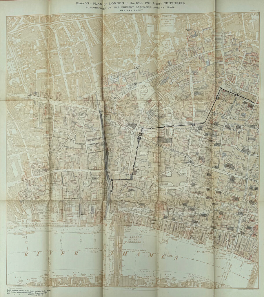
Plan of London in the 16th, 17th & 18th Centuries Superimposed on the Present Ordnance Survey Plan

The above map is the Eastern Sheet and the map below is the Western Sheet:

A small detail from the map shows the outline of the pre-Great Fire St. Paul’s Cathedral overlaid on the outline of Wren’s cathedral which we see today, showing a slight change in orientation and size:

Another of Harben’s maps where has overlaid data on a street plan is a:

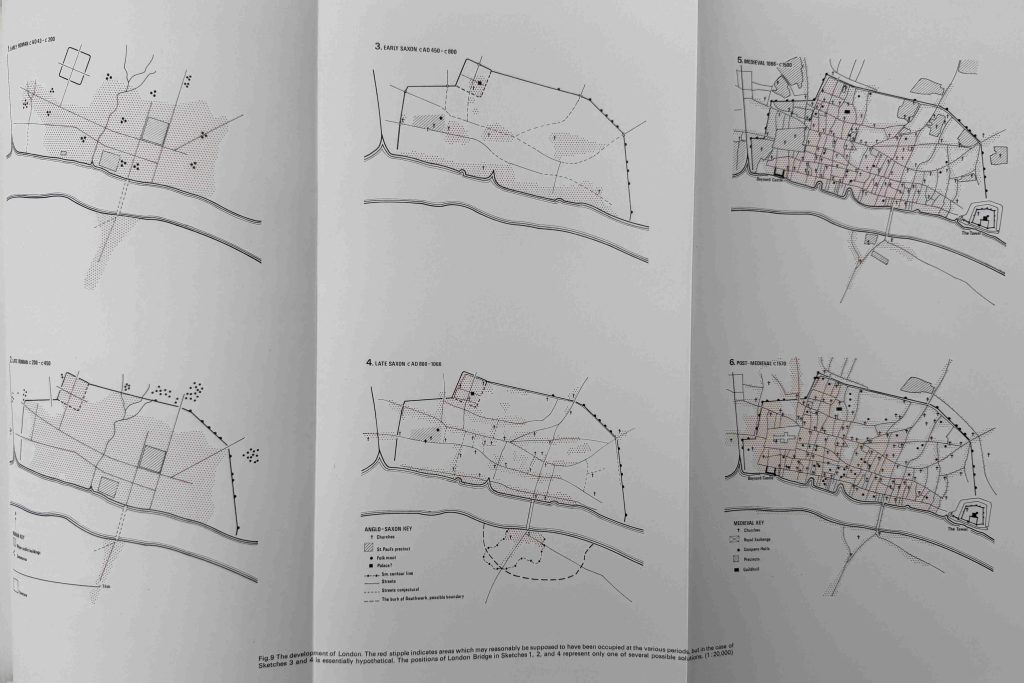
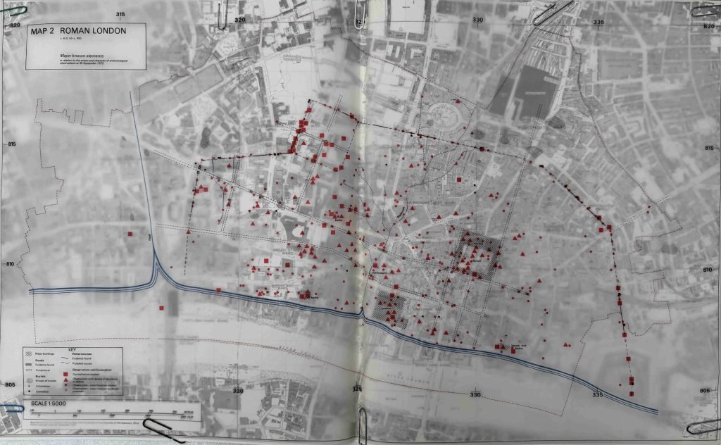
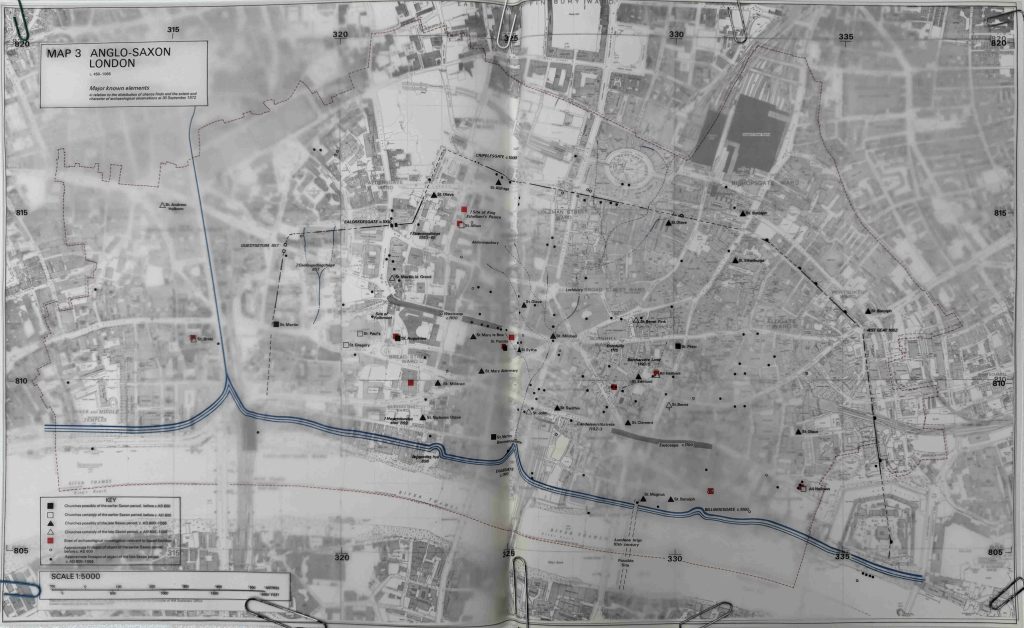
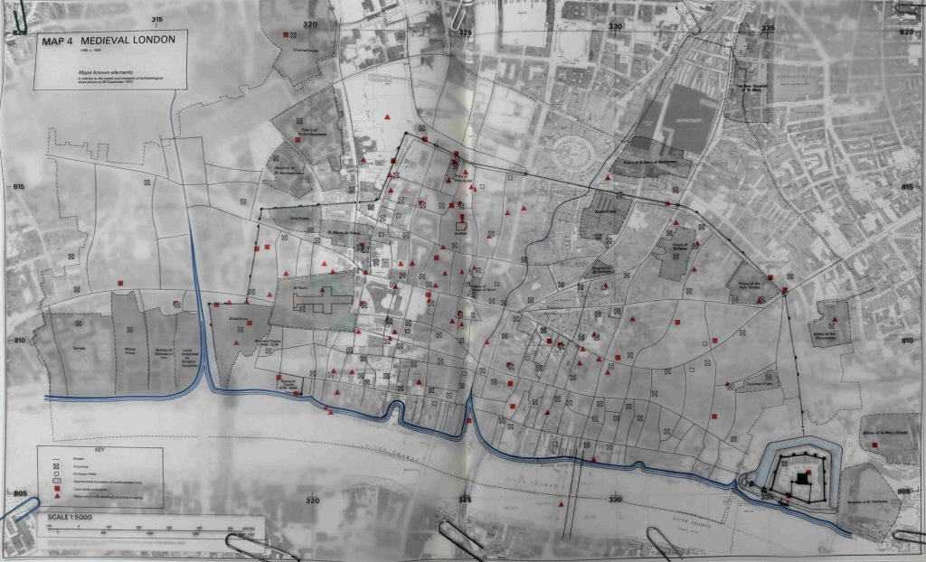
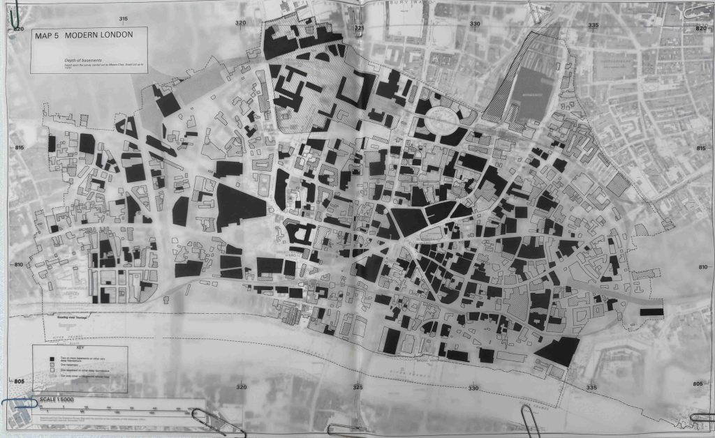
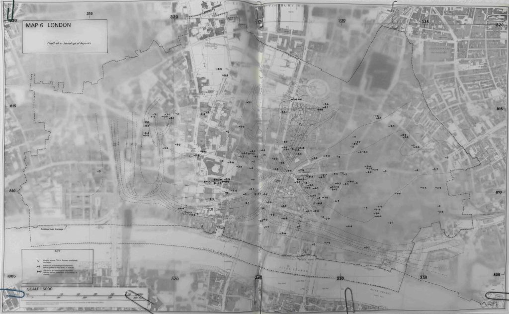
Plan of London showing the Levels of the Natural ground below the present Surface, the Line of the Roman Wall of the City, and the Sites of Discoveries of Roman remains etc.

Walking the city streets today, it is hard to appreciate just how much land levels have changed over the last couple of thousand years.

Centuries of dumping of building rubble, accumulations of rubbish, waste and soils, demolition rubble from events such as the Great Fire, leveling of the city, for example, the land running down to the Thames (when Queen Victoria Street was built, parts were raised to level out the street), covering of rivers such as the Fleet and the Walbrook etc. have all contributed to raising the ground level of the city.

The lowest levels where evidence of human occupation of the city are those from the Roman period, and in the map, Harden has located where remains have been found, and the level below the current surface, for example, as shown in this extract showing the area around Cripplegate and London Wall:

One of the best places where this raising of surface levels can be seen is the part of the Roman Wall shown in the above map, which is preserved in the underground car park below London Wall. Whilst there are many runs of the wall above ground in the area, these are all medieval, we have to look below the surface to get down to the Roman Wall, as can be seen in this post where I photographed the wall in the car park.

A small sample of some of the old maps of London that show how the city has developed over the centuries, and finding an old book with a large folding map, or even better, a pocket at the end of the book stuffed with maps is always a bonus.

Some of the other maps I have looked at in the blog are Reynolds’s Splendid New Map Of London , the 1944 report on the Reconstruction of the City of London, and the 1943 London County Council Plan for the redevelopment of London.

alondoninheritance.com

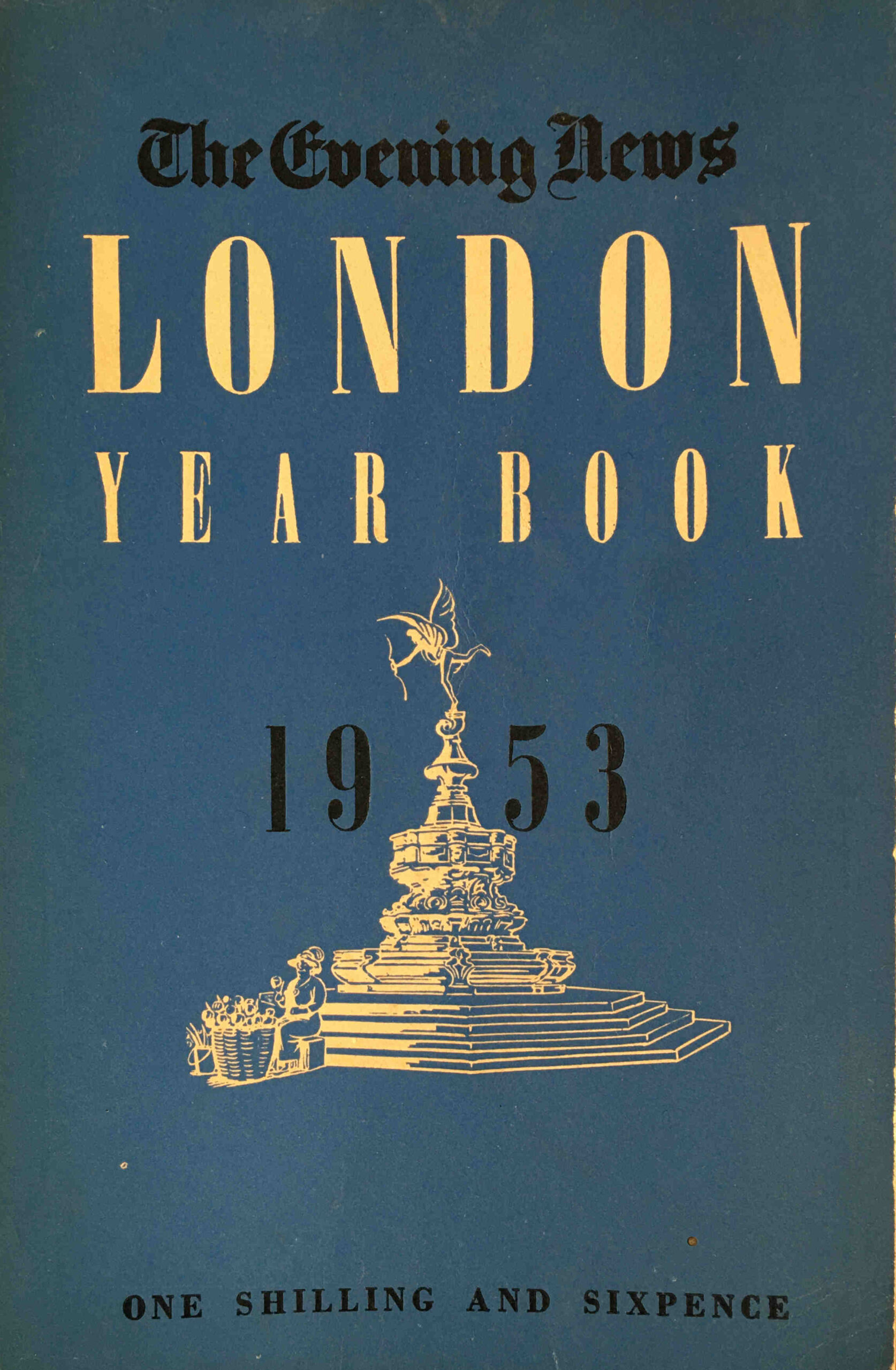
1953 – A London Year Book

Seventy years ago, the Evening News published the London Year Book 1953.

London Year Book

Despite its small size (7 by 4.5 inches), it was packed with information about London. Statistics, stories and facts, then and now photos, lists of events and dates, 192 packed pages on the city. The book claimed to have “10,000 facts and the answers to the many questions on Britain’s capital which are constantly being asked”.

As with 2023, 1953 was also a Coronation year, and in an article looking at the accommodation of Coronation visitors, the following new challenge is identified in estimating the numbers who would visit the city “Circumstances have changed considerably since the last Coronation in 1937. There is an unknown factor in the development of television services, which will take the brilliant panoply of the Coronation procession right into the home.”

Organisers were expecting records to be broken, with more than 150,000 overseas visitors arriving in London for the Coronation. In the same period in 1952, the city had 47,624 visitors from overseas, so 1953 would see at least a trebling in numbers.

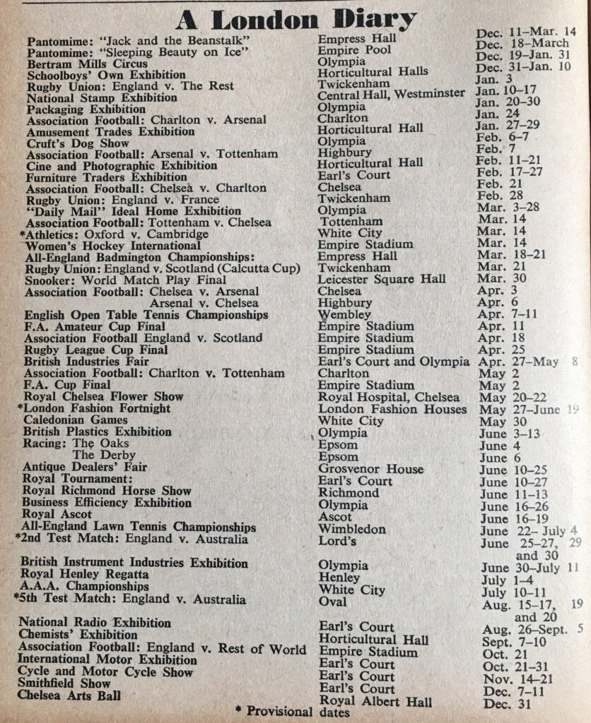
As well as the Coronation, there were many other events in London during 1953, and the book included the following London Diary listing with a rather diverse set of events:

London Year Book

The Empire Stadium and Empire Pool were at Wembley, and the Empress Hall was at Earls Court. The football matches listed are only for teams who were in Division 1 (now the Premier League), so in 1953 London only had four teams, Charlton, Arsenal, Chelsea and Tottenham. Today, all these teams are still in the equivalent of Division1 with the exception of Charlton who are now in Division 1 (which in 1953 would have been Division 3).

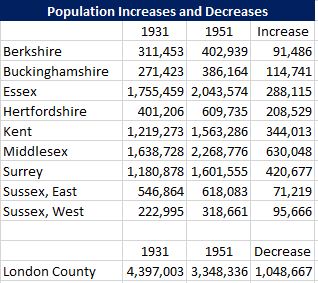
The Year Book included a large and diverse range of statistics that show London in 1953, and how the city had changed. One of these was a table of population increases and decreases covering London and the surrounding counties, between 1931 and 1951:

London Year Book

London was a smaller entity in 1953 than it is today, boundary changes in the following years would increase the size of the city and take land from some of the surrounding counties, however the table does show some significant changes.

Between 1931 and 1951 the population of London declined by 1 million people. Much of this was due to wartime damage across London. Large areas of residential streets had been bombed and rebuilding was still to come.

Comparison of London with the surrounding counties shows that whilst the population of London decreased significantly, there were large increases in the surrounding counties. Some of these populations would later be taken back within London (for example parts of Essex and Middlesex), however the table really illustrates the impact the war had on the population of the south east of the country.

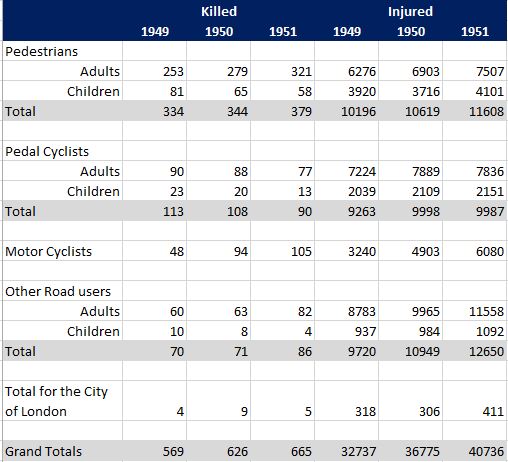
Another set of statistics shows the number of people killed or injured on the city’s roads:

London Year Book

The figures in the above table show just how dangerous the city’s streets were seventy years ago. In 1951 a total of 665 people were killed and 40,736 injured. Compare with the latest set of figures from Transport for London, and their “Casualties in Greater London during 2021” data release reports that in 2021, 75 people were killed, 3,505 seriously injured and 23,092 slightly injured – a significant reduction over the past 70 years.

This again is across a wider area than 1951, with a higher population and more traffic on the roads. The TfL data release does consider that COVID may have led to a reduction in traffic, however the figures for 2021 were part of an ongoing reduction in deaths and casualties across the city streets.

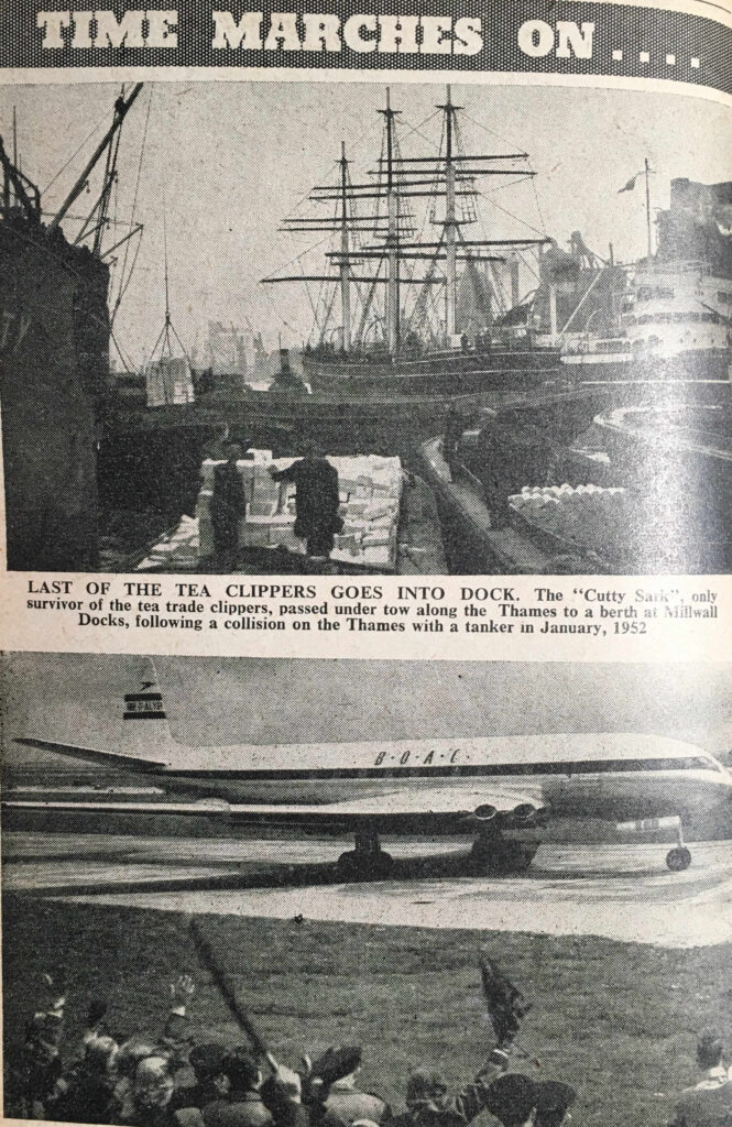
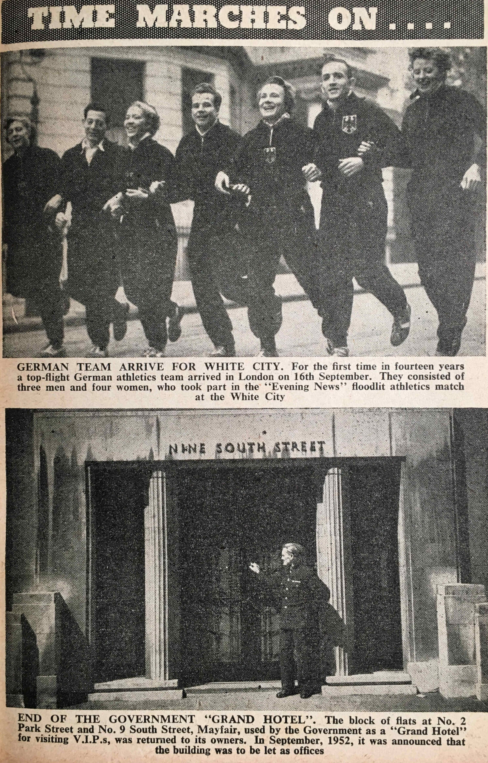
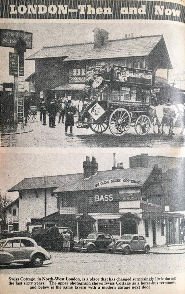
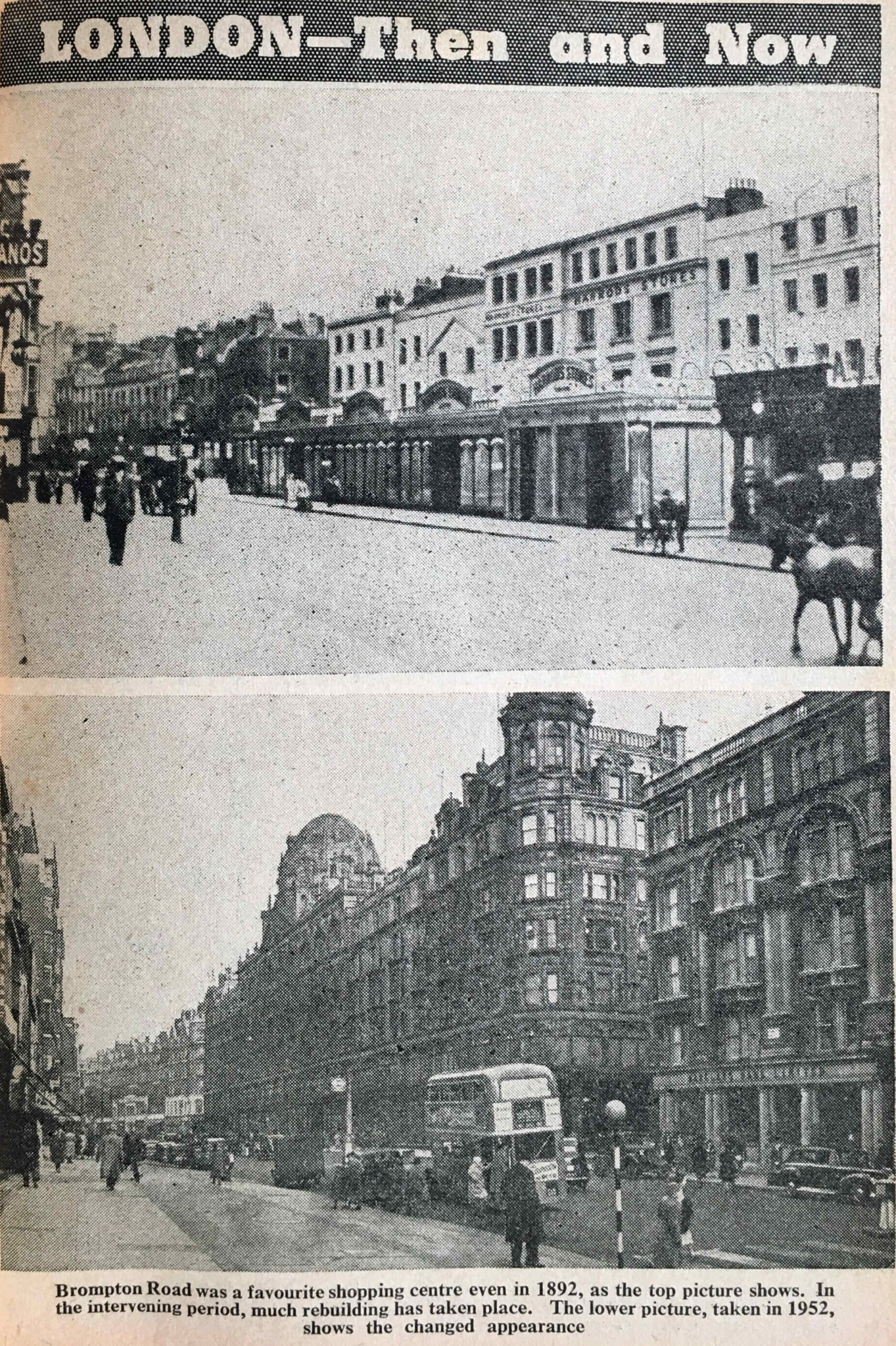
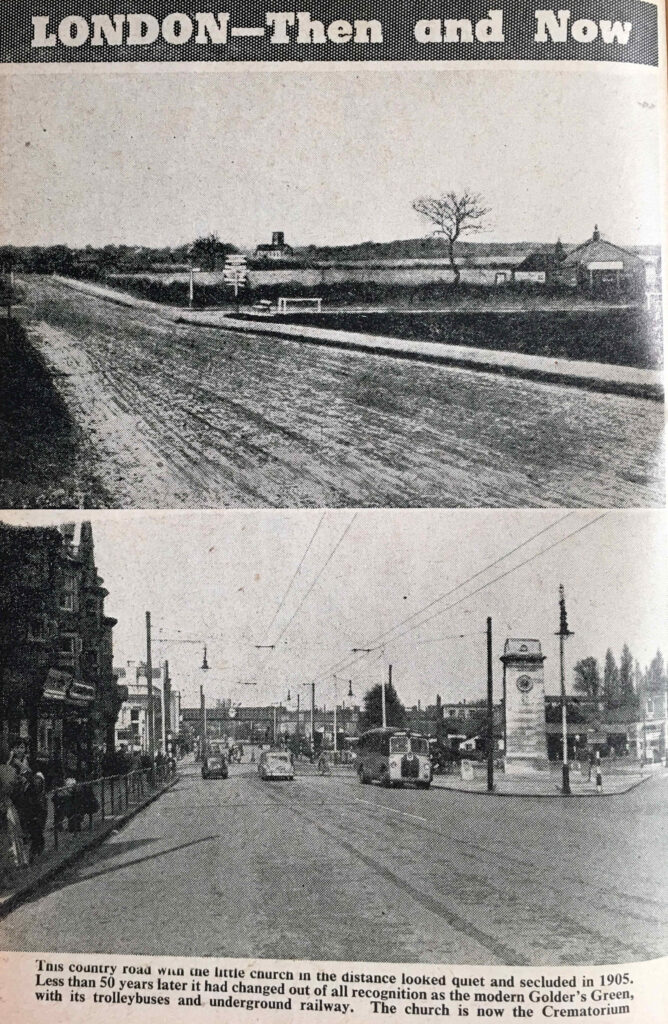
The Year Book includes a series of “Then and Now” photos, which illustrated how the city had changed. Along with photos under the heading of “Time Marches On….” which illustrated the many aspects of the city that were changing and developing.

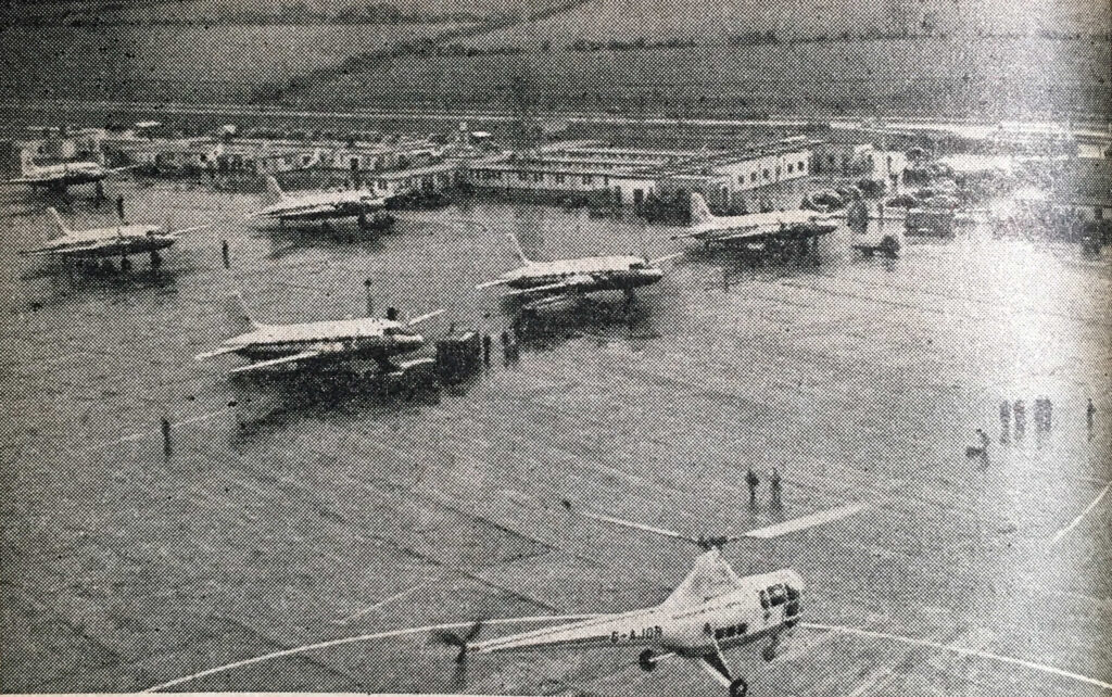
The first compares two methods of global transport, with a photo of the Cutty Sark under tow to a berth in Millwall Docks, following a collision on the Thames with a tanker, in 1952. This is compared with the latest form of global travel with the De Haviland Comet, the world’s first jetliner service taking of from London Airport on a flight to Johannesburg.

De Havilland Comet

The excitement of the crowds in the bottom of the photo as they wave off the de Havilland Comet would be short lived. The first production release of the Comet suffered a number of fatal crashes. Design problems and structural issues would be identified and would result in redesigned versions of the aircraft, however by the time they were in production, other aircraft companies such as Boeing had jumped ahead.

The aircraft in the above photo with the registration G-ALYP was one of those that crashed. This happened on a flight back to London from Singapore. Soon after taking off from Rome, the aircraft exploded and debris fell into the Mediterranean, killing all 35 people on board.

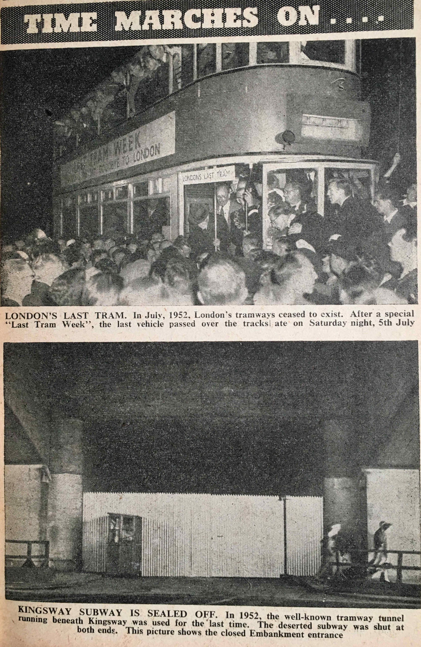
Another changing form of transport was the London tram, with the last tram on the 5th of July 1952 being featured. My father also took some photos during “Last Tram Week” which are in this post.

Londo's Last Tram

The above photo shows the sealed off entrance from the Embankment to the Kingsway tram subway, which was made redundant following the closure of the tram network.

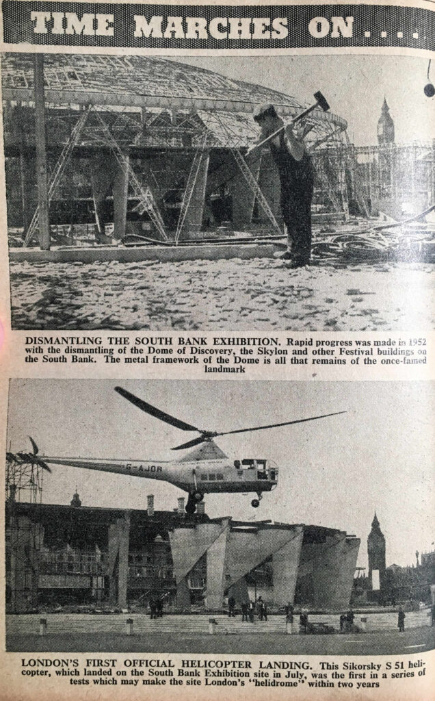
The majority of the buildings of the Festival of Britain on the Southbank had been demolished by 1953 and the Year Book includes a photo of the site, with the remains of the Dome of Discovery in the background (see this post for photos of the Festival of Britain site before demolition):

Dome of Discovery

The above photo shows parts of the concrete supports to the Dome of Discovery with County Hall in the background. The focus of the photo is on the helicopter landing on the Southbank site, which was the first of a series of tests to enable the site to become a “helidrome”.

The site did become the Waterloo Air Terminal, offering check-in services and coach travel to Heathrow Airport. There was a limited helicopter service for a period offering faster travel to Heathrow (see this post for more on the Waterloo Air Terminal).

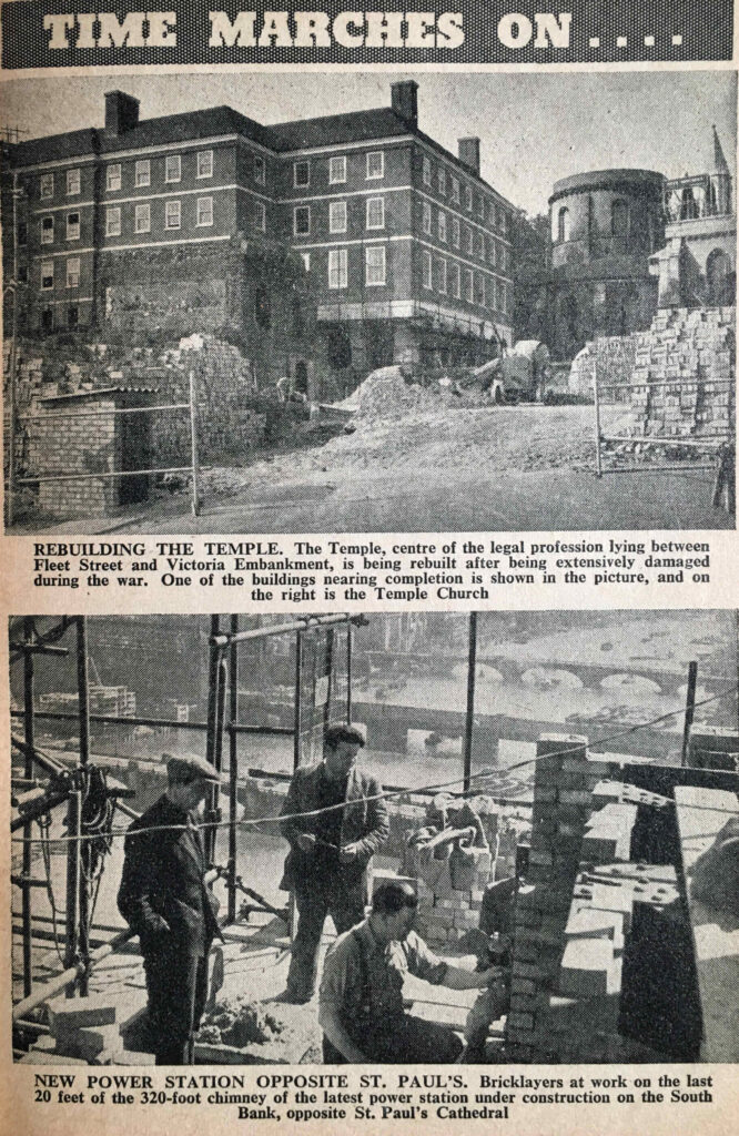
Some photos under the “Time Marches On” theme also showed the repair of wartime damage, as with the Temple Church:

Temple and Bankside Power Station

And the above photo shows bricklayers at work on the last 20 feet of the 320 foot chimney of the new Bankside Power Station – from the days when most protective headgear in construction work seemed to consist of a flat cap.

Time Marches On also applied to reconciliation with Germany, as in the following photo of the first time that a “top-flight German athletics team” arrived in London since before the war:

White City

And the above photo highlights the return of one of the many London buildings used by the Government during and after the war.

London Transport

Several pages in the London Year Book were devoted to London Transport, with the following introduction to how London’s public transport system had been organised up to 1953:

“London’s transport system was first united under the name London Passenger Transport Board in July 1933, when 170 different undertakings were taken over, including the Metropolitan Railway, the London County Council Tramways, the Central London Railway, and the London General Omnibus Company.

The first regular London bus services was inaugurated in 1829, when George Shillibeer began a service with a single horse-bus running through the streets of London. In 1856 an Anglo-French company, known as the London general Omnibus Company, began operations, an organisation which grew to become the largest of its kind in the world.

L.P.T.B. ran London’s transport until 1st January 1948, when under nationalisation it became the London Transport Executive.

Today, the London transport area is 1,986 square miles, roughly one twenty-fifth of the whole of England. it covers two counties and parts of seven other counties, as well as serving parts of a tenth county. The estimated population of this area is 9,800,000.”

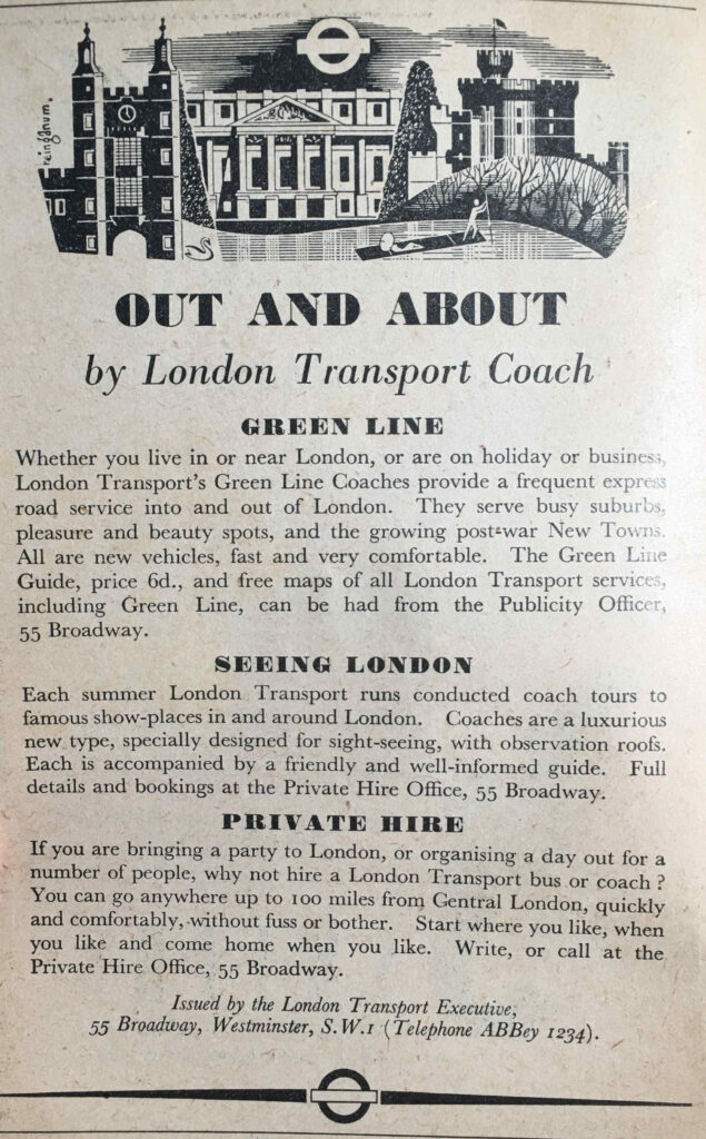
Part of this extensive network, and one that served the counties around London was the coach service, with Green Line providing timetabled services to places around London, as well as sight-seeing and private hire coaches:

London Year Book

The London Year Book includes the passenger journeys made in 1950:

London Year Book

The Year Book appears to have used the term Railways for the Underground network. For comparison, from the last reporting period, from the London Datastore, comparison figures are:

  • Buses: 1,490,700,000
  • Underground: 748,300,000

The use of buses shows a considerable drop over 70 years, however the figures come with the caveat that the scope of central buses in 1950 and the bus network today may be very different.

Underground journeys do show an increase of over 100 million, which sounds about right given the enlargement of the underground network over the last 70 years.

The London Year Book includes a number of statistics that show the scale and complexity of the Underground network, including:

  • 106 lifts are maintained at 37 stations
  • The longest railway station escalator in the world is at Leicester Square Station with a vertical rise of 80.75 feet
  • The shortest escalator is at Chancery Lane Station with a vertical rise of 15 feet
  • 106 lifts are maintained at 37 stations
  • The deepest lift shaft ay 181 feet is at Hampstead Station
  • The shortest lift shaft at 30 feet 6 inches is at Chalk Farm Station
  • There are 1,150 automatic ticket machines in use which issue 85 per cent of all tickets and use more than 15,000 miles of paper a year

The Year Book identifies a number of “London Transport Records”:

  • Highest point on the road is a country bus and coach route at Botley Hill, Warlingham, Surrey
  • Deepest point is in the railway tube 67 yards south of Waterloo Station , where the tunnel is 67 feet below ground
  • longest continuous tunnel in the world runs from just south of East Finchley Station to Morden Station via Bank on the Northern Line. 17 miles 528 yards in length, it has been in use since 1939
  • Longest railway journey direct is from Liverpool Street to Aylesbury at 41.8 miles
  • Longest railway journey changing once is from Epping to Aylesbury at 58.8 miles
  • Longest Green Line Coach route is the 716 Hitchen to Chertsey at 66 miles
  • Shortest bus route for Central buses is the 249 which runs from Upminster Station to Corbets Tay at 1.3 miles

What I did find strange was the statement that the deepest point in the tube network is just south of Waterloo Station, where the tunnel is 67 feet below ground, however in the previous statistics it states that the deepest lift shaft at 181 feet is at Hampstead.

I assume the deepest point just south of Waterloo Station is referring to depth below sea level. Hampstead Station is at a height of 351 feet above sea level, with the area around Waterloo Station at around 3 feet above sea level, so the statement about the tunnel south of Waterloo being the deepest is correct, relative to sea level.

There is a list of the longest bus routes on the network:

  • On summer Sundays: 112 from Palmers Green to Hampton Court (22.3 miles)
  • On winter Sundays: 59 from West Hampstead to Chipstead Valley (22 miles)
  • On weekdays: 25 from Victoria to Hornchurch (19.6 miles)
  • On country buses: 414 from West Croydon to Horsham Station (32.6 miles)

The oldest bus route in 1953 was the one running between Shepherds Bush and Liverpool Street Station. It was founded in 1866 and in 1953 was route 11, this number being in use from 1905. Today route 11 runs between Fulham Town Hall and Appold Street where it terminates two stops after Liverpool Street Station.

The change from Shepherds Bush, first to Hammersmith seems to have happened around 1970, then to Fulham around 1994.

The challenge with full comparisons between 1953 and 2023 are the significant changes to the transport network, as well as where and how people liver and travel.

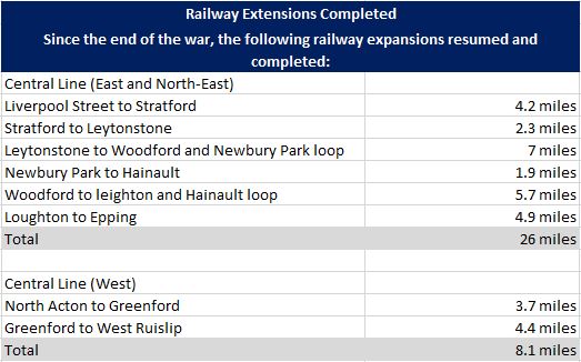
For the underground network, completely new underground lines would be constructed in the decades after 1953. The war had put a hold on expansion of the network, and the Year Book identifies the sections where work had recommenced and been completed:

London Year Book

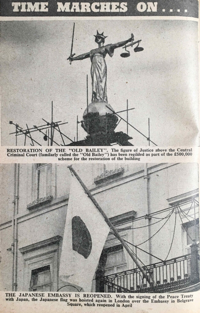
Back to some of the photos in the book, and under the “Time Marches On….” category, there is a photo of the figure of Justice above the Central Criminal Court / Old Bailey, to highlight the major restoration of the building:

Old Bailey

Which is followed by a photo of the Japanese flag in front of the Japanese Embassy, following the signing of the peace treaty with Japan, and the restoration of relations between the two countries.

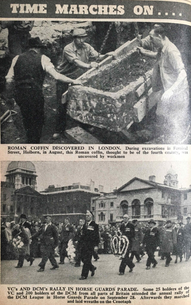
The following photo shows a Roman coffin discovered during excavations in Furnival Street, Holborn. The years following the war were a time of significant reconstruction in the City, and although much was discovered, I have always wondered how much archaeology was lost.

Roman Coffin

The above photo shows a rally of holders of the Victoria Cross and the Distinguished Conduct Medal in Horse Guards Parade.

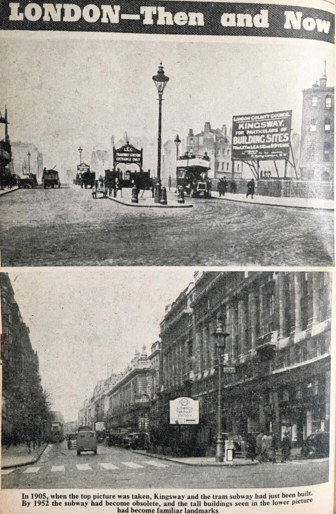
The “Then and Now” theme continues with two photos showing Kingsway. In the top photo, taken in 1905, the Kingsway tram subway had just been completed. By the time of the second photo in 1952, the subway had become redundant and the right side of the street had been developed.

Kingsway

Supplying London with Electricity

The London Year Book includes a few pages on the supply of electricity across London. This was a time when electricity generating stations were operating across London, and the use of coal was one of the major causes of air pollution.

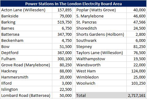
The following table lists the locations of power stations across London, along with their generation capacity in kilowatts:

London Year Book

My grandfather worked in the St. Pancras power station up until 1948.

Note that the Bankside figure is for the original power station on the site, not the power station that was being constructed (see this post on Building Bankside Power Station).

As with the London transport system, the post-war period had seen the consolidation of electricity supply in London, and the Electricity Act of 1947 formed the British Electricity Authority which consisted of fourteen individual electricity boards across the country, with the London Electricity Board serving London.

Bringing together the electricity supply industry was also aimed at standardising electricity supply. The early 1950s was not a time when you could have taken your mobile phone charger (assuming there could have been such a thing), and simply plug it in to any electricity socket in the city.

There were still many non standard electricity supplies, and the Year Book records some figures in the change over of consumers’ supply, with 6,112 consumers having been transferred from Direct Current (DC) supplied to Alternating Current (AC) – the supply type we use today, as well as 1,337 consumers from non-standard to standard AC supplies.

These changes were part of creating the world we take for granted today, where standard electricity supplies resulted in standard appliances, lower costs and easier availbility.

There was still much change to complete however, as the Year Book records there were still 155,998 DC services being provided.

Over the coming decades, all the power stations within London would close down as larger power stations were built along the Thames, out towards the estuary, and London was integrated into the wider country grid. In turn, these stations along the Thames would also close.

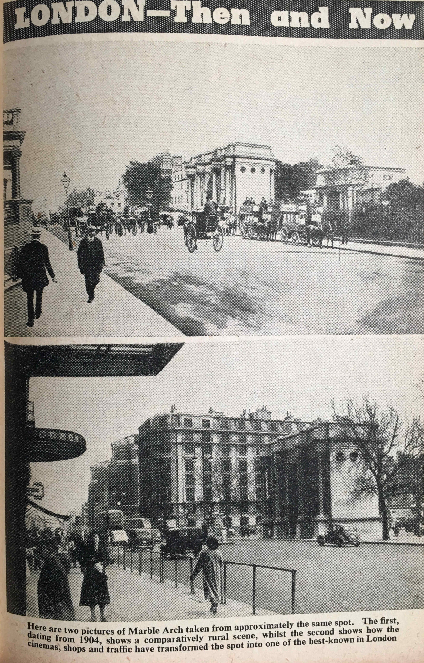
Back to “Then and Now”, and two photos showing Marble Arch, the top photo from 1904, and the second showing how the area had been developed by 1953:

Marble Arch

Two photos showing Swiss Cottage, showing that the “place has changed surprisingly little during the last sixty years”. The view of Swiss Cottage is a bit different today.

Swiss Cottage

Brompton Road, before and after redevelopment, including the construction of Harrods:

Brompton Road

The Post Office and London Telecommunications

Some of the statistics in the London Year Book show numbers and technologies that would change beyond all recognition in the years between 1953 and 2023, for example, in 1953:

  • Number of telegrams delivered: 5,885,300
  • Number of telephones: 1,755,919
  • Number of telephone calls: 1,730,000,000
  • International (radio) calls: 249,000
  • Telephonists: 16,117
  • Number of letters and packets posted: 2,737,394,100
  • Letters and packets at Christmas: 83,745,200
  • Number of pillar and other post boxes: 11,688
  • Number of postmen: 32,195

The telegram has disappeared, there are probably still a high number of telephones, but more mobile phones, with many of the traditional land lines not being used. Although there were sub-sea telephone cables in 1953, radio was still being used to put through international calls, for example from the very tall radio masts that were at Rugby, alongside the M1.

The job of a telephonist is now redundant, and I suspect many of the telephone calls and letters have been replaced by messaging and email applications.

In 1953, the Internet and mobile phone would have been more science fiction than reality.

Many of those telephones would have been installed across the expanding city suburbs, and the following “Then and Now” photo from the London Year Book illustrates how the city had expanded during the first half of the 20th century.

The photo at the top shows the rural area in 1905 that would become Golder’s Green, shown in the lower photo:

Golders Green

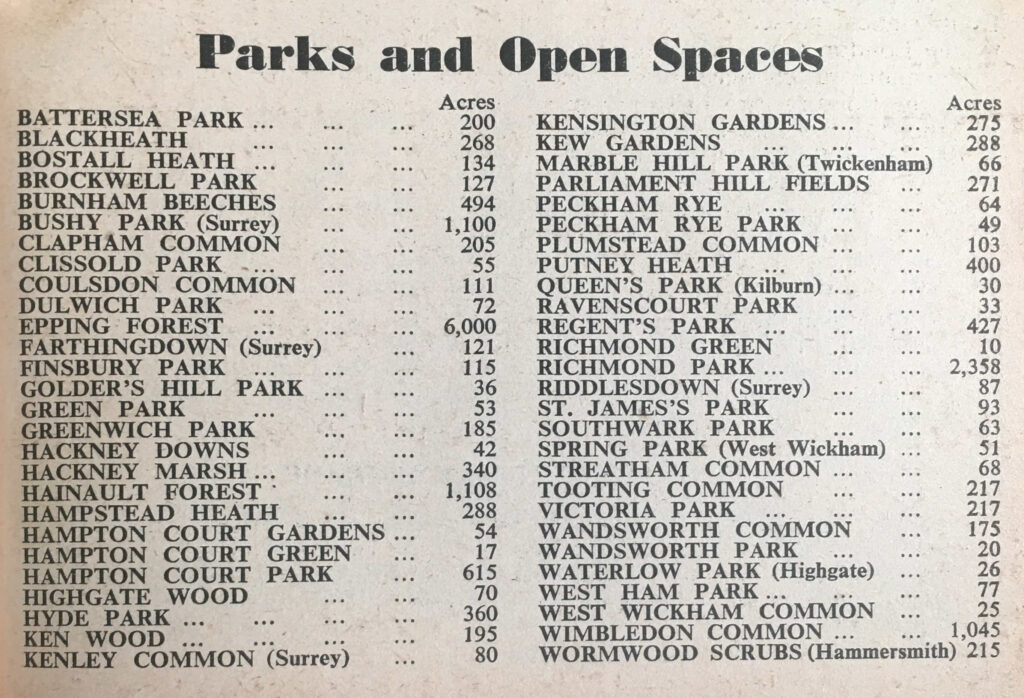
Although London was building and expanding at a rapid pace, there was still a reasonable amount of green space across the city, as listed in the following table, although east London was very poorly provided for compared to the rest of the city:

London Year Book

The Airports of London

The Year Book provides some details on the airports and airlines serving London.

At the time, the London Year Book records that British airliners flew the equivalent of five times around the world every day, and during a year carried over a million passengers.

The heaviest traffic was between London and Paris, with during the summer fifteen flights a day on the route. The longest route served by a London airport was to Tokyo. There were sixteen flights a week to New York.

Three airports serviced London.

The main airport was London Airport, the site that would become Heathrow. In 1953 23 airlines used London Airport, carrying around three quarters of a million passengers in a year. London Airport had “long range radar apparatus, which is able to pick up aircraft flying at more than a hundred miles away”.

The central passenger terminals and tunnel between airport and roads were in the plans, but had yet to be constructed.

Northolt was the second of London’s airports, originally the busiest airport in the country, until being overtaken by London Airport, but in 1953 it was still a busy place, as shown by the following photo of Northolt:

Northolt Airport

The third London airport was at Croydon, which by 1953 was mainly serving charter aircraft, and handling around 9,000 passengers a year.

Back to central London, and the following photo shows the “basket race”, when market porters ran around a track whilst carrying a large number of baskets on their heads.

Covent Garden

The following photo is accompanied by the text “The three London buses which made a 12,000 mile tour of America and Canada are seen in this picture after they had arrived back in Britain in August 1952. Large crowds gathered on Horse Guards Parade for a ‘welcome home’ ceremony.”

London buses

I suspect that the buses are the ones that were sent to America and Canada to advertise the Festival of Britain. London buses had also be sent across Europe to advertise the Festival.

I covered earlier the power stations across London that generated electricity for the city. There was a more polluting industry that provided energy for London, and the following photo shows hot coke being guided through a retort at the Beckton Gas Works.

Beckton Gas Works

Prior to the discovery of natural gas in the North Sea, gas was produced from coal, an incredibly dirty and polluting process.

As with electricity, the production and distribution of gas had been consolidated into the North Thames Gas Board, that as well as serving London, provided for customers out to Bracknell, High Wycombe and Marlow in the west, and Southend and Shoeburyness in the east.

In the year 1950 to 1951, 367,084,958 therms of gas were sold, with 4,528,789 tons of coal being carbonised to produce the gas.

As well as 1,937,155 tons of coke, this process also produced 227,000 tons of tar, 6,500,000 gallons of Benzole and 111,000,000 gallons of ammoniacal liquor – a highly polluting process.

Crime and Policing

The City of London Police had a strength of 616 officers in 1951. They dealt with a range of crimes, and those classed as larcenies (robbery, theft by a servant, theft of motor vehicle, fraud etc.) totaled 2,506 in 1951.

The following table shows the type and numbers of offences against the person and property:

London Year Book

Motoring offences across London were rising rapidly, probably due to increased car ownership. In 1949 there were a total of 77,326 offences, rising to 89,002 in 1951.

Some other statistics from London policing:

  • There were 138,745 registered aliens across Greater London in 1951
  • 19,820 firearms certificates were issued during 1951
  • There were 8,038 licensed premises in the ‘off’ and ‘on’ trade
  • There were 19,727 arrests for drunkenness in 1951
  • 404 men and 14 women were charged with begging. 247 men and 134 women were charged with sleeping out
  • 1,076 persons were recorded as missing during 1951
  • Police rescued 24 people from drowning, however 83 bodies were recovered including that of one child

The early 1950s were a time when the police used the BBC to broadcast messages and appeals, and in 1951, 172 messages were broadcast on behalf of the Metropolitan Police, of which 84 were successful.

The police were probably involved with maintaining order at football games, and one featured in the Year Book shows “Ditchburn pushes the ball off the head of Souden in the Spurs v. Manchester City match at Tottenham on September 1st, 1951” – although according to the 11v11 website, on September 1st 1951, Spurs were playing Newcastle away, with Newcastle winning 7 – 2, so I have no idea which game is captured in the photo.

Spurs v Manchester City

The London Year Book included a number of adverts, including one showing the story of Arding & Hobbs at Clapham Junction:

Arding & Hobbs

The Civil Service Stores in the Strand:

Civil Service Stores

Although the Civil Service Stores as a business closed many years ago, the building can still be seen. It has been modified a number of times, although the clock is still a feature on the corner of the building:

Civil Service Stores

And an advert for London Stadiums Ltd. who ran greyhound racing at Wandsworth, Park Royal and Charlton Stadiums:

Wandsworth Stadium

The London Year Book covers far more than I have been able to write about in this post. In the introduction, the editor claims that “we think it will help to solve problems and settle arguments, and believe it will prove of real help to everyone living in, or interested in, the world’s greatest city”.

The intention was that the London Year Book would become an annual publication. As far as I know it was only published in 1953 and 1954.

So much of what is covered in the 1953 London Year Book seems like another world, and London certainly has changed considerably in the last 70 years. Reading through the book, it suddenly occurred to me that years I remember really well and are so familiar are actually closer to 1953 than to 2023.

For example, 1983 was only 30 years after 1953, but is now 40 years ago. In 1983, I was in my 4th year of my first full-time job in London, and;

  • Blue Monday by New Order, Sweet Dreams by the Eurhythmics and Lets Dance by David Bowie were in the music charts.
  • The Falklands War was the previous year, and in June 1983 Margaret Thatcher won a large majority, helped by victory in the Falkland’s.
  • ARPANET (the US Advanced Research Projects Agency Network) was configured to use the protocol that would become the Internet, a technology that would transform so much.
  • The one pound coin was introduced.
  • The comedy series Blackadder was first shown on TV.
  • The Campaign for Nuclear Disarmament march in London had over a million people protesting against the deployment of US nuclear cruise missiles in the UK. They would arrive at Greenham Common in November.
  • An IRA car bomb killed six people when it exploded outside Harrods.

All the above events were much closer to 1953 than they are to today.

As the title above many of the photos in the London Year Book confirms: “Time Marches On…..”

alondoninheritance.com

BBC Broadcasting House

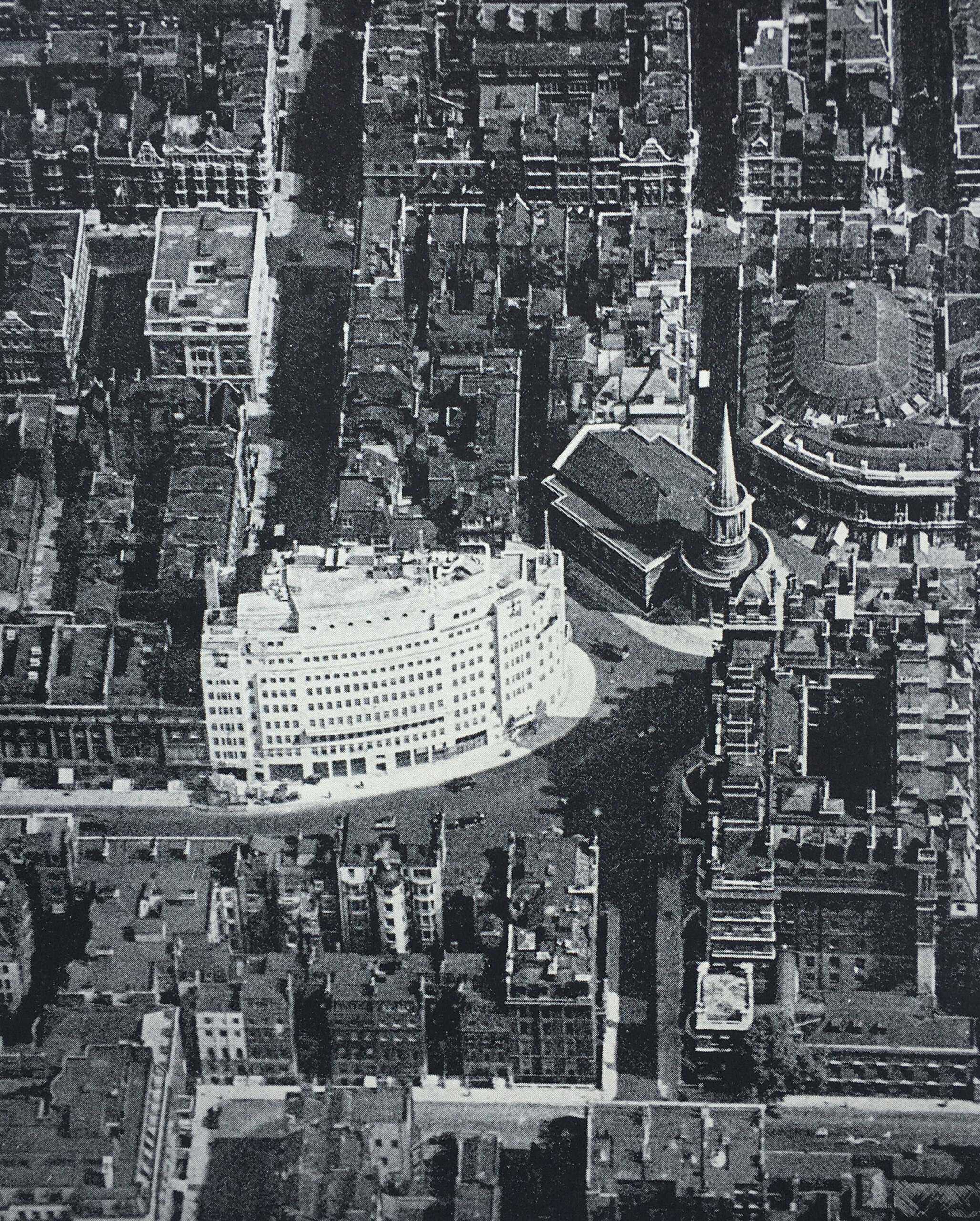
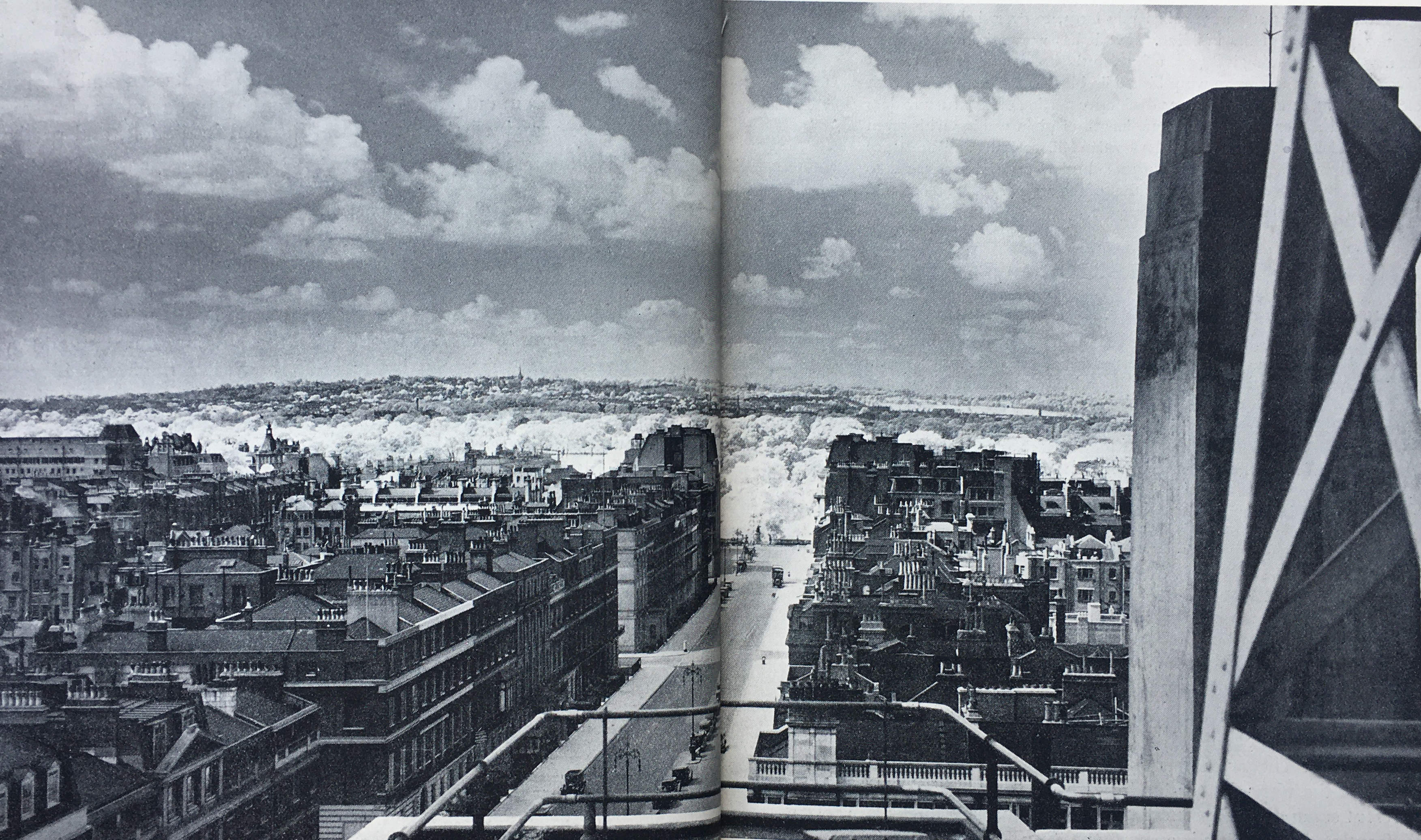
This year, the BBC is celebrating 100 years of broadcasting, having started in 1922 with a limited programme of music, drama and talks. There is another BBC anniversary this year, as it is 90 years since Broadcasting House on Langham Street / Portland Place opened as the first building in the country, purpose built for the new medium of broadcasting.

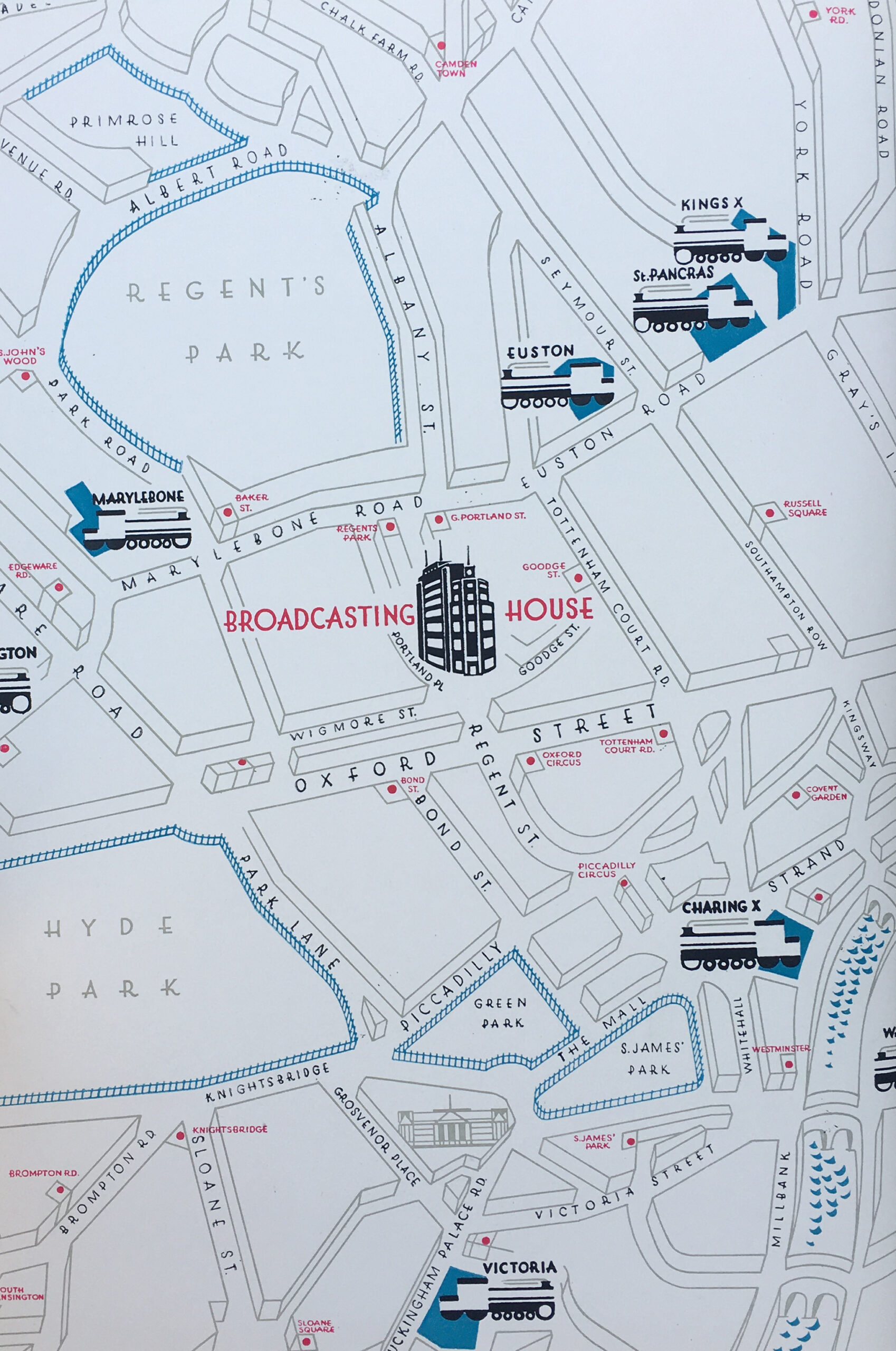
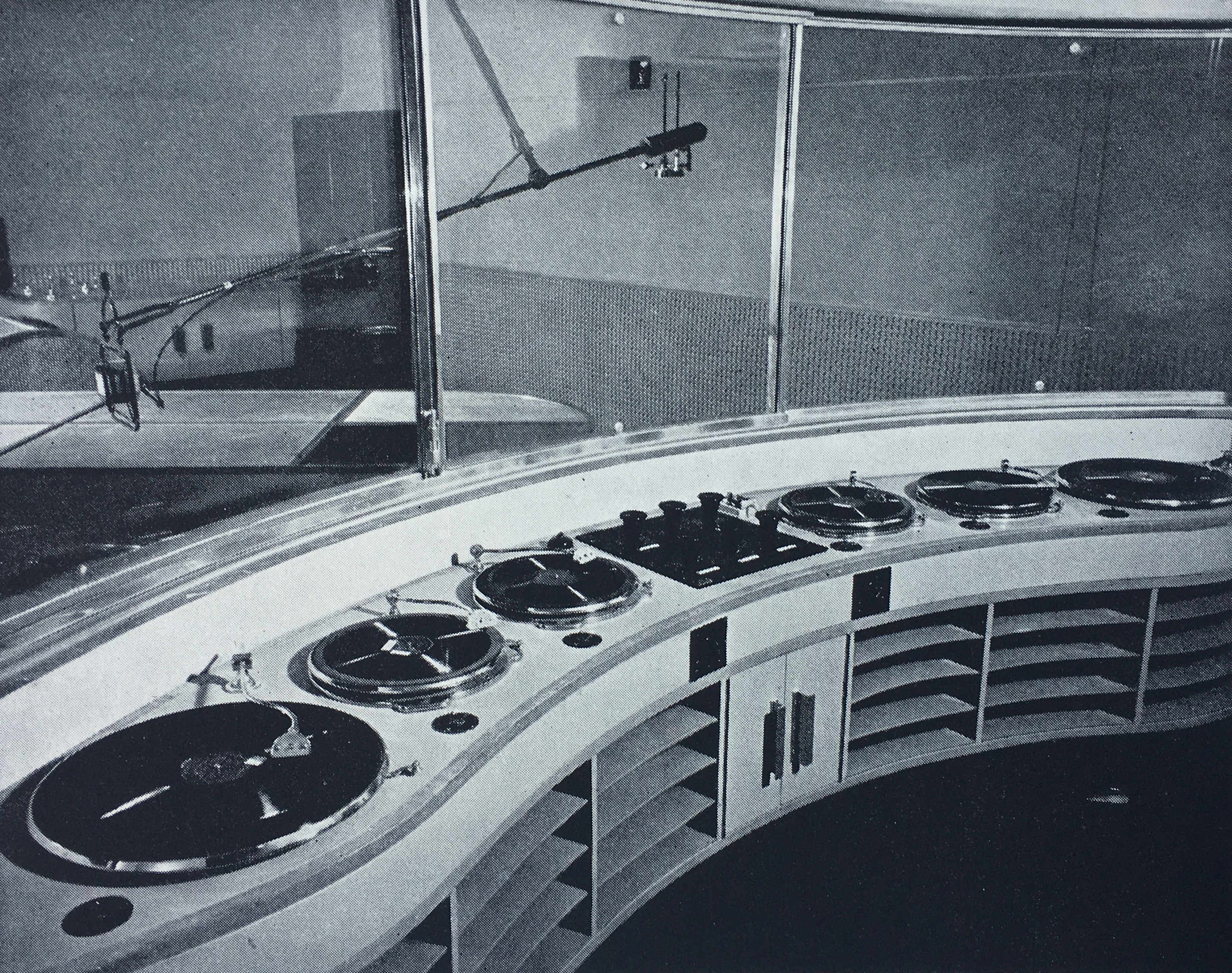
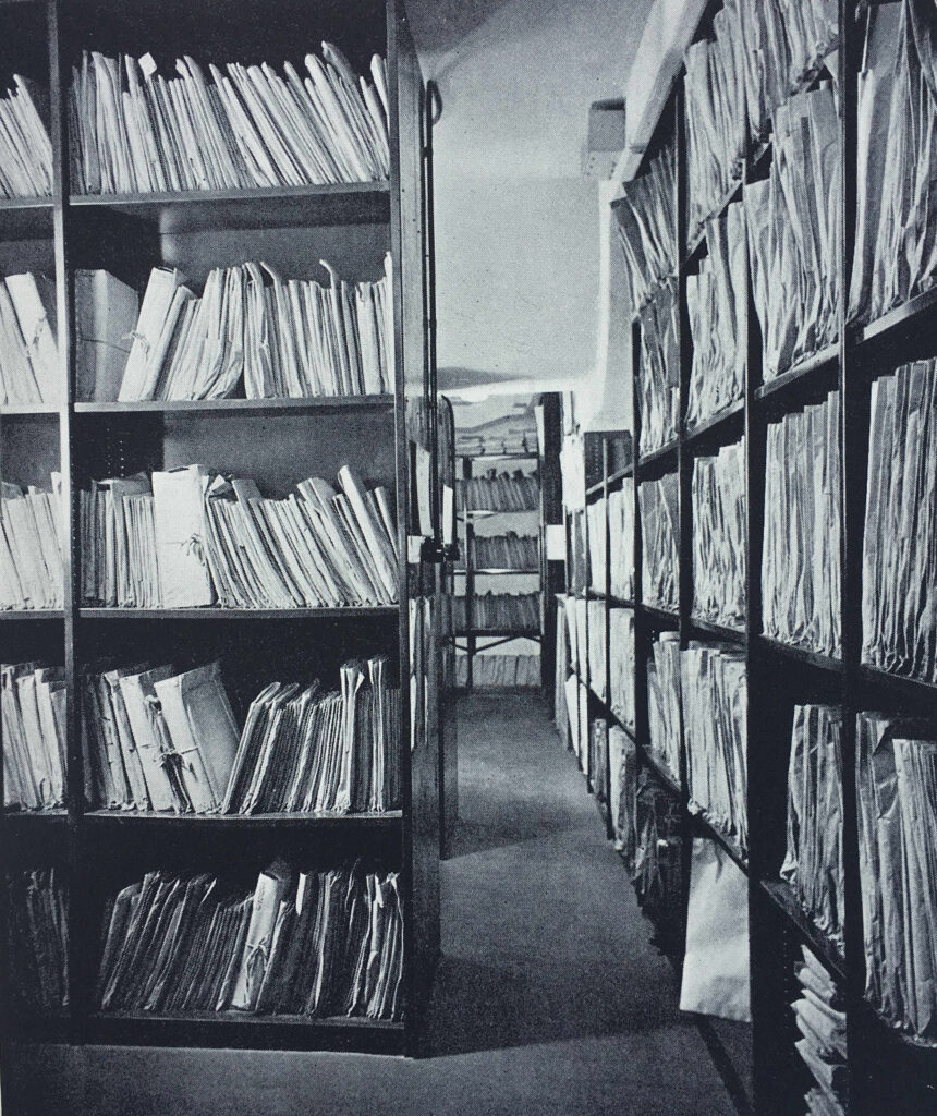
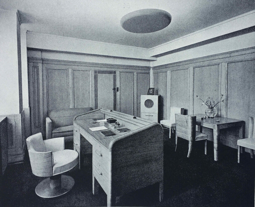
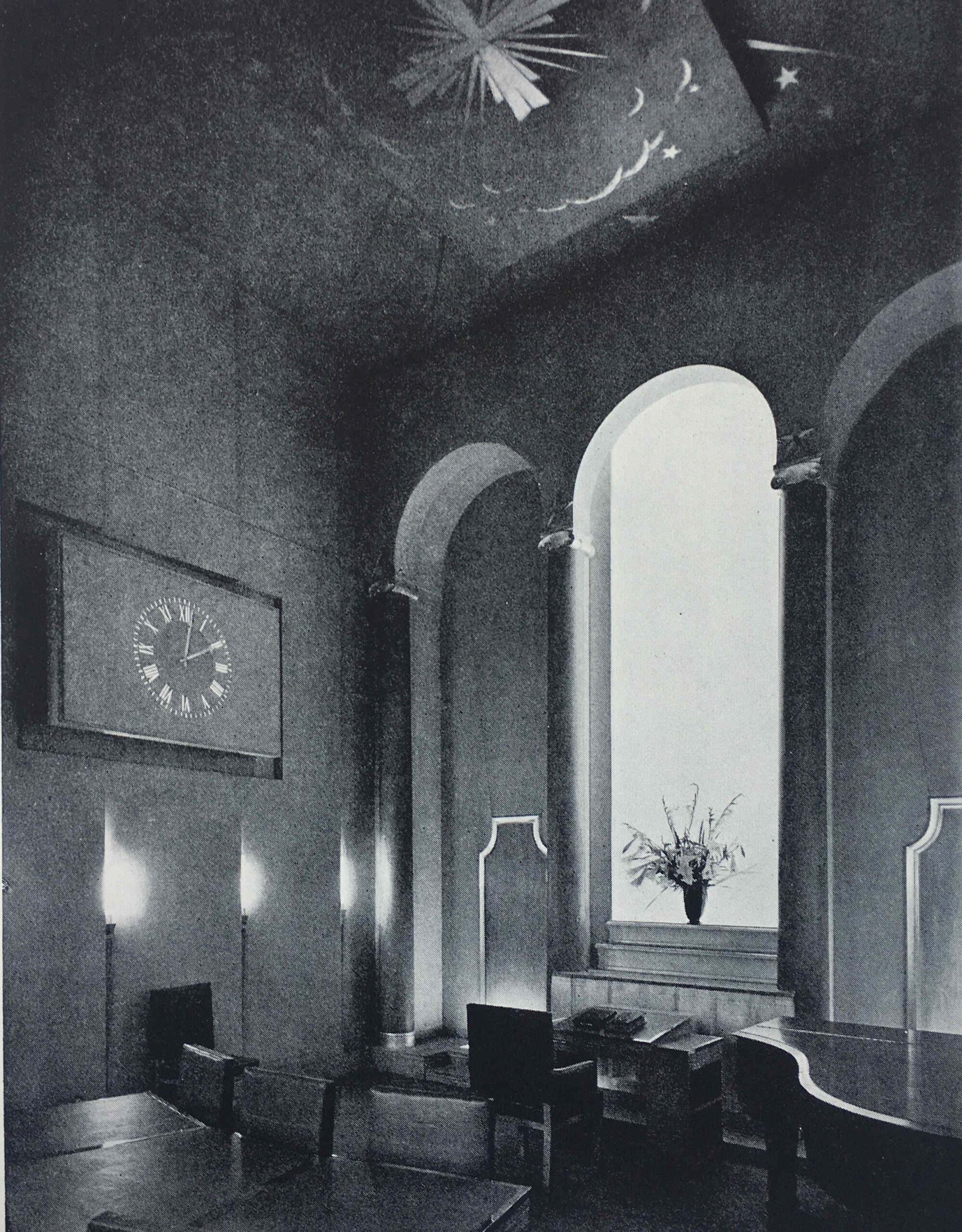
I have a copy of the book the BBC published in 1932 to celebrate the opening of the new building, so I thought I would take a look at the building and some of the many photos from the original book, which show leading edge broadcasting design and technology from 1932.

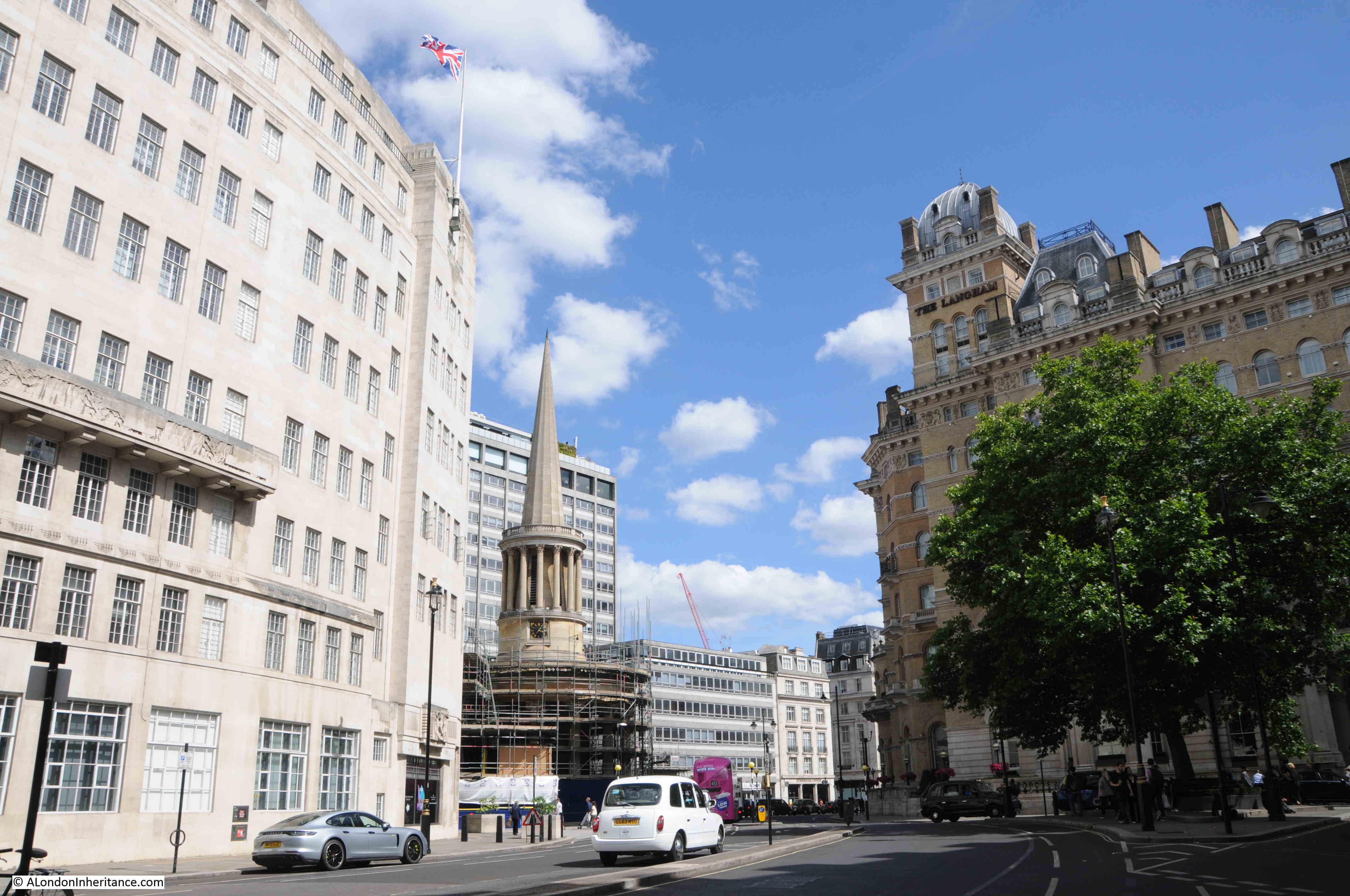
Walk north along Regent Street from Oxford Circus, into Langham Place, and this is the first view of Broadcasting House, just behind the distinctive tower and spire of All Souls:

Broadcasting House

When the BBC first started broadcasting, the BBC’s premises were at Savoy Hill, however with the rapidly growing popularity of broadcasting along with equally fast technical development, it was soon clear that a new building was needed, ideally a building custom designed for broadcasting.

The site of Broadcasting House was initially to be developed as what were described as “high-class residential flats”, however the location was perfect for the BBC. It offered a central London location, close to multiple transport links, and with just enough space to construct a new building.

The owners of the site agreed to build the BBC’s new centre and offered a long lease, however the BBC purchased the site before the building opened.

The site was of some size, but was strangely shaped, with a long curved section along Portland Place. The building was limited in height as there were a couple of nearby buildings that had their right to light protected under the custom of “ancient lights”.

The architect of the building was Lieut-Col G. Val-Myer FRIBA, who was supported by the BBC’s Civil Engineer, M.T. Tutsbery.

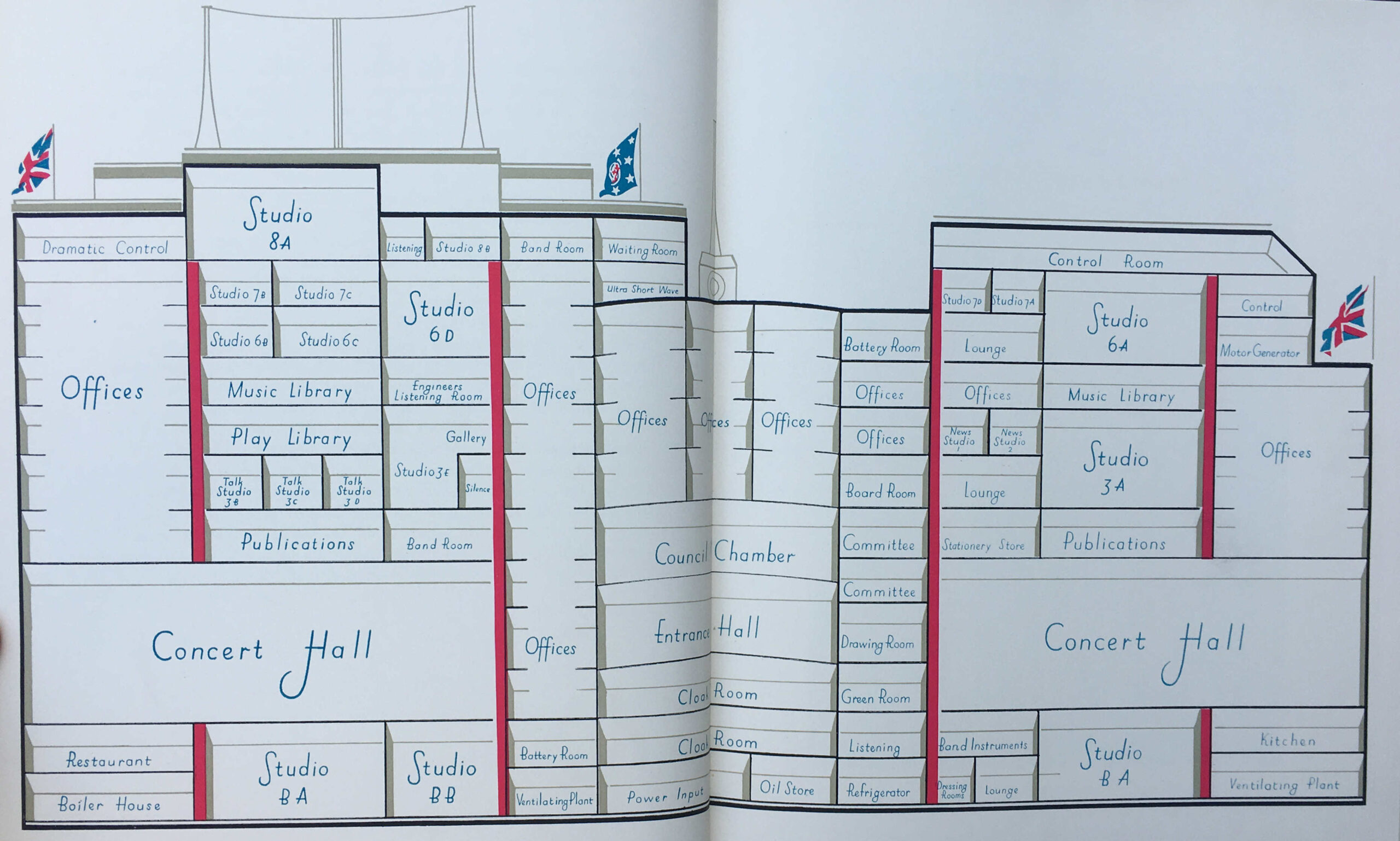
Broadcasting and the functions of the BBC dictated some challenging requirements. Despite being called Broadcasting House, the building would house a considerable number of people working on the administrative functions of the BBC. These would all require naturally lit space.

A wide range of studios were also needed, of very different size and function, from small studios for one or two people, up to concert hall size. These studios needed to be sound proofed both from the noise of the street, and internally generated noise.

A creative design solution met these competing requirements. Broadcasting House was constructed as a building within a building. A central core was constructed of brick, avoiding as much as possible the use of steel girders and stanchions which would have transmitted sound. The studios were located within this central core, and they were separated where possible by quiet rooms such as the library.

The outer core of the building housed office space, so these rooms had natural light and acted as an additional level of sound proofing between street and studios, with the inner brick core providing internal sound proofing.

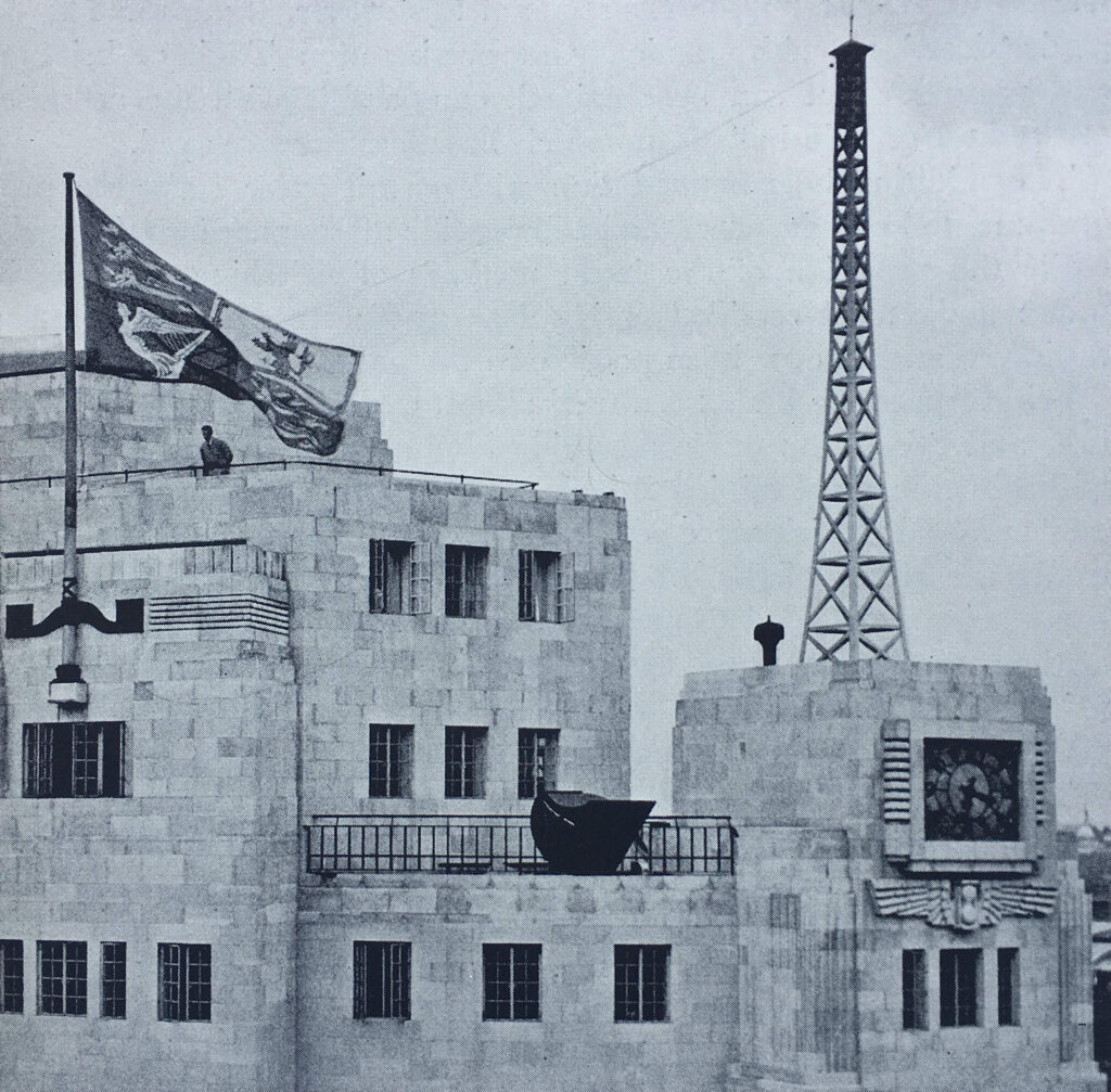
The external design of the building had some distinctive features. Looking above the main entrance, and one of the aerial masts stands above a clock:

Broadcasting House

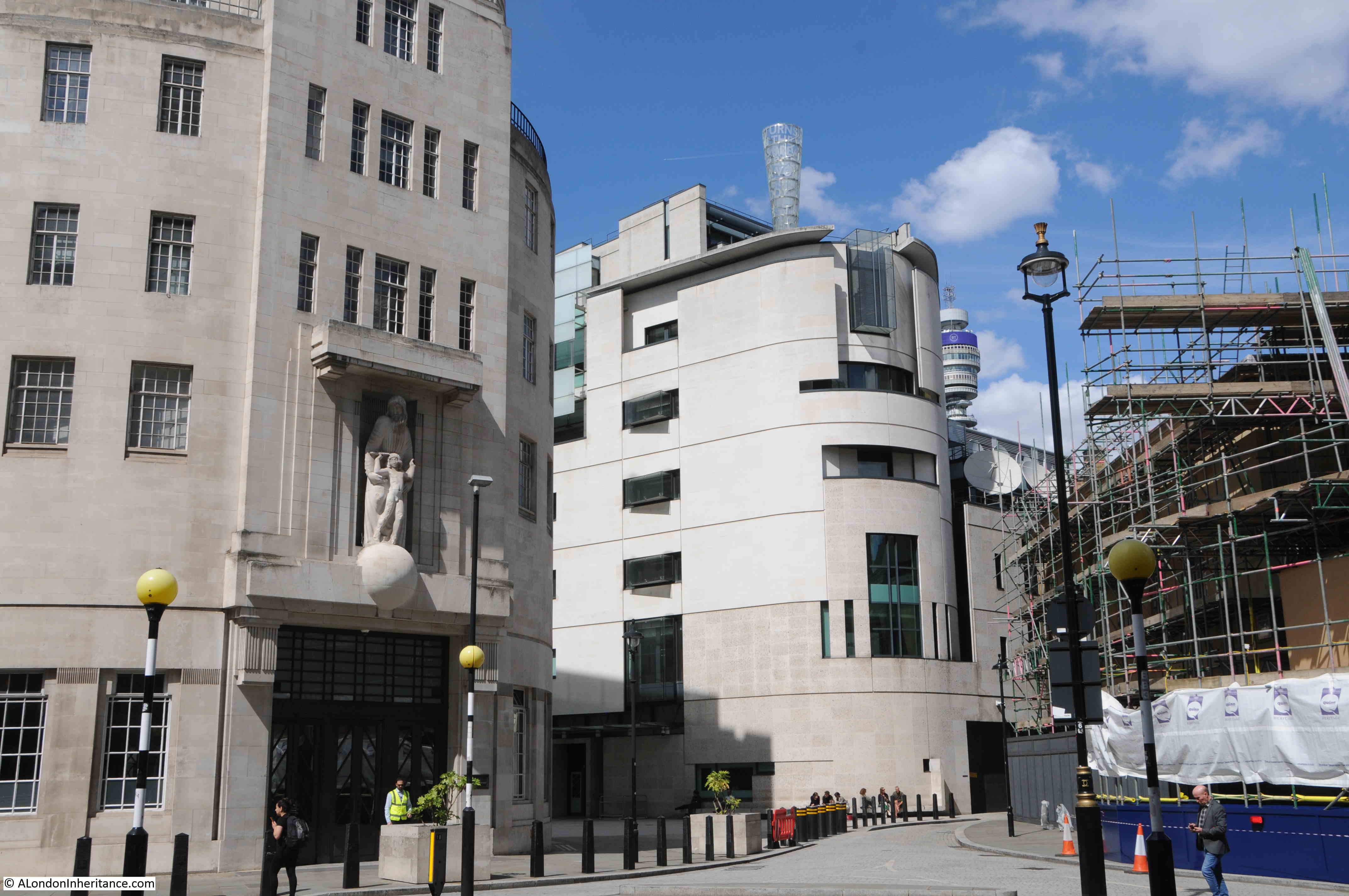
The main entrance at bottom left:

Broadcasting House

Eric Gill was responsible for the sculpture decorating the building. The BBC requested that the works would feature Shakespeare’s Ariel as the BBC considered this would represent the “invisible spirit of the air, the personification of broadcasting”.

The sculpture above the entrance shows Prospero, Ariel’s master, sending him out into the world. Gill created the work in situ during the winter of 1931 / 1932. Before being uncovered and revealed to the public, the Governors of the BBC inspected the work and considered that, Ariel’s “appendage” was too large for public decency and a reduction of a couple of inches was made.

Eric Gill was also responsible for some of the sculpture on 55 Broadway – London Underground’s Head Office.

To the right of the above photo is the considerable extension that has been added to the original Broadcasting House.

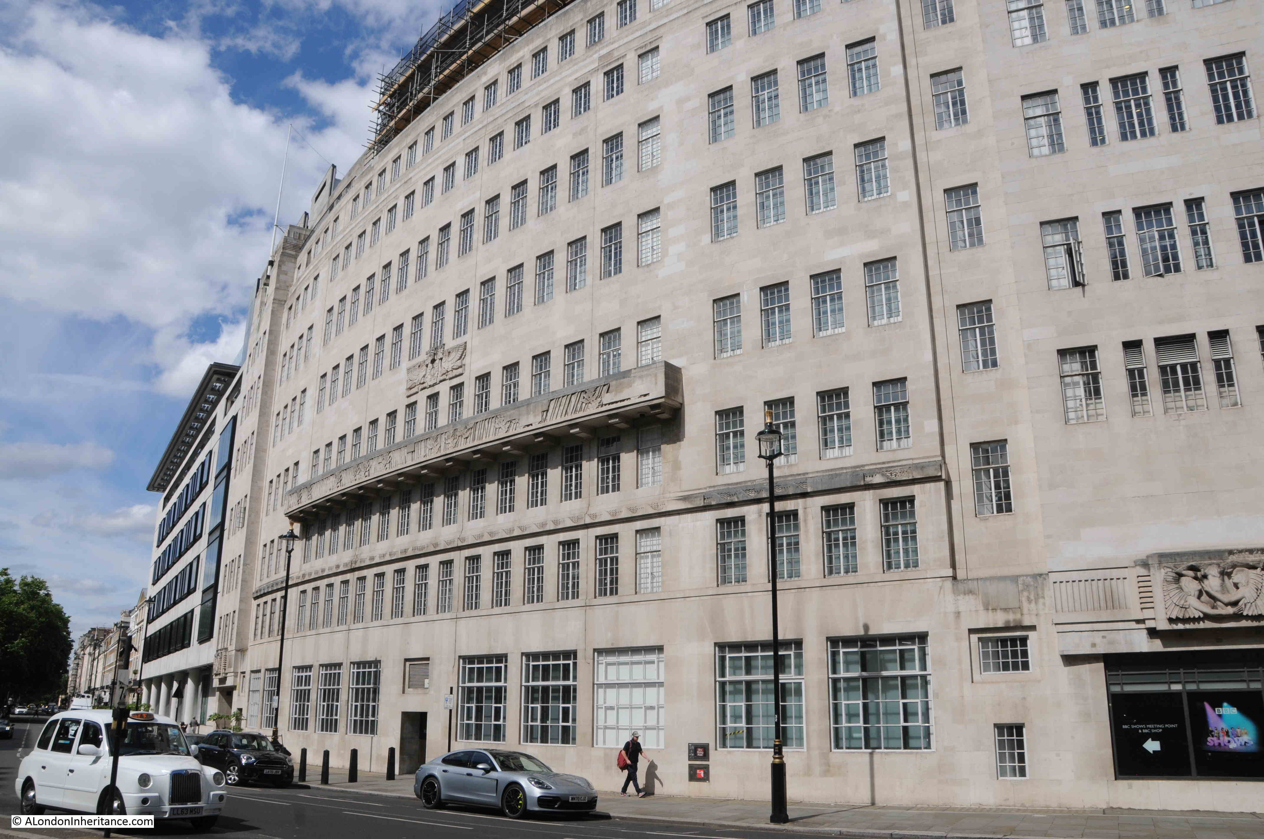
Walking along Portland Place, and we see the curved façade of the buildings, with the rows of windows providing natural light to the offices behind:

Broadcasting House

To the lower right of the above photo is Eric Gill’s “Ariel hearing Celestial Music”:

Broadcasting House

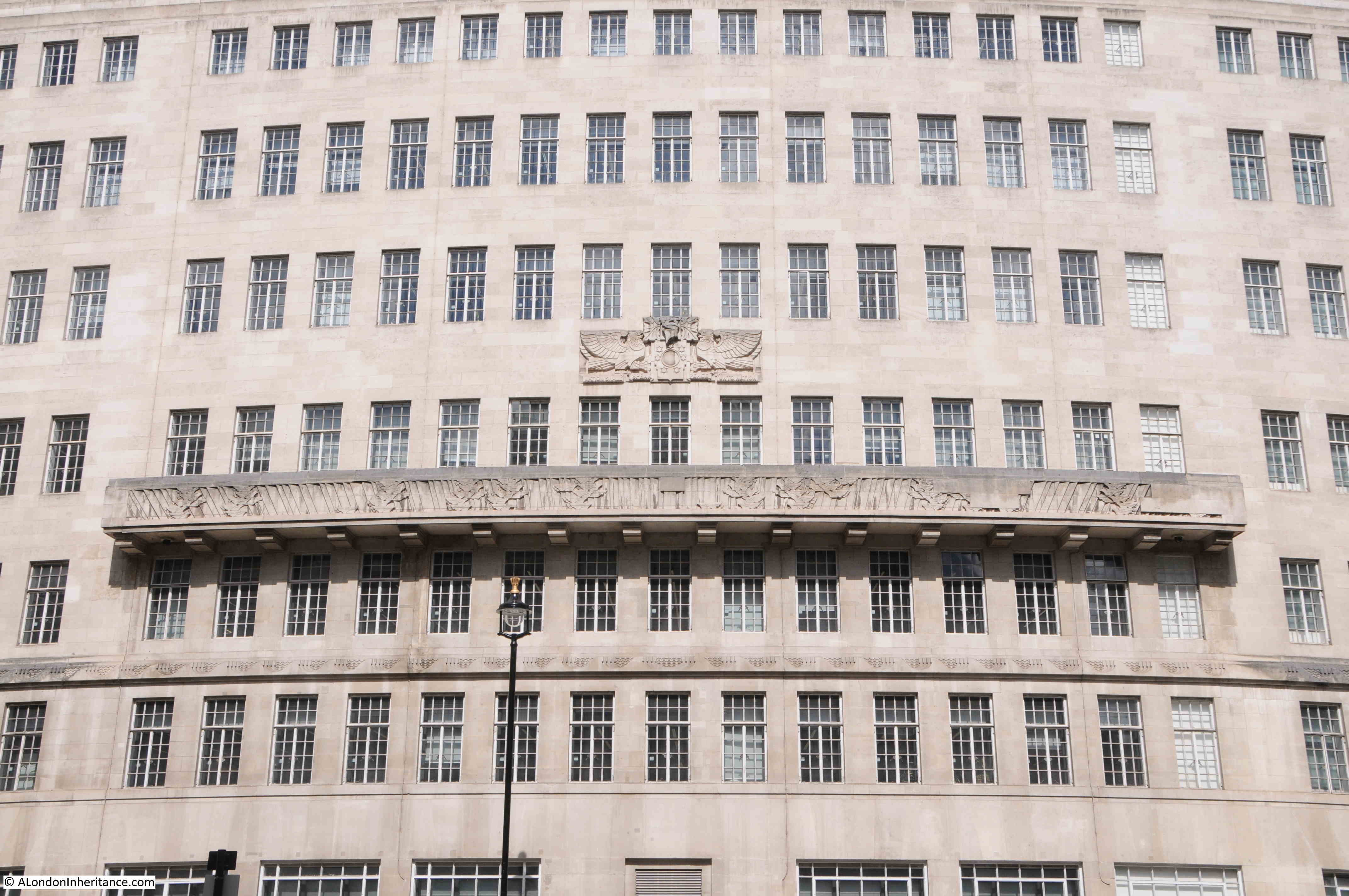
Much of the building is faced with plain stone, with identical, regularly space windows, however there are some key features along the centre of the façade:

Broadcasting House

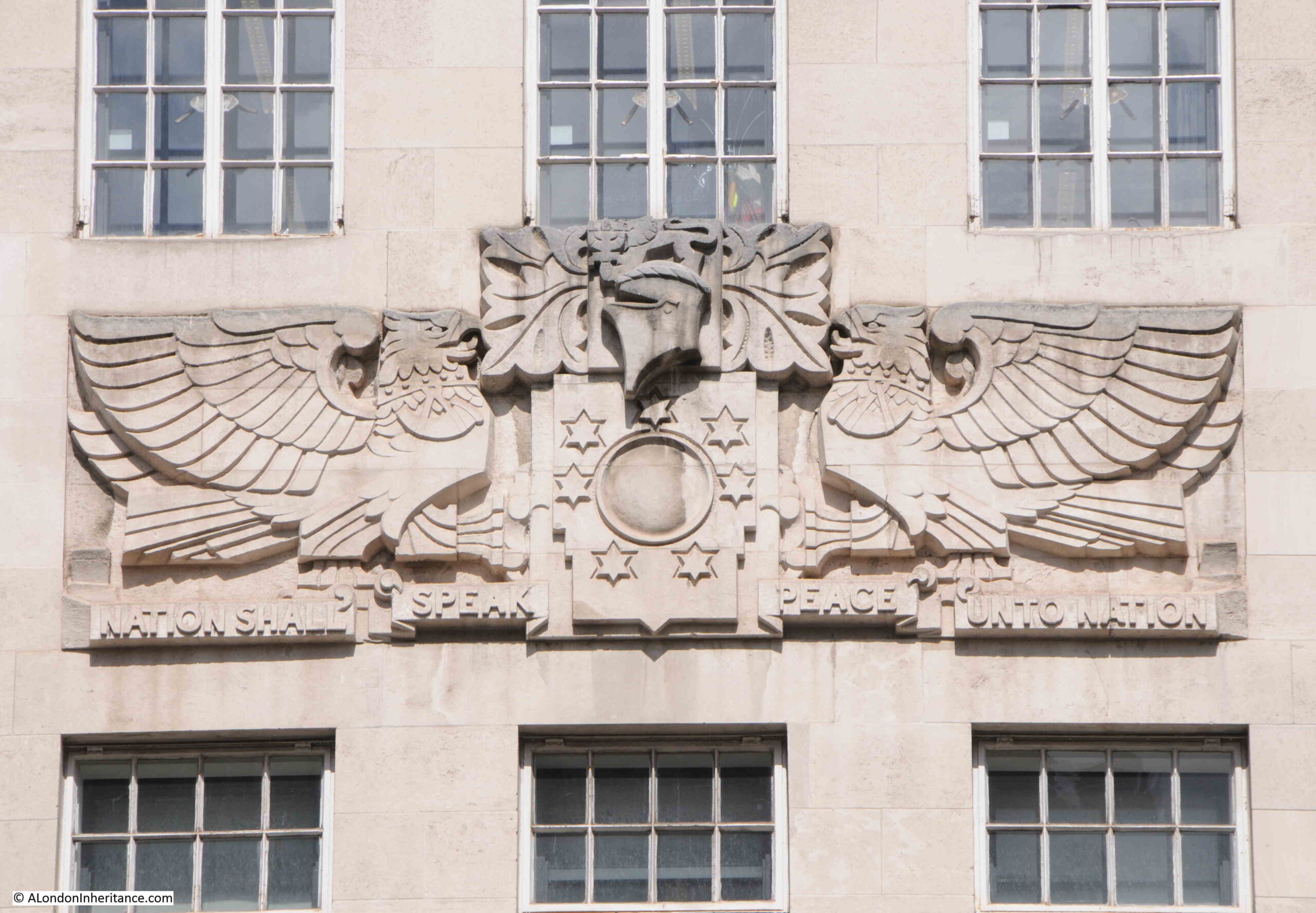
At the top are the Coat of Arms of the BBC. The circle in the centre represents the world, to show the breadth of the BBC’s coverage. Running along the bottom of the sculpture is the BBC’s motto “Nation shall speak peace unto nation”:

Broadcasting House

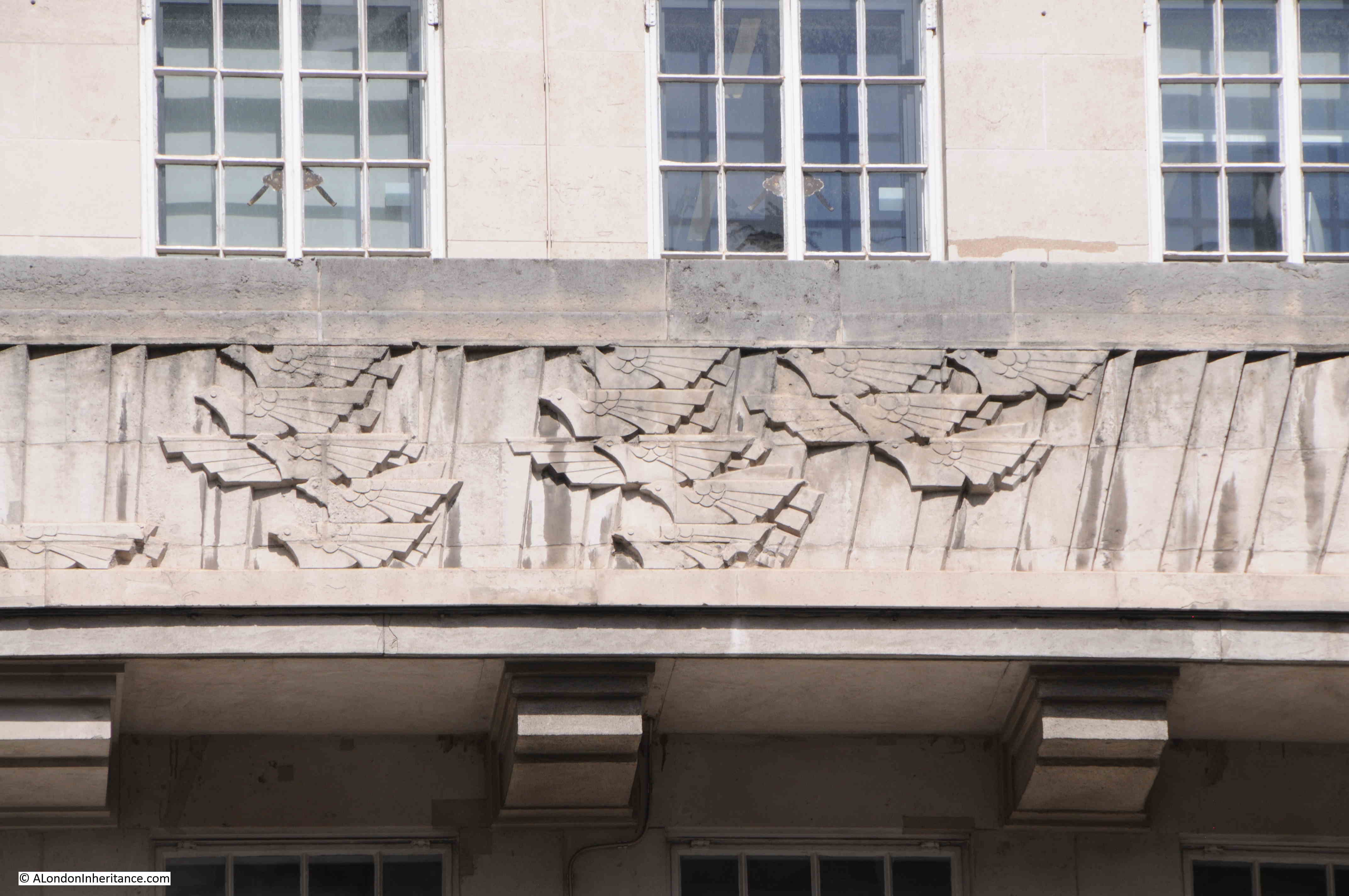
Below the arms is a long balcony decorated with birds of the air:

Broadcasting House

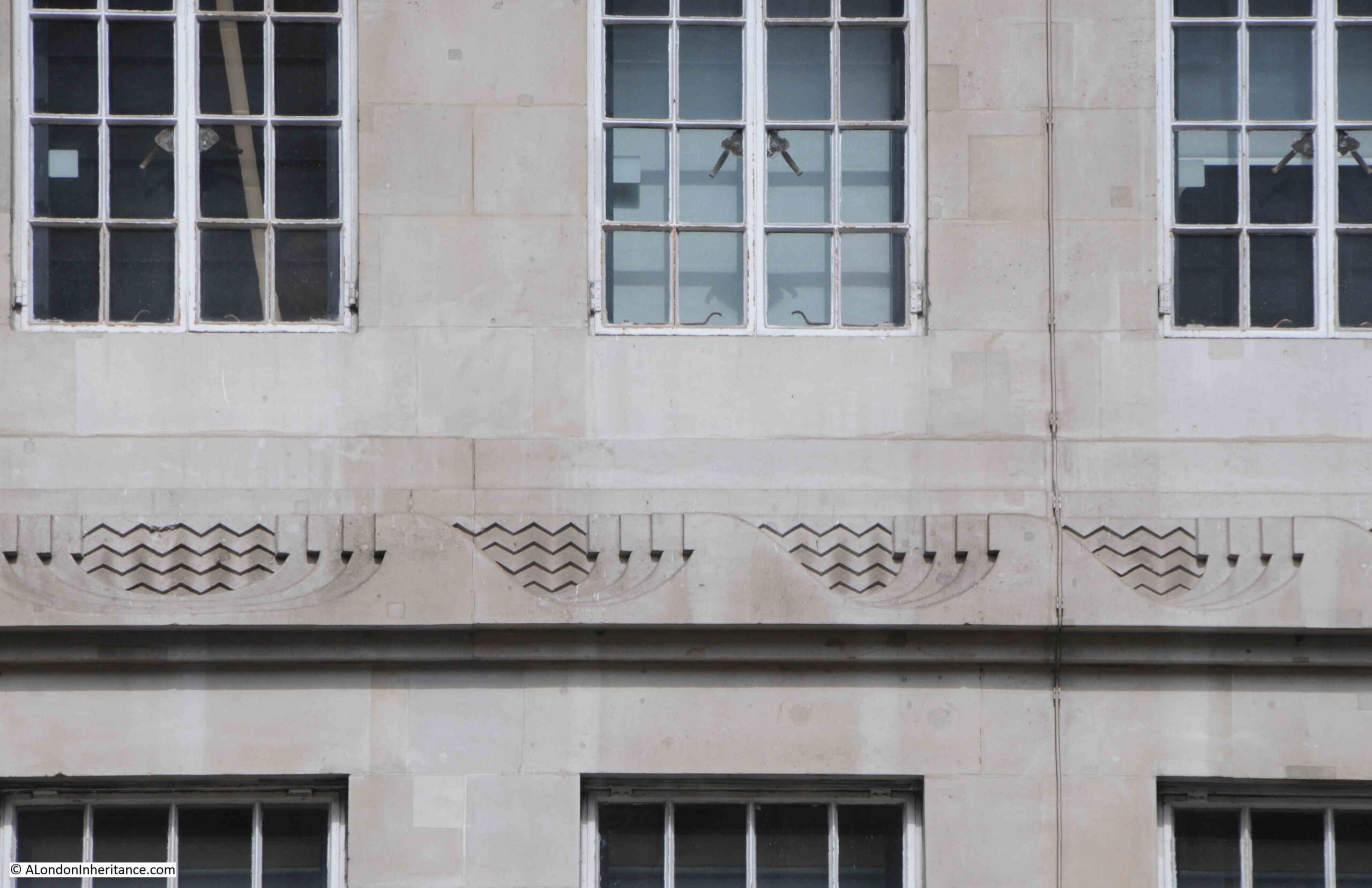
And below the balcony are “wave” symbols:

Broadcasting House

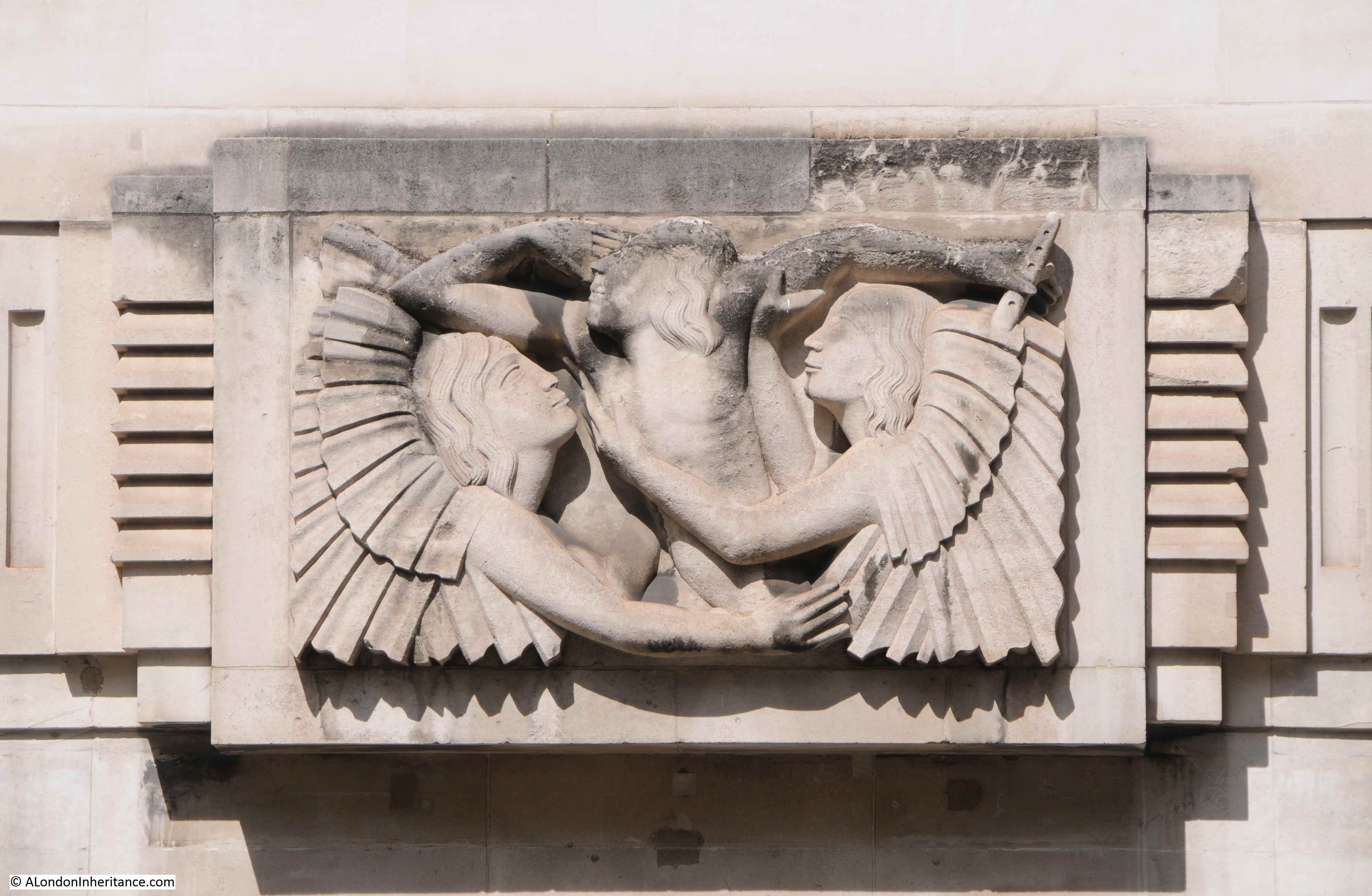
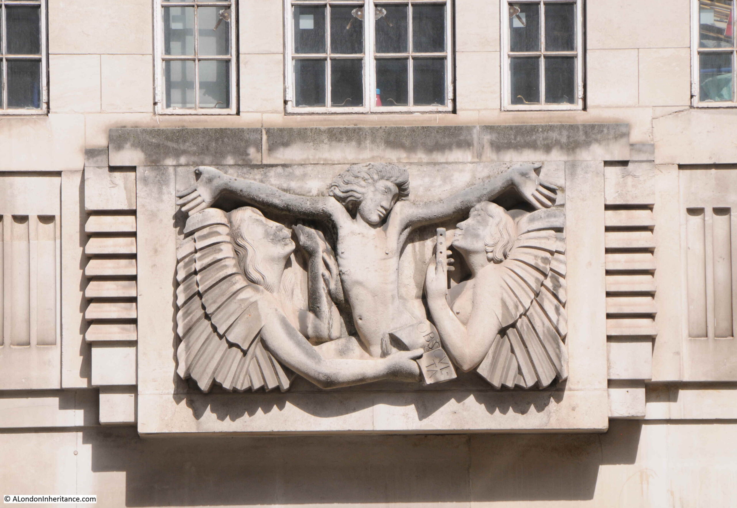
On the northern end of the façade is another work by Eric Gill, representing Ariel between Wisdom and Gaiety:

Broadcasting House

Looking back towards Langham Place with Broadcasting House on the left:

Broadcasting House

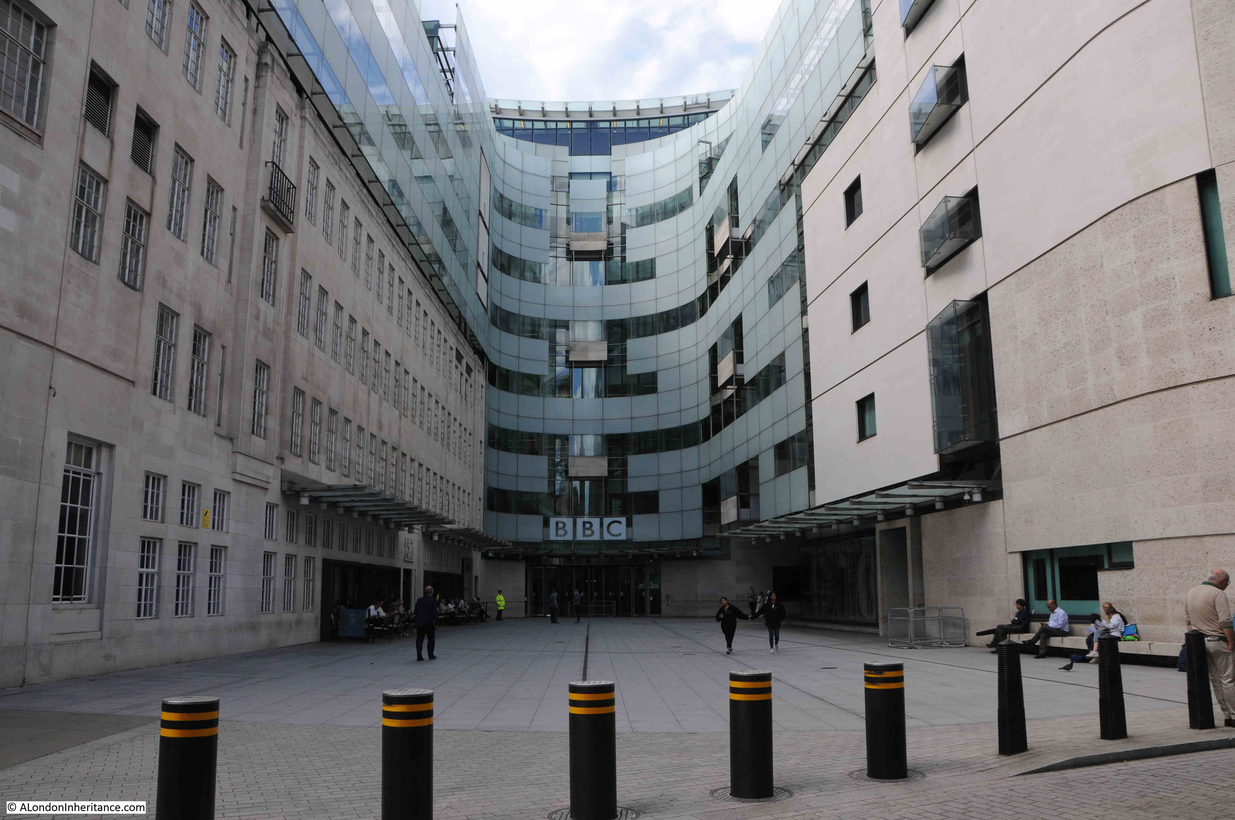
A large extension has been added to Broadcasting House. This was done to help consolidate many of the different BBC London activities into a single building, with the move of BBC World Service from Bush House into the new extension, along with many of the functions that were in Television Centre such as News, when the BBC left Television Centre.

Looking to the east of Broadcasting House, and we can see the original building to the left, with the new building to the right and at the far end:

Broadcasting House

The BBC’s 1932 book celebrating the opening of the building is full of photos of the new building, internally and externally, and shows what was considered leading edge design for the new medium of broadcasting in 1932.

At the start of the book is a map showing the location of Broadcasting House, with an emphasis on the closeness of the building to a range of travel options. This was important not just for those who worked full time in the building, but for the many people who would visit the building for a short time to participate in one of the many concerts, talks and plays that were broadcast.

Broadcasting House

An aerial photo shows Broadcasting House, just completed, and gleaming white among the surrounding dirty buildings of the city:

Broadcasting House

The book includes a rather unusual photo, looking north from the roof towards Hampstead. The photo was taken using an infra-red camera, which at the time improved the level of detail at a distance, and had the effect of showing green objects such as trees as dazzling-white:

Broadcasting House

The clock and mast which are still visible today. On the balcony, to the left of the clock is a loud speaker which was used to broadcast the sound of Big Ben, imitating the natural strength of the bell.

Broadcasting House

The following diagram shows the internal core of the building with the outer offices removed. The diagram shows how much had been crammed into the space available, as well as the positioning of quiet rooms between the studios:

Broadcasting House

The book covered all aspects of the new building, including the technical infrastructure that enabled broadcasting. The following photo is the Control Room and apparatus is described as being “battleship grey with stainless steel fittings”:

Broadcasting House

Two of the amplifier bays, one with a cover removed showing the valves that were critical to this type of equipment, long before transistors had been invented:

Broadcasting House

One of the issues with being in London was the polluted air with still plenty of smoke in the atmosphere. Broadcasting House featured state of the art air conditioning equipment, which included outside air being passed through a spray of water to remove particles in the air, as shown in the following photo:

Broadcasting House

The book also includes plans of each floor, the following plan of the seventh floor being an example, with the studios located in the central core:

Broadcasting House

The BBC provided tours for journalists in May 1932, and papers of the time were full of glowing articles about the new building. The following is from the London Correspondent of the Dundee Courier, who wrote an article titled “The Palace of Broadcast – A peep into new home of the BBC”:

“When the British Broadcasting Corporation decided to build themselves a new home they did the job thoroughly.

After a tour of Broadcasting House in Portland Place my mind was in a whirl of gigantic boilers, pictures of the most modern studios, miles of corridors, hundreds of lights, and a thousand and one other things.

The tour reflected the BBC’s thoroughness and started in the basement, which is three floors below street level, and finished eight floors above.

The people who matter in broadcasting said ‘we must have no noise from the outside in our studios’ therefore, each studio, which has no communication with the outside world apart from the door, has its own exclusive current of air for ventilation and heat so that no sound is carried through from one room to another.

The experts have taken sound well in hand, and controlled its unruly antics. The studio for ‘talks’ has been made so dead that there are no reverberations at all. If you speak in the studio your voice sounds like a voice heard in a dream. It is most eerie.

The furnishing is definitely 1932, and about this studio for discussions there is a make-yourself-at-home atmosphere.

Soft beige carpets cover the floors. The walls and the ceilings are delicate shades of beige, with a touch of orange and cream stripes around the walls. Below a mirror which stretches across one side of the room there is a jade green vase containing huge flowers.

The chapel studio is of great beauty. The cream walls are lit by pillars of light. Two tall columns painted green reach the ceiling, which is of blue with silver stars and signs of the Zodiac.

Next to each studio, of which there are 22, there is a little listening room. There is a window through which the performers can be seen. Here an announcer can make announcements without the artists being able to hear him, and he can check the quality of the transmissions.

The ‘effects’ room is above. here it is all very scientific. In the centre is a large table that swivels round. It is divided into sections, each of which is covered in a different substance to give different sounds when it is rapped or hard objects dropped upon it.

The equipment of this room also includes a pall full of lumps of bricks and a tank of water, and to mention a humble sheet of iron for thunder.

Then there are a series of records for crowd noises, angry, and jolly, English or foreign. Others give cries of babies and every form of animal.

All those cheery messages about depressions of Iceland and anticyclones together with news, emanate from a very chic little studio of which the walls are matted silver. Light is thrown upon the subject from a large globe at the end of a long telescope-like stand.

Such is the ‘Radio Village’. There are dressing rooms, waiting rooms, artists’ foyers, refreshment lounge, libraries and, to complete it all, a small black cat who wanders about at will, and not at all impressed with the dignity of the surroundings.”

Photos from the book show the “make-yourself-at-home atmosphere” described in the article, for example Studio 8B used for Debates and Discussions:

Broadcasting House

Studio 6E – Gramophone Effects, with plenty of turn-tables to play records of effects:

Broadcasting House

The Music Library, which the book claimed to be the largest in the world, with every kind of music from manuscript parts of Bach cantatas to the latest comic songs:

Broadcasting House

The Office of the Director of Programmes:

Broadcasting House

One of the interesting aspects of studio design in the early 1930s is that the studios were made to replicate the place where the production would take place. Studio 3E for Religious Services had the appearance of a religious building, however this could be changed for secular broadcasts when the vase of flowers (as shown in the photo) were used to replace the cross used for religious broadcasts:

Broadcasting House

Studio 3B for Talks looks like a domestic setting. There were no windows behind those curtains.

Broadcasting House

The interior design of Broadcasting House was led by Raymond McGrath, an Australian born architect who led a team of young designers. They were given a degree of freedom with their designs, which resulted in a curious mix of homely and modernist features.

The studios are very different today, and in the past 90 years the function of broadcasting has taken over from the designs of 1932.

The Chairman’s Office:

Broadcasting House

Broadcasting House opened when the autocratic Sir John Reith was Director General. It was Reith who defined the BBC’s purpose as being to “inform, educate, entertain”. It was probably with some fear that employees would be summoned to the Director-General’s Office:

Broadcasting House

The majority of the photos in the book show empty studios and equipment rooms. Very new, and no people to be seen. The only photos with people are of some of the offices of Broadcasting House, such as the following photo of the Accounts Office.

Broadcasting House

Note in the photo the windows facing out. To the left would have been a corridor, then the brick wall of the inner core with the studios to avoid sound transmission from outside or from the internal offices.

The entrance hall from Portland Place, with staff lifts to the right and the Artists’ Foyer behind the pillar at the far end:

Broadcasting House

The Latin inscription on the right reads “This Temple of Arts and Muses is dedicated to Almighty God by the first Governors of Broadcasting in the year 1931, Sir John Reith being Director General. It is their prayer that good seed sown may bring forth a good harvest, that all things hostile to peace or purity may be banished from this house, and that the people, inclining their ear to whatsoever things are beautiful and honest and of good report, may tread the path of wisdom and uprightness.”

The Council Chamber:

Broadcasting House

The Lower Ground floor provided access to the concert hall, from where concerts with a live audience would be broadcast. View towards the platform:

Broadcasting House

View towards the rear of the Concert Hall:

Broadcasting House

The Concert Hall is now known as the BBC Radio Theatre.

All the studios, along with other rooms involved with the broadcast process, were in the central core of the building, so they did not have windows and there was no natural light. The designs for these rooms attempted to address this with decoration, and in the following photo is Listening Hall 1, where a seascape had been added on the wall at which those listening would have been facing:

Broadcasting House

And in Listening Hall 2, gold and silver foil had been put on the walls to simulate the effect of sunlight:

Broadcasting House

Broadcasting House was built long before the days of electronically created sound effects. These were usually prerecorded on records as seen in one of the earlier photos, or involved making noises with physical objects.

Some sound effects needed a different approach such as the creation of an echo, or the impression that the sound was created in a large space rather than a small, sound proofed studion.

To provide echo effects, Broadcasting House had the Echo Room, where sound from a studio were played in the room which had reflective, resonant walls to bounce the sound, which was picked up by a microphone at the end of the room:

Broadcasting House

Broadcasting House was a leading edge facility at the time of construction for the new medium of broadcasting. It was however designed to meet John Reith’s view of the BBC, and the studios were designed for talks and discussions (nearly always by men), and for broadcasts of plays and concerts.

In the previous building at Savoy Hill it was common for those arriving to give a broadcast talk to be offered cigars, brandy and whisky before broadcasting – operating almost like a Gentleman’s Club.

News would become an increasing feature of the BBC, with the use of external agencies to provide news before the BBC developed their own internal news gathering capability.

As well as broadcasting to the country, broadcasting to the world would become an integral part of the BBC’s mandate, beginning with what was called the Empire Service, then the World Service.

The first broadcast specifically to the “Empire” was made from Broadcasting House on the 19th of December 1932, with John Reith speaking an introduction to the broadcast.

The BBC’s Centenary celebrations seem to have a different focus to 1972 when they celebrated 50 years.

In 2022 the focus seems to be more of the present day relevance of the BBC, with the breadth and depth of services provided. I suspect this is down to perceived threats to the BBC’s charter and the licence fee.

In 1972, the focus was more on the historical, showing the BBC almost as the official recorder of the great events of the previous 50 years.

The BBC produced a double album in 1972 containing excerpts from key broadcasts of the Corporation’s first 50 years. I was given a copy at the time, a strange present given the age I was in 1972, but one I appreciate now for the historical context.

Broadcasting House

The double album opened up and inside there is a listing of all the broadcasts on the records.

Side 1 covers from 1922 to 1932, so pre Broadcasting House. Included are music from the Savoy Orpheans and the Savoy Havana Band, a recording of the opening of Tutankhamun’s tomb, a news item from the 1926 General Strike, and the first Royal Christmas Message broadcast on Christmas Day in 1932.

Side 2 covers the six years from 1933 to 1939, when many of the recordings would have come from Broadcasting House. Along with recordings of musical items, the slow build up to war can be seen, from a 1934 speech by the Nazi Joseph Goebbels to Prime Minister Chamberlain’s announcement of the outbreak of war on the 3rd of September 1939.

Broadcasting House

Side 3 covers the Second World War, from the fall of France in 1940 to the final surrender of Japan in 1945.

Side 4 covers the period from 1946 to 1972 and includes an FA Cup Final, Oxford – Cambridge Boat Race, a Royal Wedding, Coronation and Funeral, shows such as the Archers, Goons and Twenty Questions. The First Man in Space, assasination of President Kennedy and England’s 1966 World Cup victory.

The final track on side 4 is appropriately the funeral of Lord Reith in 1971, who was instrumental in building up the BBC and was Director-General when Broadcasting House was planned and built.

Broadcasting House

The BBC does have some pages on their website on the 100 years, which can be found here.

Broadcasting House comes from a simpler time, when the BBC was virtually the only form of mass electronic media, with only newspapers for competition.

Today, the broadcaster has no end of competition, from multiple broadcasters, online services and streaming providers. Shifts from linear broadcasting to time shifting and on demand programming.

The BBC suffers accusations of bias from almost every part of the political spectrum. It seems to tie itself in knots in trying to tread carefully and appear impartial around contentious subjects.

The licence fee is indeed an anachronistic way to fund the organisation, but a fair alternative that provides sufficient funding for the organisation has yet to be proposed.

The BBC has made some huge mistakes over the years, but still has a global reputation for independence, and is a prime example of the country’s soft power.

After 90 years, it is brilliant that Broadcasting House is still part of the country’s broadcasting fabric, and with the BBC it must be an example of where the phrase “you never know what you’ve got, till its gone” strongly applies.

alondoninheritance.com

Fred Cleary and the Flowering City

The City of London has always been a busy and congested place. For centuries, gardens and green space were only to be found around the halls of the Livery Companies and the gardens of some of the larger houses owned by rich City merchants and well connected residents.

As trade, manufacturing and finance expanded within the City during the 19th century, open space was not treated with the some level of priority as buildings that served the commercial purposes of the City.

Significant destruction of buildings and damage to large areas of land during the war resulted in new thinking as to how reconstruction should take place. I have written about a couple of plans for the City such as the 1944 report on Post War Reconstruction of the City, and the 1951 publication, The City of London – A Record Of Destruction And Survival.

More green space, places for people to sit, and the planting of flowers was one of the initiatives pushed forward by Fred Cleary, and in 1969 he published a book about the new gardens in the City titled “The Flowering City”:

Fred Cleary

Fred Cleary was a Chartered Surveyor who worked for a City mortgage and investment company. He was also a longtime member of the City’s Court of Common Council, and according to the author information in the book was Chairman of the Trees, Gardens, and City Open Space Committee, and the Chairman of the Metropolitan Public Gardens Association.

The aim of the book was to “record something of the considerable efforts made by the City Corporation who, supported by many business interests and voluntary bodies, have endeavoured to make the City of London one of the most colourful and attractive business centres in the world.”

Through his interests and his membership of a number of key City committees, Fred Cleary had a leading role in the post war development of many of the gardens across the City, and the book includes a map of some of these gardens, many of which feature in the book:

Fred Cleary

The book is full of photos of the first gardens to be created as the City reconstructed after the war. Many of these gardens still remain, although they have changed significantly over the years.

Originally, they had a rather formal layout with basic planting. Today, many City gardens are far more natural with lots of planting and almost a wild feel to some of the best.

What I think is the very latest City garden almost looks straight from the Chelsea flower show and has an incredible central water feature. I will come to this garden later in the post, but the first garden on a brief walk to some of the City gardens, was the one named after Fred Cleary.

Looking south, across Queen Victoria Street, and we can see the start of Cleary Gardens:

Fred Cleary

One of the entrances to Cleary Gardens from Queen Victoria Street:

Fred Cleary

A long brick pergola facing onto Queen Victoria Street with seating between each of the brick columns:

Fred Cleary

Many of the new post-war gardens were built on bomb sites, and Cleary Gardens occupies such a site. The land drops away to the south of Queen Victoria Street towards the Thames, so the gardens are tiered. Walk down to the middle tier and there is a small enclosed space:

Fred Cleary

At the end of the above space, there is a blue City plaque on the wall, commemorating Fred Cleary who was “Tireless in his wish to increase open space in the City”.

Fred Cleary

The remaining walls from the buildings that once occupied the site have been included in the structure and tiers of the gardens:

Fred Cleary

Cleary Garden was initially planted by a City worker in the 1940s and on the evening of the 26th July 1949, the garden was visited by the Queen (mother of the current Queen) who was on a tour of City and East London gardens.

The gardens were significantly remodeled in the 1980s and it was following this work that they were named after Fred Cleary who had died in 1984.

The lower tier of the gardens:

Fred Cleary

Huggin Hill forms the eastern border of the gardens. Excavations at the gardens, under Huggin Hill and under the building on the left have found the remains of a Roman bathhouse.

Fred Cleary

Fred Cleary argued not just for open gardens and green space, but also for more planting of flowers across the City, and an example of what he would have appreciated can also be found in Queen Victoria Street, outside Senator House, where the office block is set back from the street, and raised beds full of flowers have been built between building and street:

Fred Cleary

Almost all of the City gardens featured in Cleary’s book have been remodeled several times since their original construction, and those in the book look very different to the gardens we see today.

Hard to keep track with change in the City, but I think the very latest example of how gardens change are the recently reopened gardens on the corner of Cannon Street and New Change.

There have been gardens on the corner of these two City streets for many years. The gardens were last redesigned in 2000 based on a design by Elizabeth Banks Associates, however they recently reopened following another major redesign.

These gardens are in front of 25 Cannon Street, and Pembroke, the developers of the building included a transformation of the gardens by the landscape and garden design practice of Tom Stuart-Smith.

I must admit to being rather cynical of many new developments which are aligned to an office project. Too often they are a low cost bolt on, designed to make the planning process easier, however these new gardens are really rather good.

The key new feature at the centre of the gardens is a large reflection pool:

Fred Cleary

The pool was the work of water feature specialist Andrew Ewing. The water in this pool is very still (although it does appear to be flowing over the internal edge), and is positioned to provide some brilliant reflections of St Paul’s Cathedral:

Fred Cleary

The outer wall of the pool provides seating, and the surrounding gardens are planted to such an extent that the traffic on the surrounding streets is effectively hidden.

Although good for taking photos, I was surprised that on a warm and sunny June day, very few people walked through the garden or used the seating. Not easy to see the central pool from outside the garden, but it is very much worth a visit.

View across the central pool to the buildings of One New Change – the mature trees from the previous development have been retained, and the central layout and smaller planting is new:

Fred Cleary

Possibly one of the reasons why the above gardens were so quiet is the large amount of open space and gardens across the road around the south side of St Paul’s Cathedral.

These gardens were all part of the late 1940s / early 1950s development of new green / garden space, but have become more planted since.

The garden’s in the 1960s were rather basic green space, as shown in the following photo from The Flowering City:

Fred Cleary

The office blocks in the above photo have long been replaced, and the only recognisable feature in the photo is the church of St Nicholas Cole Abbey in the background.

The garden consisted of mainly grass with some planting in the centre and around the edge.

Today. the gardens are very different with plenty of planting and some works of art:

Fred Cleary

Plants, hedges and walkways:

Fred Cleary

Looking towards the City of London Information Centre:

Fred Cleary

City gardens tend to be very well maintained and the gardens to the south of St Paul’s were being worked on during my visit:

Fred Cleary

Across the road from the above photos to the immediate south east of St Paul’s Cathedral, there is another large area of green space:

Festival Gardens

These gardens have changed the area considerably, and have been through a series of post war development.

The following photo is one of my father’s photos from the Stone Gallery of the cathedral. The church in the photo (minus the spire), is the same church as seen in the above photo.

Festival Gardens

The space occupied by the gardens to the south east of the cathedral were once a dense network of streets and buildings as can be seen by their remains in the above photo.

My comparison photo to my father’s is shown below – a very different view:

Festival Gardens

The gardens in the above photo were the first to be constructed in 1951 to tie in with the Festival of Britain, and go by the name of Festival Gardens. The book Flowering City shows the gardens as they were originally built:

Festival Gardens

The gardens seen in the above photo remain, however the gardens have been extended all the way back to cover the road and circular feature at the top of the photo and the road to the right.

These original gardens and the three fountains are very much the same today, as can be seen in the following photo:

Festival Gardens

View back from the top of walkway behind the fountains:

Festival Gardens

This original part of the gardens were timed to open for the Festival of Britain (hence their name), and were decorated with flags during the festival as shown by my father’s photo below:

Festival Gardens

Plaque on the wall commemorates the year of opening:

Festival Gardens

And another plaque on the wall behind the fountains records one of the ancient streets that were lost during the construction of the gardens:

Old Change

As well as large, formal gardens, Fred Cleary was keen to encourage the use of flowers in as many settings as possible, and devoted four pages to photos of City buildings with window boxes.

I found a number of these adding colour to City streets:

window boxes

Many of the window boxes across the City in the 1960s were the result of a campaign, as described in the book:

“In 1963 the Worshipful Company of Gardeners in conjunction with the Metropolitan Public Gardens Association and supported financially by the City Corporation launched a ‘Flowers in the City’ campaign under the patronage of the Rt. Hon. The Lord Mayor and in recent years there has been considerable response from the business houses and firms by providing more and more flowers giving a very colourful effect to many parts of the City.”

As well as windows boxes, the book encourages the planting of flowers across the streets and includes a section titled “Pavement Treatment” which shows how plants can be distributed across the streets in pots, wooden boxes and within raised concrete walled beds. The aim was to add flowers and colour to as many points across the City as possible.

An example of the type of planting featured in the section on “Pavement Treatment”, can be seen today at the junction of Cheapside and New Change:

Pavement flowers

At the start of the book, it mentions that originally gardens in the City were mainly part of Livery Company sites, or surrounding some of the more expensive houses in the City.

There are still a number of gardens on land owned by Livery Companies. One of these is at the junction of Copthall Avenue and Throgmorton Avenue and is on land owned by the Drapers Company who have their hall in Throgmorton Avenue.

The gates to the garden are locked, however peering through the gates delivers this colourful view:

Drapers Gardens

The book also shows just how much areas of the City have changed. In the following photo, the wall to the left is the medieval wall that sits on top of the original Roman wall, just to the north of London Wall, close to the Barbican development:

London Wall

When the area around the wall went through its first post-war phase of development, it was surrounded by new office blocks and the high level pedestrian ways that followed the wartime proposals for City redevelopment which included below ground car parking, wide streets for car, and raised walkways to move pedestrians away from traffic.

The photo below shows the wall surrounded by the first phase of post-war development. Note the shops and pedestrian ways to the right.

London Wall

What looks like the original route of London Wall is in the lower right corner of the photo. This is now a walkway with the route for traffic moved slightly south as the dual carriageway routing of London Wall.

A small section of gardens is between the wall and street.

The medieval wall is the only feature that remains today from the above photo.

The area today is landscaped with gardens where the steps and building in the background of the above photo were located, and the medieval walls of St Mary Elsing have been fully exposed:

St Mary Elsing

The City of London has benefited considerably from the work of Fred Cleary, and the book shows just how much was achieved to green the City during immediate post-war redevelopment, and the very many photos in the book shows how much the City has changed since it was published.

Fred Cleary was awarded an MBE in 1951 and a CBE in 1979 for his environmental and philanthropic work. He was also active in building conservation.

The Cleary Foundation was a charity established in his name, and today continues to provide grants to fund projects in the areas of Education, the Arts, Conservation, and the Natural Environment.

The majority of the gardens in The Flowering City remain, and many have developed from a formal simplistic style, to more heavily planted, and attempt to isolate the garden experience from the surrounding streets.

Fred Cleary dedicated the book “To all who live and work in the City of London”, and there can be no doubt that the gardens across the City enhance the experience of living and working in this historic place.

alondoninheritance.com

Carter and Goldfinger explain the County of London Plan

One of the strangest headings I have used for a post, however, this was the title of a wonderful booklet published in 1945, where Edward Julian Carter (Librarian of the Royal Institute of British Architects) and Erno Goldfinger, (the architect of buildings such as the Balfron Tower in Poplar), explained the London County Council, 1943 County of London Plan.

County of London Plan

The idea for a County of London Plan came from Lord Reith, the Minister of Works and Planning. In 1941 he asked the London County Council to prepare a plan “without paying overmuch respect to existing town planning law and all the other laws affecting building and industry but with a reasonable belief that if a good scheme was put forward it would provide reasons, the impulse and determination to bring about whatever changes in law are needed to carry the plan into effect”.

The County of London Plan was published in 1943, and provided a view of what the city could become after the devastation of wartime bombing.

As is always the way with long term plans, many of the recommendations were not implemented. Money was a considerable post war problem, many changes were long term, and in the decades following the 1940s, changes not foreseen by the plan, such as the exodus of industry from the city and the closure of the docks, would result in a new approach to city planning.

The impact of the County of London plan can though be seen across London today, with, for example, the South Bank being the combination of cultural (Royal Festival Hall, National Theatre etc.), gardens (Jubilee Gardens), office (IBM) and housing recommended by the plan.

The 1945 booklet by Carter and Goldfinger was an attempt to provide a concise view of the plan in a more readable format, and to get the buy in from Londoners to the future of their city as proposed by the plan.

Trying to get the support of Londoners for the plan did though display a bit of “central authority knows best”, as shown by the following two sentences from the introduction to the plan in the booklet:

“So when the L.C.C. plans for London it is not merely planning these things in an abstracted way for Londoners; it is London’s own people through their own democratic government planning themselves”, and;

“The Plan was generated by the people of London and created by architects and planners aware of what the people want. Now it is before the people for them to turn it into reality”.

There is no indication in the booklet how architects and planners were aware of what the people wanted, however the booklet does highlight many of the problems experienced by people living and working in the city.

The booklet was published by Penguin and cost 3 shillings and 6 pence. It would be interesting to know how many Londoners actually purchased and read the booklet.

As with the County of London Plan, the booklet makes some brilliant use of diagrams, what we would today call infographics, use of colour, and plenty of maps, including a wonderful fold out map at the end of the booklet.

The booklet starts by positioning London in Britain, including that London’s population was almost equal to the number of people living in the whole of the British countryside, as well as the significant percentage of imports and exports that went through the city’s docks.

County of London Plan

The booklet identifies a number of themes under “What is Wrong”, which includes traffic congestion, depressed housing, inadequacy and maldistribution of open space and a jumble of houses and industry. Another problem is the sprawl of London, with ribbon development along the roads leading to the counties surrounding London, an approach which would gradually leads to urbanising the countryside.

The report illustrates five of these problems. Slums and the Muddled use of land:

What is wrong with London

A lack of open space, traffic problems and architectural squalor:

What is wrong with London

Interesting that the book identifies the “absence of coherent architectural treatment in recent building”. A problem that still exists and demonstrated by the towers that are descending on Vauxhall at the moment.

The booklet reviews the growth of London, from 1660 when the city had a population of 450,000:

Growth of London

In 1862, population estimates now include the County of London area, as well as outside the County area to provide a view of the population of Greater London which was 3,222,720 in 1862 rising significantly to 8,203,942 by the time of the report:

Growth of London

The booklet shows some of the data that was used in the County of London Plan to develop the plan’s proposals. The following diagram shows Family Grouping in London, with the number of people in family groups for a sample size of 100 families.

Family size in London

The above diagram was based on the 1931 census, and shows that the highest numbers of families were in the size of three to five persons per family (which also included lodgers and dependents).

This was not so different to the late 19th century. When I looked at the 1881 census data for Bache’s Street (see this post), the average number of members of a family was 3.15, however this figure hid the real problem of houses of multiple occupancy where more than one family would occupy a single house.

Blocks of flats would be a key feature of post war housing development, the booklet goes some way to explaining why this approach was taken.

In the following diagram, the heights of blocks are shown, the height is used to determine the spacing between the blocks.

Housing and flat density

Whilst smaller, 2-storey houses can have their own garden, this arrangement does not give any land over for public gardens, and will require longer roads.

The justification for larger blocks of flats was the large amount of public open space that could be provided, along with uses such as allotments, with very little space wasted for roads.

Whilst the booklet does recognise the lack of private gardens, it does not really appreciate the impact of high rise living, and that large areas of public open space can become a bit of a windswept wasteland if not carefully managed.

The problem with London was the limited amount of space available for everything that could be expected to be included within the city. Homes, schools, factories, shops, public buildings, offices, roads, railways and services for visitors.

The definition of the County of London for the 1943 plan resulted in an area of 74,248 acres available for every use London was expected to support.

This resulted in some serious decisions on population densities, which again influenced the house / flats discussions.

The following diagram shows the different combinations and their resulting density of people per acre:

County of London Plan

However, even achieving these population densities would cause rehousing problems. Open space was also a consideration as many areas of London had very little public open space. The upper map shows the areas of London where housing is most crowded and there is a negligible amount of open space:

County of London Plan

The lower map shows the target population densities defined by the County of London Plan.

The central area would have the highest population density of 200 people per acre, however this figure was much below many areas of London which had densities up to 360 people per acre. This would require the challenge of rehousing and averaging out population densities if a reduction was to be achieved.

As well as housing, London at Work was a key consideration of the plan. At the time of the plan, an estimated 2,990,670 people was employed in Greater London.

The trade with the most people was the Distributive Trades with 563,540, followed by Engineering and Metal Trades at 443,380 and Building and Public Works Contracting at 280,440.

Interesting that the majority of people were involved in some form of manufacturing industry. We tend to think that the city had always been a centre for finance and the professional and service industries, however the report listed 55,360 people in Finance and Commerce, 71,080 in Professional Services and 184,170 in Hotels, Restaurants, Club Services etc. Today, I suspect the numbers for manufacturing and those for the finance, professional and hotel services have swapped.

The booklet includes a map showing the built area of London, with the division of industrial and built areas:

County of London Plan

What is interesting is how the growth of industry has followed the rivers of London. Not just the Thames, but the Lea in east London, and if you look in south London, the string of industry along the Ravensbourne and Wandle.

The following map shows the future locations of industry and commerce proposed by the plan. Red being industry and Yellow for Commerce.

County of London Plan

National Government focused on Westminster, Local Government on the South Bank (County Hall), Law to the west of the City, Bloomsbury being the centre for University education and Kensington being the location for museums.

The County of London Plan was concerned with the lack of public open space. During the 19th century London had grown exponentially, with industry surrounded by dense housing estates and very little land available for those living in the city. Whilst to the west there were the Royal Parks, the east of the city was very poorly served as illustrated by the following map, where the dark area indicates areas deficient of open space:

County of London Plan

The County of London Plan proposed a system of new parks, mainly in the east and south of the city as shown in the following map:

Open Space Plan

It would be interesting to compare how many of the sites marked in the above map are open space today (adds projects to ever increasing list of things to write about).

The growth in traffic was a key consideration of the County of London Plan. The post war growth in car and lorry traffic was a theme of the majority of post war city development plans. The City of London’s plans proposed dual carriageways through the City (of which the section of London Wall between Aldersgate Street and Moorgate was one of the very few sections to be built, along with underground car parks and raised pedestrian ways.

The County of London Plan offered a desperate view of what could become of the city if measures were not taken:

Traffic

Pre-war, many of the city’s streets were not designed to support the expected volumes of vehicle traffic, or the speed at which these vehicles were expected to travel – much faster than the horse drawn transport of previous centuries.

This was illustrated by the increasing numbers of cars in the country up to 1938 (blue) along with the increasing number of road traffic accidents (red):

cars and accidents

To address the problem, the County of London Plan proposed a series of arterial and ring roads that would help take traffic from the smaller surrounding roads, and speed this traffic to their destinations. The following map shows the proposed new roads on the south-east of London, marked in red:

County of London Plan

Note the intention for a new road to the west of the Isle of Dogs, that would cross under the river to the south of London. Many of these plans would not be built, or would be built along different routes.

The route through the Isle of Dogs was part of an inner arterial road that would ring the city. The following map shows this road, along with the arterial roads that would connect this ring road out to the rest of the country.

Road Plan

The black area in the centre is the City of London. The red dashed lines between the City and river represent the arterial road that would be created with the construction of the dual carriage ways along what is now Upper and Lower Thames Street. This, as shown in the map, would create a the main east – west route through the City.

The arterial roads stretching out from the city are roads such as the A1, A2, A13, A3, A4 etc. all of which have been rebuilt as major routes into and out of the city to the wider country.

Railways were also considered in the report. A major concern was the impact that railway viaducts had on the city. Viaducts cut through neighbourhoods, dividing areas, and as the booklet described “were signs of incredible squalor, with trains rumbling in front of bedroom windows, day and night”.

The booklet used an aerial photo of Southwark as an example of the impact of viaducts:

Southwark Viaducts

The booklet has a bit of a negative view of rail transport, which probably influenced the following decades of under investment in rail and investment in road transport.

For example, the following paragraph from the booklet covering the London Underground:

“In recent years the Underground Railways have contributed an additional problem for planners. Without thought for the total welfare of London they have pushed their lines out to the open country, encouraging uncontrolled speculative development. It was said at one time that London Transport needed a London of 12,000,000 inhabitants if it was to operate profitably. growth to such dimensions in the districts to the present railway network is the worst possible thing from the point of view of London as a whole.”

The plan makes a number of recommendations for London’s railways, including “increased electrification, better interchange between main lines, underground and suburban services; removal of viaducts; better receiving and distributing services for goods; and possibly the use of air-freight services”.

It is interesting comparing the 1943 plan, with today’s approach, where in 1943 air travel was being suggested as an alternative method for transporting freight, rather than the railways.

The booklet complained that whilst the County of London Plan “tackled the railway problem boldly”, the Central Government or Local Authorities did not have the powers to plan railway companies activities.

The plan suggested the use of underground loops to link stations, an inner and outer ring for goods traffic and the removal of viaducts. Some of the proposed new routes are shown in the following maps from the booklet:

London Railways

The plan used the South Bank as an example of what could be achieved. The area between Westminster and Blackfriars Bridges had long been the target for improvements. In the late 19th century, newspapers moaned that the area was the first view of London that Americans arriving on the boat train from Southampton would see, and it was an industrialised area with dense, poor terrace housing.

Improvements along the South bank had started in the first couple of decades of the 20th century with the construction of the London County Council’s County Hall, and the plan proposed the South Bank up to Blackfriars Bridge should be transformed as a cultural centre, offices, improved housing, open space and a river walkway.

The plan’s vision for the South Bank was shown using the following model:

South Bank development

As well as the development of the South Bank, proposals included the removal of Hungerford Railway Bridge, and two new road bridges; a new Charing Cross road bridge and a new Temple Bridge. The car rather than the railway was seen as the post-war future of transport.

The booklet includes a section titled “Putting Theory Into Practice”, which deals with the challenges of implementing the complex and extensive plans proposed in the County of London Plan.

It makes a comparison with Russia, stating “We all know the great Russian Plans were actually named by the number of years work they involved – the Stalin Five Year Plans – so in due course the County Plan must be divided up into periods and, if we secure sufficient means and powers, we can get the planners a real confidence that each stage will be completed within a limited and stated time.”

To illustrate how this might happen, the booklet includes a series of maps showing how a area could be transformed, starting of with a “Survey of present conditions”:

County of London Plan

Followed by Housing as the first priority:

County of London Plan

Places of work would be key:

County of London Plan

With the need to re-plan the places of work so they move from being packed within areas of housing (above map), to dedicated industrial areas away from residential areas (following map):

County of London Plan

The following diagram shows an aerial view of the completed transformation. A planned and completely rebuilt area of London consisting of ordered residential areas with plenty of public open space. Industrial areas along the edges of the residential to provide local jobs, but not on top of where people lived.

County of London Plan

A map titled “Period Planning” identified the priorities for the first period of development, with the key arterial roads and the areas that needed the most attention. The areas outlined in red are those where the plan recommended that work should start immediately.

County of London Plan

The rear cover of the booklet has a diagram of the proposed road system, with the first indication of an outer ring road, a proposal that many years later would evolve into the M25, although further out from the city than shown in the diagram.

County of London Plan

On the inside rear cover of the booklet is a wonderful fold out map titled “London Today”. the map shows a high level view of the use of land within the County of London. What is interesting is that the map shows the boundary of the County of London, with east London places such as Canning Town, Stratford and West Ham being outside the boundary. These were originally within the County of Essex (click on the image to open a larger version).

County of London Plan

The booklet provides a really good summary of the 1943 County of London Plan, and it is interesting that the architect Erno Goldfinger was one of the two authors of the booklet. The planned developments of housing probably aligned with Goldfinger’s view of the possibilities of new residential buildings as can be seen with those he was responsible for, such as the Balfron Tower.

The County of London Plan and the booklet used some really creative graphics to illustrate the key themes of the plan.

Many of the developments proposed within the County of London Plan would not take place. Some would still be debated decades after the plan. If you go back to the map titled period Planning, you will see at the right edge of the map, there is a road in yellow routing under the Thames. This was the original East London crossing that caused major controversy in the early 1990s when the proposed route would take the road through the ancient Oxleas Wood.

That scheme was cancelled, but it is interesting that over 40 years later, there were still plans to implement some of the recommendations of the 1943 County of London Plan.

Planning for London has always been a challenge. Never enough money, changing politics and changing public attitudes.

The Mayor of London continues to produce a London Plan, the latest March 2021 plan can be found here.

The current strategic plan is a total of 526 pages and after wading through it, it would really help if an equivalent to Carter and Goldfinger could produce a booklet explaining the key points of the plan.

I do wonder how much of the current plan will be implemented. The word “should” is used a total of 1,540 times in the document to describe a recommendation or target, rather than words such as “will” or “must”.

There are some fascinating statements in the 2021 plan, for example at paragraph 10.8.6:

“The Mayor will therefore strongly oppose any expansion of Heathrow Airport that would result in additional environmental harm or negative public health impacts. Air quality gains secured by the Mayor or noise reductions resulting from new technology must be used to improve public health, not to support expansion. The Mayor also believes that expansion at Gatwick could deliver significant benefits to London and the UK more quickly, at less cost, and with significantly fewer adverse environmental impacts.”

I always wonder how much politics is involved in these decisions. Are there fewer voters for the London Mayor under Gatwick’s flight paths than under those of Heathrow?

The 2021 plan includes proposals for major transport projects such as the Bakerloo line extension and Crossrail 2. In the section on funding the plan, there is the statement that:

“There is a significant gap between the public-sector funding required to deliver and support London’s growth, and the amount currently committed to London. In many areas of the city, major development projects are not being progressed because of the uncertainty around funding.”

The Covid pandemic has really hit Transport for London’s finances, and a long term reduction in those working five days a week in London will further reduce fare revenue. The national Government also has a focus on the so called “leveling up” agenda which may focus funding on developments outside of London.

Long term planning for a city with the complexity of London is extremely difficult. Funding, politics, the impact of external and unforeseen events all contribute to the very high risk that plans will need to change, will not be implemented, or will be implemented in different ways.

What these plans do help with though, is an understanding of the city at the time the plan was developed, challenges facing the city, and how these challenges were expected to be addressed.

As such, booklets such as that by Carter and Goldfinger really help with understanding how London has developed.

They also include some wonderful graphics and maps.

alondoninheritance.com

Living in Stepney

Build Back Better has been a slogan much in evidence over the last year, however without a clear understanding of the problems that need to be fixed, or a plan for how to fix them, slogans often end up as meaningless statements.

In the 1940s there were a number of studies and plans published, recommending how London should rebuild after the devastation of the war. How this was an opportunity, to use the current slogan, to “Build Back Better”.

I have covered a number of these plans in previous posts such as the 1943 County of London Plan, 1944 Post War Reconstruction of the City of London, and the report of the 1944 Railway (London Plan) Committee.

London’s boroughs also wanted to improve the living conditions of their residents, and to fix many of the problems that had built up over decades of unrestricted growth that had resulted in some boroughs having the most over crowded, densely built housing in the country.

One such borough was Stepney, and the independent Stepney Reconstruction Group, Toynbee Hall published their report in 1945, detailing the past and present in Stepney with proposals for the future.

The report was titled “Living in Stepney”:

Living in Stepney

The Stepney Reconstruction Group was an unofficial group, led by Dr. J.J. Mallon, the Warden of Toynbee Hall. The group had been working through the early years of the 1940s, studying the causes of bad living conditions in the borough and the impact of various London wide plans that were being developed. In 1943 the group held an exhibition titled “Stepney Today and Tomorrow” at the Whitechapel Art Gallery.

The 1945 written report, Living in Stepney, was the group’s attempt to summarise the past, present and possible future of the borough, and to encourage those who lived in Stepney to engage with their elected representatives to ensure that their views were taken into account.

The first chapter of the report gives an indication of the themes that the report would address – Crowding, Congestion and Chaos.

The borough of Stepney was formed in 1900 through the consolidation of a number of east London parishes. It would last as an indepent borough through to 1965 when it was in turn consolidated into the larger London Borough of Tower Hamlets.

The key driver to the growth of Stepney was the Thames, along with the docks that would take over the southern part of the borough along the river. Docks, industry and the need to house thousands of workers created uncontrolled growth that would lead to dense housing with many people to a house. Lack of green space, health problems, poverty and misery would characterise much of the area.

Living in Stepney provides a comparison with the City of Plymouth. Before the war, Stepney had a population almost as large as Plymouth, but occupied less than a fifth of the area of Plymouth.

Proximity to the docks resulted in much damage through wartime bombing. The report highlights the democratic test for the future of the borough “Here came the blitz, where many had died before through poverty and slums, and little was done. Here the sincerity of democracy will be tested”.

The central area in the following map dated from 1833 shows the area that would become the Borough of Stepney.

Living in Stepney

Building had initially extended along the river from the City to the left, and then continued in land to where the original village of Stepney was located, around the church of St. Dunstan And All Saints. In 1833, the area from Bow Common onwards was still mainly open land, but this would change during the rest of the 19th century as London continued its eastward expansion.

The report identifies four phases in the growth of the borough:

  • 1000 to 1800: The Riverside Village
  • 1800 to 1870: Unplanned Growth
  • 1870 to 1914: No More Room
  • 1919 to 1939: Half-Planned Social Services

The period from the end of the First to the start of the Second World Wars were characterised by Borough Council and London County Council attempts to improve housing conditions as these were the only organisations undertaking any new building, apart from some limited building by housing associations and larger private owners. Almost no rebuilding was undertaken by private estate owners and very few houses were reconditioned to modern standards and repairs to the housing stock were frequently neglected.

In the late 19th century, where rebuilding did take place, it was often at the expense of those living in the buildings to be demolished. The following photo from Living in Stepney is titled “Tenants evicted from slums for the new model blocks to be built”.

Living in Stepney

Also illustrated are some of the dense housing and limited outside space of many of the buildings in Stepney, including Paragon Mansions, Stepney Green:

Living in Stepney

Pre-war housing development by the London County Council, also had the effect of reducing the population of Stepney by relocating people as the slums were cleared. The following map shows the distribution of 3,478 Stepney families as they were moved out of the borough to new LCC estates during slum clearances between 1932 and 1938.

Living in Stepney

Whilst these clearances started to reduce overcrowding in the borough, the impact of these relocations was the break-up of established communities. The report states that whilst the new estates to which people were moved were more healthy locations, they “did not have the social amenities of Stepney. There were not enough pubs, or shops, and far too few clubs or social centres”.

Living in Stepney illustrates the pre-war choice offered to those being moved, from: “A crowded flat”:

Living in Stepney

“With work on top of you”:

Living in Stepney

To a “modern house with a garden in the suburbs (in Dagenham)”:

Living in Stepney

“But with a long journey to work”:

Living in Stepney

This was the challenge with pre-war housing strategy. The London County Council was making considerable improvements in housing standards, however these often meant relocation and the break up of communities which would take time to reestablish, along with the failure to provide social facilities in the new estate.

The impact to these communities was very clear to me when I went to find one of my father’s photos from east London in 1949. I wrote about Hardinge Street, Johnson Street And Ratcliffe Gas Works, with Hardinge Street being a street just off Cable Street, a third of a mile east of Shadwell Station. The was the view of the street in 1949:

Hardinge Street

And following post war redevelopment, all the streets, shops and pubs in the above photos were demolished and the population dispersed. This was exactly the same view a couple of years ago:

Hardinge Street

The arch of the railway bridge being the only part of the 1949 view that remains.

Living in Stepney has a section on “community”, and includes a description of the old parishes that consolidated into the Borough of Stepney. These parishes still had their own characteristics which the report describes:

Wapping is an island which lives to itself. Access is not easy, as no buses pass that way, and there is only the underground line from Whitechapel. The nearest market is Watney Street, and there is no cinema nearby. The population is largely Irish in origin and is strongly attached to the area.

The areas adjoining the City are crowded with factories and warehouses. Spitalfields is a largely Jewish area, where old eighteenth century weavers’ houses, factories workshops, and old fashioned tenements jostle with a large number of common lodging houses. There are few open spaces.

Whitechapel is not so crowded, but presents similar problems. It is in these areas that industry has taken over space from housing, and there has been the largest fall in population.

Mile End and Bow Common were laid out at a later date. Around Burdett Road, once lived a wealthy class who kept carriages. The houses are larger, with gardens, and there are trees in the streets. There is not the same congestion as in the other areas in the West of the Borough.

Limehouse is still a place of ships and seamen and many work to provide their needs. It suffers from being cut up by the canal and railways, and from too much industry, but the old centre remains.

St George’s is one of the most crowded areas of Stepney. In the west live foreign seamen, and a coloured population. There are many Jewish people, but they do not extend much east of Cannon Street Road.

Towards Shadwell are to be found some of the most typical East End streets. Shadwell and Ratcliffe merge into St George’s and Limehouse, but across Commercial Road, Stepney is different. Here are better houses and squares and some well laid out streets, and the houses are old. But around the Commercial Road Gas Works, there was, before the blitz, an area of bad houses”

Living in Stepney illustrated a section titled “What is Wrong With Stepney”:

“Old Damp Houses, mostly 100 years old, with no bathrooms, usually only one tap and the lavatory outside and often shared”

Terrace housing

Crowded Houses, with no space for a garden or proper yard, block out light and air. Dull monotonous streets waste space”

Living in Stepney

“Overcrowding, which is intense, mainly hits large families with children. Stepney had more overcrowding than any London borough. 60 per cent of all families share houses”

Living in Stepney

“Small workshops crowd the ground, using valuable space, and creating unhealthy working conditions. This court was partly cleared in 1937, but there are many like it”

Living in Stepney

“Clubs and Social Centres have not proper buildings. Voluntary bodies have done wonders, but all needs have not been met. Some areas are badly served”

Living in Stepney

“Open Spaces hardly exist in Stepney – 45 acres for 200,000 people in 1938. Children have to play in the street, the great playground and meeting place”

Living in Stepney

“Commercial Road – typical combined main road and commercial centre, causing accidents and traffic congestion. With control of advertisements and buildings it could be a fine street”

Living in Stepney

Living in Stepney includes the following graphics which highlight the impact of overcrowding and compares Stepney with the more affluent and less crowded Lewisham:

Living in Stepney

The lower part of the page identifies the causes of crowding, although in 1945, and just before the start of the war, the population of Stepney had been in decline since the start of the 20th century. The report provides the following summary of Stepney’s population:

Stepney population

Along with some facts on the 1938 population:

Housing space

The themes identified in the above graphics from the 1945 report can still be seen today. In 1945 there were a higher number of deaths per thousand in Stepney than Lewisham, and a considerably greater infant mortality.

The same issues can be seen today, both nationally and within London. The following table comes from the Office for National Statistics latest release “Life expectancy for local areas of the UK: between 2001 to 2003 and 2017 to 2019 and shows that for males within Westminster and Tower Hamlets (of which Stepney is now part), the life expectancy in Westminster is currently 4.53 years longer than that in Tower Hamlets:

Life expectancy

The above graphic also identifies land prices as one of the problems with rebuilding at lower densities and with the provision of open space, with land in 1945 being worth between £10,000 and £30,000 per acre.

The situation is probably even worse today, with land prices explaining why most residential building today appears to be high density apartment blocks. According to the Economic Evidence Base published in 2016 by the Mayor of London, residential land prices in East London were £7.3 million per hectare. (A hectare is 2.47 acres, so the equivalent in 1945 would have been £74,100 to today’s £7.3M).

Living in Stepney also includes a graphic which identifies the cause of high land prices, with the landowner benefiting whilst the tenant pays in rent, rates and the cost of goods.

if landlords do not rebuild, the local authority has to house as many people on a site, so opts for higher density housing, and with more rents coming in for both private landlords and local authorities, the value of land increases – a vicious circle.

Land costs

Many of these themes still drive land prices today, and is one of the reasons why London’s skyline is growing taller, and why Vauxhall in now growing a collection of densely built apartment towers.

On the left of the above graphic is Industry, and in 1938 there was a considerable range of industry in Stepney. In addition to the Docks, there were metal working firms, paint and oil seed crushing firms, printing works, drug, soap and other chemical works, wood, furniture and building firms, and the gas and electricity works. The clothing industry was the largest employer as illustrated in the following summary of how the 140,000 workers were employed in the borough (although slightly more were employed in the general business of buying, selling and distribution):

Stepney jobs

Living in Stepney notes that although the Clothing industry was the largest employer, work was carried out in few large factories, with the majority of workers employed in small, unhealthy workshops in houses and backyards.

The 7% unemployed may give the impression that compared to some impressions of employment in east London, the percentage in Stepney was relatively low, however 7% masks the highly variable nature of employment in the Docks and the Clothing trades, as for many work was precarious, and the unemployment figure could rise or fall considerably within a short period of time.

In asking “Who Governs Stepney”, the report illustrated how the rates were spent, by the two authorities responsible for different aspects of Stepney’s governance – the London County Council and the Borough Council.

Firstly, the responsibilities of the London County Council, and the money spent from the rates on each of their responsibilities:

Stepney council rates

The Borough Council was responsible for many local services, such as street lighting, libraries, public bathes, roads and sewers:

Stepney council rates

Living in Stepney makes a number of recommendations for how Stepney should be transformed. Housing was a big concern, for many of the reasons already stated. Over 90% of families in Stepney did not have a bathroom. Two thirds of families lived in a shared house, and whilst this was less than other parts of London, in Stepney, the high number of small terrace houses meant that where they shared, families lived in much smaller and more crowded conditions.

Many houses dated back to the 18th and 19th centuries, and the borough’s character of streets of terrace houses was seen as a positive rather than a borough of streamlined flats which was considered “entirely contrary to the spirit of the East End”. It was the decayed condition of the housing stock, lack of modern facilities and overcrowding that were the problems, not the concept of terrace housing.

Living in Stepney recommended that housing the population should move from this:

Living in Stepney

To this:

Living in Stepney

Where modern terrace housing replaced the old.

it is interesting to compare the photo of the old terrace housing that the report recommended replacing with one of my photos from last week’s post on Roupell Street.

Terrace Housing

Ignore the roof line, and the design of the terrace is basically the same, even the curved top of the doorway. The key issues in Stepney were overcrowding and the lack of maintenance and upgrading the housing stock. Fix these issues and the original terrace housing would probably today be worth a fortune.

The plan also included recommendations for transport through the borough. During the 1940s, the future of personal transport was seen to be the car, and in the majority of planning for post war reconstruction, major road routes were planned through and around London to support the expected growth in car numbers.

This would also impact Stepney, and plans had already been put forward in the 1943 County of London plan. This included new arterial roads. A sub arterial road to the west of Stepney crossing below the river in a new tunnel, along with an arterial road through the eastern side of the river to what was described as a “doubled Rotherhithe tunnel”.

New routes would also traverse the borough from east to west, however all these new arterial routes were mainly for through traffic with few access points recommended within the borough.

These arterial routes are shown in the following map.

Stepney Road Plan

These routes can also be seen in the road plan from the earlier 1943 County of London Plan. I have ringed the route to the left of the above map in red. It is this route that included a new tunnel under the river just to the east of the Tower of London. This would would act as an inner ring road.

County of London road plan

Open space was a critical issue in the report. At the time of the report, Stepney had a total of 45 acres of open space. The County of London Plan recommended 4 acres for every 1,000 people, which would mean 376 acres for Stepney instead of 45, however the London County Council reduced the ratio down to 2.5 acres per 1,000.

The report recommended making use of the river front and stated that the river is the greatest advantage that Stepney has. At the time, there were three miles of river front within Stepney, but of this, only 700 yards were open to the public.

An example of how this could be achieved was provided by the following illustration where a riverside park stretching from St Katherine’s Dock to Shadwell Park would provide nearly one and a half miles of river front open to the public.

Stepney open space

The Port of London Authority were not happy with this approach, stating that the wharves which occupy the space are particularly suited for the trades which use them, and that the approach would provide less employment in Stepney.

The County of London Plan included proposals that the Living In Stepney report did not agree with. The following table compares a number of key statistics for Stepney as they were in 1938 and as proposed in the County of London plan:

Stepney statistics

The County of London plan proposed a significant reduction of people living in the borough. This figure had already been gradually reducing during the early decades of the 20th century, however the plan proposed a significant further reduction (some of which had already been achieved by bomb damage to the housing stock).

Stepney Borough Council wanted the population target to be 130,000 rather than the much lower figure proposed by the County of London plan. The Council also wanted the majority (60 percent) to be in houses, rather than flats, which the council did not regard as the ideal location for families, older residents, or for the development of a community. The County of London plan had a much higher target of 67 per cent living in flats.

The County of London plan also targeted a density of 136 people to the acre, where the Council wanted this to be 100 people or less per acre.

Living in Stepney also recommended that where industries have been bombed, they should not be allowed to rebuild and start up again, unless it was of vital national interest that they remain in Stepney.

Although the council wanted a higher population than the County of London plan proposed, Living in Stepney was not encouraging a large scale return of those who had moved out of the borough during the war – only those who for personal or work reasons needed to live in Stepney.

Mid 1940s ideas for New Towns was part of the thinking for how Stepney would evolve.

New Towns were seen as the logical destination for industry, along with the workers that industry would need.

The report mentions a number of the possible locations for New Towns, with a focus on Essex – the county that has long been the destination for much east London migration.

New Towns were proposed at Chipping Ongar, Harlow and Margaretting, along with expansion around Brentwood, East Tilbury and Romford.

Harlow did become a new town, I was aware of the Chipping Ongar proposals, but not that Margaretting in Essex was a possible location for a new town. Margaretting is a small village on the old A12 to Chelmsford with a church that dates back to the 12th century – it would have looked very different today if it had become a new town.

Living in Stepney finished with a plea to residents to make sure they told their elected officials how they wanted their borough to develop. The report was concerned that very few people voted in local elections, or take an interest in their local councils. At the time, Stepney had 3 members of Parliament, 6 Members of the London County Council, and 60 Members of the Borough Council.

The local population was encouraged to make sure their representatives knew what they wanted.

It was interesting reading the report to see how many of the issues raised are still valid. The price of land, the root cause of land prices and the type of building that this price dictates.

The best type of housing and whether flats or houses are preferred. Maintenance and modernisation of housing and the impact of landlords. Access to open space, and access to the river, and the inner city location of industry.

The build of the new towns would see continued migration to the Essex new towns of Harlow and Basildon as well as many south Essex towns.

Stepney would change considerably in the following decades, much of which was down to issues outside the control of any local planner. Containerisation and the move of cargo ships to much larger ports resulted in the closure of all the docks within Stepney.

Reports such as Living In Stepney tell us much more about life and thinking at the time, rather than how the future would develop, which is almost always influenced by events that at the time seemed impossible to consider.

alondoninheritance.com

William Maitland’s History and Survey of London

“To the Right Honourable Slingsby Bethell, Lord-Mayor. The Right Worshipful the Court of Aldermen and Sheriffs, and the Worshipful the Court of Common-Council of the City of London.

The Proprietors of this voluminous and useful work, undertaken with a pure intention to preserve those monuments of antiquity, which convey a just idea of the wisdom, good governance, loyalty, religion, industry, hospitality and charity of your predecessors in the Magistracy of this City, and to perpetuate down to the latest posterity the present flourishing and prosperous State of this Metropolis, to which is arrived by your Zeal for the Public Good, steady attachment to the true Interest of your fellow Citizens, and unwearied Application in the Support of Trade, National Credit, and Works of Charity; and by Duty and Gratitude, as well as Affection, induced to make this Public Acknowledgment of the many Obligations they owe for your kind Assistance which has enabled them to finish so extensive and chargeable a Plan, and to seek your Patronage and future Recommendation”.

So reads the dedication at the start of William Maitland’s “History and Survey of London From Its Foundation to the Present Time”.

The History and Survey was first published in 1739, with an expanded version in two volumes in 1756. Maitland was a Scottish merchant and antiquary, born around 1693 and died in 1757. He was a Fellow of the Royal Society, but not too much appears to be known about his life.

An obituary after his death in 1757 reads “At Montrose, in an advanced age, William Maitland Esq. F.R.S. author of the histories of London and Edinburgh, and one of the history and antiquities of Scotland, lately published. He was born at Brechin, and had lately returned home to spend the remainder of his days with his relations; who, it is said, have got by his death above £10,000”.

As well as Scotland, he appears to have lived in London for some years, including when he was working on the History and Survey of London.

I cannot find any reference as to how he created the work, however he references previous historians of London, and if his work on Scotland offers a comparison, he would send out letters to vicars, societies, organizations, etc. asking for their respective history and details, which he would compile.

The History and Survey of London provides a very readable history of the city, and a wealth of information about so many aspects of the city in the first half of the 18th century.

I was able to get hold of a copy of Maitland’s History and Survey of London some years ago. Two large volumes comprising 1392 pages of text and tables and numerous drawings and maps, so for today’s post, let me take you through one of the volumes of the History and Survey of London and explore London in the early 18th century through a fraction of the information Maitland offers.

The page photos are directly from the book. Due to the age of the book, the tight binding and condition of the pages, I have not straightened or flattened them out, so some of the photos may look a bit distorted.

Click on any of the pages for a larger view.

The first Ward map is of Aldersgate Ward, which “takes its name from that north gate of the City, and consists of Diverse Streets and Lanes, lying as well within the Gate and Wall, as without”.

The map shows Aldersgate Street as the central street with the “diverse streets and lanes” of the ward radiating out either side.

Interesting that north of the junction with Long Lane and Barbican (now Beech Street), Aldersgate Street was called Pickax Street.

To the right of the map is the wonderfully named Blowbladder Street, and just above is Foster Lane, the home of the Goldsmiths Hall:

Also in Aldersgate Street was the City of London, Lying-In Hospital for Married Women, which had been “instituted on March 30th 1750”.

The description of the hospital provides a clear view of the attitudes of the time, and who was deserving of charity. The name of the hospital indicates that it was only for Married Women, and the text further includes terms such as “the industrious poor” and that it had been set-up for the “Wives of Poor Tradesmen or others labouring under the Terrors, Pains and Hazards of Childbirth”.

We next come to Aldgate Ward, which “takes its name from the East gate of the City, called Aldgate, or anciently Ealdgate”.

The map includes the Ironmongers Hall, the Bricklayers Hall, the synagogues off Beavis Marks and in Magpye Alley, and to the south centre of the map, the East India Warehouse.

Within the dense text of the books, there are numerous tables providing statistics of life in London in the first half of the 18th century. The table below shows the number of people buried between 1704 and 1733, including where they were buried, split by male / female and those who had been christened.

As would be expected, the number of deaths changes year to year, however there is a gradually increasing trend in the total number of deaths per year which probably reflects the growing population of the city, rather than an increased rate of deaths for a given population count.

There are a wealth of statistics in the book, all begging to be entered into an Excel spreadsheet followed by a bit of graphing – perhaps one day.

Next up is Baynards Castle Ward and Farringdon Ward Within.

The map shows the location of Barnards Castle on the river to the south of the map. Farringdon Ward is Within, as it is within the old City walls as shown by the thick line to the left of the streets, along with the Fleet River, or the New Canal.

At the centre of the map is St Paul’s Cathedral, at the end of Ludgate Street (note that the present day street was divided into Ludgate Hill and Street at the location of the city gate). The book includes a print showing the west end of St Paul’s, facing onto Ludgate Street:

Very few drawings seem to get the dome of the cathedral right, and the above drawing seems to have a slightly flattened dome.

The book includes the dimensions of the cathedral, which was still relatively new at the time the book was published:

As well as the dimensions of the cathedral, there is a comparison with St Peter’s Church in Rome, where St Peter’s was apparently still measured in Roman Palm, so the table includes a conversion from Roman Palm to English Feet. The table shows that in all measurements, St Peter’s is larger than St Paul’s.

We next come to Billingsgate Ward and Bridge Ward Within.

The map shows Thames Street running the length of the ward, with the street being described as “a place of very considerable trade on account of its convenient situation near the water, the Custom House, Billingsgate and several Wharfs and Keys for the lading and unlading of Merchants Goods, and is very well built for that purpose”.

The map shows the original location of London Bridge, when Fish Street Hill and Grace Church Street were the main streets leading down from the centre of the City to the river crossing.

The text lists twenty one Keys, Wharfs and Docks that line the river between Dowgate and Tower Wards showing just how busy was this short stretch of the river.

Next up is Bishops Gate Ward Within and Without, showing that the ward covered the area both within and without the old city walls.

Bishops Gate Ward was another ward that took its name from one of the City gates.

The text for each ward describes the streets and buildings of the ward, as well as administrative details covering how the ward was run. For example, for Bishops Gate Ward “There are to watch at Bishopsgate, and the several stands in the Ward, every Night, a Constable, the Beadle, and eighty watchmen, both within and without”.

The ward also had “An Alderman, two deputies, one without the Gate, another within, six Common-Council men, seven Constables, seven Scavengers, thirteen for the Wardmote Inquest, and a Beadle. it is taxed at thirteen Pounds”.

Many of these adminstrative arrangements had not changed for many centuries.

Bread Street Ward and Cordwainers Ward were two relatively small wards in the centre of the City:

Bread Street Ward “takes its name from the principal street therein, called Bread Street, which, in old Time, was the Bread-market”,

Cordwainers Ward takes its name from “the occupation of the principal inhabitants, who were Cordwainers, or Shoemakers, Curriers and other Workers of Leather”.

A large fold out map covers Broad Street and Cornhill Wards:

The text gives the source of the Broad Street name as being a reference to the street before the Great Fire as “there being few before the Fire of London of such a Breadth within the Walls” Cornhill Ward derives its name from Cornhill Street which took its name from the corn market which was “kept there in ancient times”.

In the lower part of the map, above Corn Hill we can see the Royal Exchange, and to the upper left of the Royal Exchange is the Bank of England, then a relatively small building. To the left of the Bank is St Christopher’s Church. This old church would be demolished in 1781 to make way for the extension of the Bank of England along Threadneedle Street as the bank expands to take up the large site it occupies today.

The map of Cheap Ward, includes in the corners, four of the important buildings within the ward – the Guildhall Chapel, the Grocers Hall, the Blackwell Hall and the church of St Mildred in the Poultry.

The text explains that the name Cheap comes from the Saxon word Chepe, meaning a market which was held in this area of the City. Markets and shops selling provisions have long occupied this area of the City, and on the left boundary of the ward, just above Cheap is shown Honey Lane Market. This market is described “as well served every Week, on Mondays, Wednesdays, Fridays and Saturdays, with provisions. The Place being taken up by this Market is spacious, being in length, from East to West 193 feet, and from North to South, 97 feet. In the middle is a large and square Market-house standing on pillars with rooms over it, and a Bell Tower in the middle. There are in the Market 135 standing stalls for Butchers, with Racks to shelter them from the injury of the weather, and also several stalls for Fruiterers”.

Running vertically along the map is Queen Street, then King’s Street, which run up to the Guild Hall. The book includes a print of the Guild Hall as it appeared in the middle of the 18th century:

The next map covers Coleman Street and Bassishaw Wards:

The map shows the streets of Coleman Street Ward to the south of London Wall, and on the other side of the wall we see “The lower quarters of Moor Fields” and the Bethlehem Hospital.

The Moor gate leads into Fore Street and also to the intriguingly named “Road to Doghouse Barr”.

To the left of the above map is Cripplegate Ward, and it is to Cripplegate Ward and Cripplegate Parish without the Freedom that we come to next:

The map shows the ward within the well defined old City wall, with the street London Wall following its original alignment before post war reconstruction diverted the street south and removed the relationship between street and wall.

The bastions we can still see today are along the west of the ward, and outside the ward to the north is the church of St Giles Cripplegate and with further north, the streets that today are buried under the Barbican and Golden Lane estates.

Churches are a feature of all the ward maps, and the book include long lists of all the religious establishments in London in the middle of the 18th century. The shortest list is that covering the location of Quaker meeting places, there being a total number of 12 within London at the time.

The maps also show the main Halls of the most important Guilds and Company’s of the City, the Barbers Hall is shown up against the wall to the left of the Cripplegate map. The text of the book provides details of all the Guilds, Company’s and Fellowships of the City and their order of precedence. There are a number of interesting institutions lower down in the order of precedence.

In last week’s post on St John’s Lane, the role of Carman was listed as the profession of a number of those living in the street. In the book, and at number 89, is the Fellowship of Carmen, constituted as a Fellowship of the City in the reign of Henry VIII.

The text includes all the rules and regulations for each company, and one of the key roles was in regulating how many could practice the trade for which the company was responsible. This effectively established a monopoly for each trade and restricted competition by limiting the number within each trade.

For the Carmen, no more than four hundred and twenty Cars or Carts would “be allowed to work within the City of London, and the Liberties thereof”, with a forty shilling fine for exceeding this limit.

There were some very small Companies, including at number 82, the Longbow String Makers:

The Longbow String Makers were a “Company by prescription, and not by Charter; therefore may be deemed an adulterine Guild”.

An adulterine Guild was a set of traders or a profession that acted as a Guild, but without a Charter, and had to pay an annual fine for the privilege of acting as a Guild.

And in at number 91 were the Watermen (sounds more like a music chart). This profession has featured many times in my posts on the Thames and the River Stairs.

The Watermen were charged with overseeing the watermen’s trade between Gravesend and Windsor, and that those who worked as watermen followed a strict set of rules.

One of the rules was a Table of Rates, listing what a Waterman could charge between specific places on the river. This was important for customers as when you wanted a Waterman to transport you along the river, you would have wanted the assurance of knowing the cost, and that any of the Watermen trading at a specific boarding point should be charging the same rate.

Next comes Farringdon Ward Without:

This is a large ward, and runs up to Temple Bar to the west (an image of which is in the top right corner). We have also moved into legal London with Lincoln’s Inn to upper left. In the centre of the map is the River Fleet, although now the Fleet Ditch below Fleet Street and covered by the Fleet Market between Fleet Street and Holbourn Bridge.

To the upper right of the map is Smithfield, and just to the right of Smithfield are “The Sheep Penns”.

The book includes details from the Smithfield Clerk of the Market’s Account for the Year 1725 which shows the high numbers of animals sold at the market each day.

The tables are too large to include in this post, however a couple of extracts provide a sense of the numbers passing through the market in 1725:

History and Survey of London

The numbers in the bottom row of the above table show the total number of Sheep and Lambs sold during 104 market days at Smithfield Market in 1725. A considerable number, when you also consider that these animals had been driven from their farm or fields, and had come through the streets north of Smithfield to arrive at the market, which, as the upper table illustrates was also selling Bulls, Oxen and Cows.

Limestreet Ward was a small ward, taking its name from Lime Street, which referred to “a Place in ancient Times where Lime was either made or sold in Public Market”.

History and Survey of London

Limestreet Ward is the location of the area now known as Leadenhall Market. The early 18th century version of the market can be seen by the references to Flesh, Fish and Herb Markets to the right of Leaden Hall Street, with the original Leaden Hall being seen to the south of the street.

Portsoken Ward was outside the City walls.

History and Survey of London

A feature of all the ward maps is that at the bottom of the map is a dedication to an alderman of the ward. For Portsoken “this plan is most humbly inscribed to Sr. William Calvert Kt. an Alderman of Portsoken Ward in 1755”.

The description of the ward also mentions Whitechapel as the principle street to the City from the east, which was “a spacious street for entrance into the City Eastward. It is a great thorough-fare, being the Essex Road, and well resorted to, which occasions it to be well inhabited, and accommodated with good inns for the Reception of Travelers, Horses, Coaches and Wagons. Here on the south side of the street is a Hay Market three times a week”.

In the mid 18th century, the affluence of the City was growing based on the trade that was brought to the City along the River Thames. The river today is quiet and it is hard to imagine that the river was the hub of London business for so many centuries, and was extremely busy. The following print shows the Customs House on the river:

History and Survey of London

To get an idea of the scale of trade on the river, the book includes several pages of a list of “the ships that belonged to the City of London in the Year 1732”. The following is the first page of the table:

History and Survey of London

In total, in 1732, there were 1,417 ships, with a total of 178,557 tons, crewed by 21,797 men recorded as belonging to the City of London. It was these ships that transported the trade on which the City grew rich.
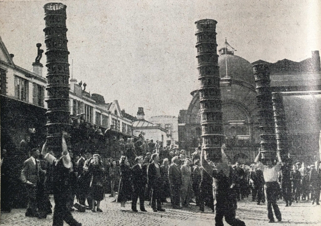
Many of those ships could have unloaded their cargo at one of the wharfs that line the river in the second of the wards in the following map of Walbrook and Dowgate Wards.

History and Survey of London

In the description of Dowgate Ward, Thames Street is described as “a great thoroughfare for carts to several wharfs, which renders it a place of considerable trade, and to be well inhabited”.

Much of that trade was run by various trading companies headquartered in the City of London. The book details all these companies, one of which was the Russia Company:
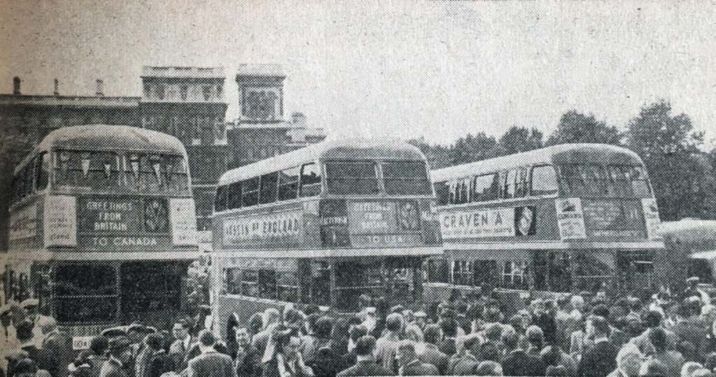
History and Survey of London

And perhaps the most well known of the trading companies – the East India Company:

History and Survey of London

The description of the East india Company provides an indication of the value of these trading companies and the wealth they created.

In 1698 the East India Company was worth Three Million, Three Hundred Thousand Pounds – a considerable sum of money at the end of the 17th century, and in the early years of the 18th century, was generating a dividend of 10%, falling to 8% for investors.

Another source of funds, part of which contributed to the City, including the costs of rebuilding St Paul’s Cathedral after the Great Fire was the Coal Duty.

A Coal-meters Office was based in Church Alley, St Dunstan’s Hill, and in the office the records of all ships entering the Port of London with coals were recorded:

History and Survey of London

Maitland’s Survey of London included areas on the edge of, or were part of the wider London. the following print is of the Charter House Hospital as it appeared in the early 18th century:

History and Survey of London

Map showing the City of Westminster and Duchy of Lancaster:

History and Survey of London

To the left of the map, Tottenham Court Road still ran through fields, Chelsea Water Works are to the right of the map, and along the river are the names of many of the Thames Stairs, all now lost under the 19th century Embankment.

The view of the first Westminster Bridge, with the two towers of Westminster Abbey on the right edge of the print:

History and Survey of London

And to the east of the city, the Parish Church of St John’s at Wapping:

History and Survey of London

The Parish church of St Paul’s at Shadwell:

History and Survey of London

William Maitland provides a very readable history and survey of London. The book really brings to life how the city was administered and operated. The wealth of the city and the trade that generated this wealth. All manner of statistics and lists cover those living in the city, key buildings and organisations.
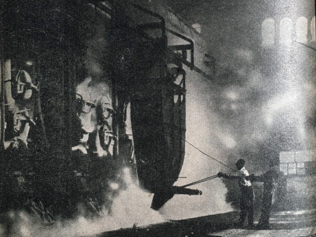
As written in the dedication at the start of the book, it really does describe “to the latest posterity the present flourishing and prosperous State of this Metropolis

The History and Survey of London is also available online and can be found at here.

alondoninheritance.com

Blogs, Books and Population Statistics

After a strange and tragic year, a year in which so many have suffered loss of loved ones, financial loss and the day to day stress of living through a pandemic, I thought I would end 2020 with a rather different post. One that looks back on the blogs and books I have been reading during the past ten months, and looks at how previous population trends across London may change in the future.

Three very different subjects, but hopefully suited for the period between Christmas and the New Year, when the days lack their normal structure and blend into each other, made even worse with the restrictions of Tier 4, and when the change to a new year brings thoughts of the past and the future.

Blogs

I started writing the blog back in 2014 after attending a blog writing course run by the Gentle Author of Spitalfields Life. I had been trying to summon the motivation, and a purpose for a project I had been thinking about for years, to track down the location of the sites my father had been photographing from 1946.

It seemed the structure and routine of a blog would provide the right motivation and purpose, although I did not expect to be still writing almost seven years later.

One of the blogs I have been reading for years is Diamond Geezer, who has been writing since 2002 and publishes daily. One of the topics Diamond Geezer occasionally touches on is the loss of many long form blogs, and whether this form of writing is a gradually disappearing format.

I hope not given that I probably started rather late using blogging as a medium, so I thought I would celebrate the diversity of blogs with a sample of those that I read regularly. I will also be adding what WordPress terms a Blogroll to the side bar of the blogs main page.

So starting with the blog that started me writing:

Spitalfields Life – A blog that probably needs no introduction from me. Written by the Gentle Author, a daily exploration of the people and places of east London, and indeed London as a whole. Spitalfields Life has become a campaigning blog, addressing some of the proposals that seem to want to change London without considering the history or future of the city, probably apart from a quick commercial return.

Diamond Geezer –  Another blog that posts daily, with the added benefit that you are never sure what the topic will be. Covering London, as well as visits to the rest of the country, analysis of data published about London’s transport network, anniversaries, street names etc.

What I envy about the Diamond Geezer blog is the ability of the author to craft a wonderful 50 words on a topic, where I would waffle through 500 words trying to say the same thing.

Bug Woman – Adventures in London – Mainly focused on the flora and fauna of London, Bug Woman shows another side of the city. The animals, plants, trees that are around us, but need that extra bit of attention to see and understand.

Bug Woman started with a weekly post, but for the last few months has been posting daily and provides a fascinating alternative view of the city.

Flickering Lamps – Although posts from this blog are not frequent, what the blog lacks in quantity is easily covered by the quality of the posts. A historical blog which brings to life some unique stories with in depth research and some wonderful writing and photography. A blog which demonstrates how much there is to be discovered across the streets of London, and further afield exploring the churches, graves and ruins to be found across the country.

Nature Girl, or “nature writing from a country warden” – I found this blog when I was researching a visit to the London Stone by Yantlet Creek on the Isle of Grain. The author is an Environmental Consultant in that wonderful area of Kent along the River Thames and inland to the River Medway. Although the blog is not about London, the proximity and influence of the Thames on north Kent has always fascinated me, and London looms as a potential threat to the area from expansion of the city, schemes such as the estuary airport, housing development, energy projects etc.

Nature Girl writes about the natural beauty of the area, and the importance of looking after such a special area of the country, not that far out from London.

Historic Southampton – Southampton is a city that like London was badly bombed in the last war, grew significantly because of the city’s access to the sea, and has a long and continuing history as a major port. The Historic Southampton blog explores the history of this fascinating city, and through some unique research and presentation of data, has mapped the location of Titanic crew members who lived or lodged in the city, and really brings home the impact of the disaster on the families in just one city.

The above is just a sample, there is so much creativity and research to be found across the blogging world, and hopefully the format will continue to gain an audience for many years to come.

London 2020 Reading

I have probably read more during 2020 than in any previous year. I have also tried to expand my London reading to explore recent history, and the London that I have experienced from the mid 1970s. The following books are a sample of my 2020 London reading (over the years, I have been offered books to review, I never except these. All books have been chosen and purchased by me, usually in a bricks and mortar book shop. It is very important to me to keep the blog free of any external, commercial or hidden influence):

London Made Us – Robert Elms

Robert Elms is a broadcaster on BBC Radio London, a writer and once a journalist with the New Musical Express (NME). The title London Made Us very much describes the contents of the book – a family history of London, growing up in London and how London has changed.

I will use the word evocative a number of times in the rest of the blog, and for London Made Us, the book is brilliantly evocative of London in the 1970s and 80s.

Elms supports Queens Park Rangers, who play at Loftus Road. I have a very different experience of Loftus Road, it was where I saw my first major stadium concert in 1975 when Yes were headlining – a memorable day which still seems as if it was only yesterday.

Blogs

Alpha City – Rowland Atkinson

One of the reasons that London has such a global presence is the attraction of the city to the super-rich of the world.

The attraction of London as an asset rich city, a place where wealth can be accumulated and preserved has an impact on all those who live and work in the city. This has influenced the buildings we see grow across the city, the ownership of the city’s land and buildings, on the type and price of housing across the city.

Alpha City helps explain why London is the London we see today, and what the impact of these trends will be on the future of London and in-equality in the city, and goes some way to explaining why the population density of Kensington & Chelsea has reduced so significantly (see later in this post).

Blogs

Soho. A Guide to Soho’s History, Architecture and People – Dan Cruickshank

This is a wonderful book on a unique area of London. The first half provides historical background, the initial development of the estates that would come to form Soho and some social history of the area.
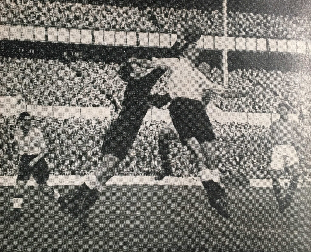
The second half is titled The Walk and presents a detailed walk through Soho, street by street and frequently house by house. I read the first half at home, then took the book out and followed the walk.

Soho is at risk of the type of development that will gradually erase what makes Soho a defined area in the city with its own unique character. Books like Cruickshank’s will help prevent this, or will help provide a record of a unique place for the future.

Blogs

On The Marshes – Carol Donaldson

Carol Donaldson is the author of the Nature Girl blog mentioned above, and I purchased the book after reading the blog.

On The Marshes is a record of a journey across north Kent from Gravesend to Whistable whilst coming to terms with the break-up of a long-term relationship.

On the Marshes provides a wonderfully evocative view of the north Kent marshes and rivers, and covers aspects such as the plotland developments – plots purchased by individuals, frequently those escaping London, who built their own home and lived based on what they could find around them.

A good read to really understand this area, and then get out for some walking.

Blogs

Excellent Essex – Gillian Darley

Again, not a London book, but a book which tells the story of a county that borders, and has been influenced by London. A county that has lost many of its original south western towns, villages and lands into Greater London.
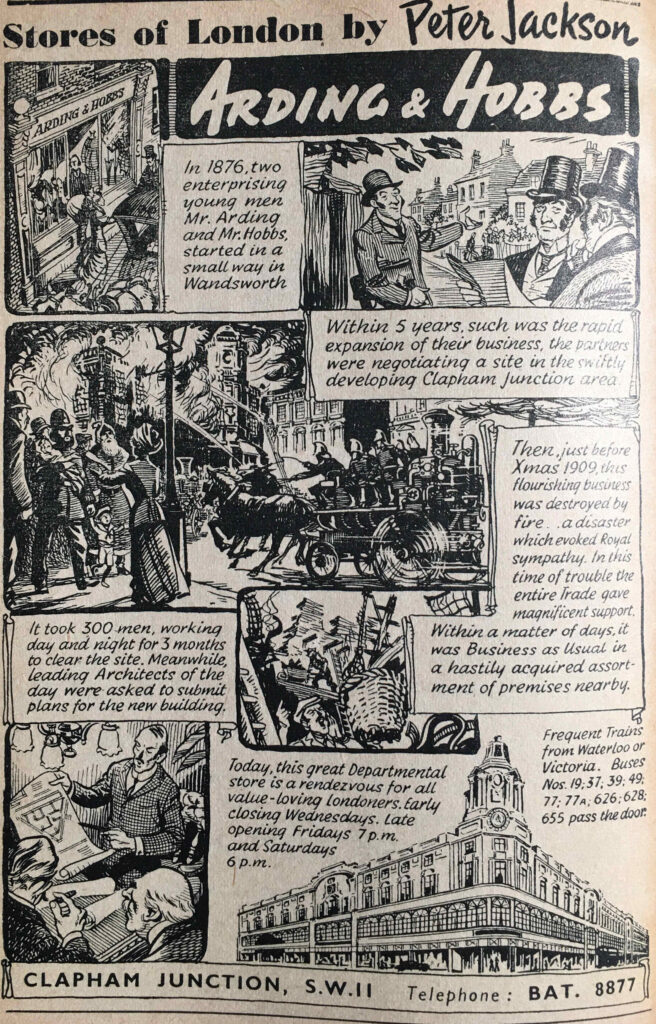
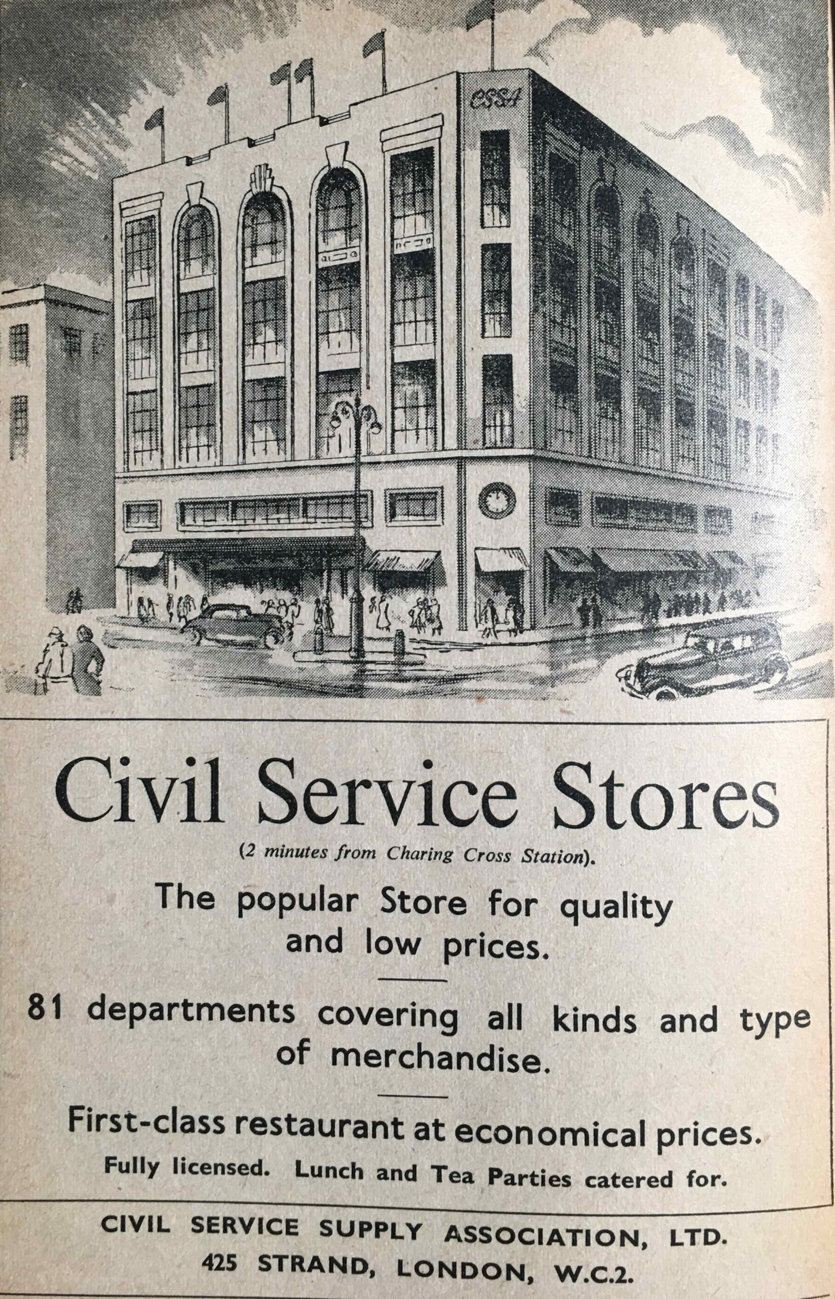
The Essex coast has been a holiday destination for Londoners (Southend and Clacton), where many Londoners moved after the war, to new towns such as Basildon, and a county that has a long relationship with the River Thames and North Sea.

The book’s sub-title is “In Praise Of England’s Most Misunderstood County” which is a good summary. Essex has long been the focus of jokes about Essex Girls, Brentwood was a lovely country town on the main A12 into London before TOWIE gave the town a different reputation.

Basildon was one of the key constituencies that signaled the swing to Margaret Thatcher’s Conservatives in 1979, and became known for “Mondeo Man”.

Although these are the aspects of Essex that are frequently in the media, there is far more to Essex. Travel to the north of the county and it is a very different place to the south and Excellent Essex takes the reader through the whole history and geography of the county of Essex.

Blogs

Some Fantastic Place – Chris Difford

Chris Difford was, along with Glenn Tilbrook, one of the original founders of the band Squeeze, and has been responsible for the majority of their lyrics.

Squeeze has long been one of my favourite bands and whenever I hear the opening of Take Me I’m Yours, I am transported back to driving around in my first car with their music playing on an Amstrad car cassette player.

Chris Difford grew up in Greenwich and his dad worked at the gas works on the Greenwich Peninsula. The book is an evocative story of growing up in Greenwich, and starting a band in Greenwich, Blackheath and Deptford. The book also touches on the London music industry, Bryan Ferry and Elvis Costello.

A brilliant read about growing up in south London, and a life in the music industry.

Blogs

Defying Gravity, Jordan’s Story

The book is about Pamela Rooke, or Jordan as she was known as the face of Malcolm McLaren and Vivienne Westwood’s shop SEX at 430 King’s Road. later known as Seditionaries.

Jordan was there at the start of Punk in London, and if what punk was intended to be could be summarised by one single person, then it was probably Jordan.

Jordan played the part of Amyl Nitrate in Derek jarman’s 1978 film Jubilee, a film that portrayed Jarman’s view of punk, and England in the years around the 1977 Royal Jubilee, when Queen Elizabeth I is transported to London to see the decline of the country in the late 1970s. The film is great for a bit of location spotting as it was filmed at many locations around London, including Shad Thames, where Jarman had a studio at Butler’s Wharf.

The book is a brilliant read and brings to life not only Jordan’s story, but also that unique time when punk, music and fashion converged, against the backdrop of a London about to go through a period of considerable change.

Blogs

Changes in London’s Population

This year there have been many stories in the media about people moving out of London. The growth in working from home enabled by the ability to work from anywhere with an Internet connection, with many companies seeming to accept that a high degree of home working will become normal in the future.
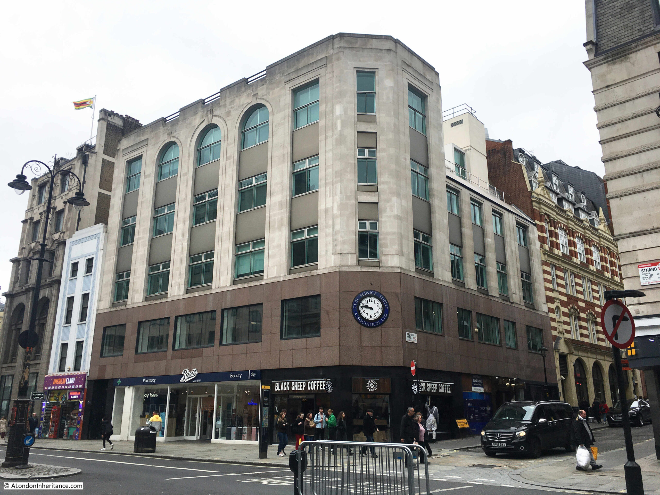
This has been a rapid acceleration of an existing trend and it will be interesting to see what impact it has on the need for office space, London housing and London’s population in the coming years.

Up until the start of the year, London gave all the impressions of a very busy city. Streets full of people, crowded underground trains where frequently standing was the only option, the West End teeming with people in the evenings, busy cafes, restaurants and pubs.

Lock downs have had a catastrophic impact on so many London businesses in the entertainment and service industries. Add to this the collapse of tourism, and London feels a very different place to this time last year.

Although up until the start of the year, London felt very crowded, in reality London’s population was only catching up to levels last seen at the start of the 1960s.

The Office for National Statistics (ONS) publish some fascinating data, and I was recently browsing through some London population data (to pinch the words of Rowan Atkinson in Blackadder – the long winter nights must just fly by), and converting the data to graphs as I find it much easier to see trends using graphical presentation.
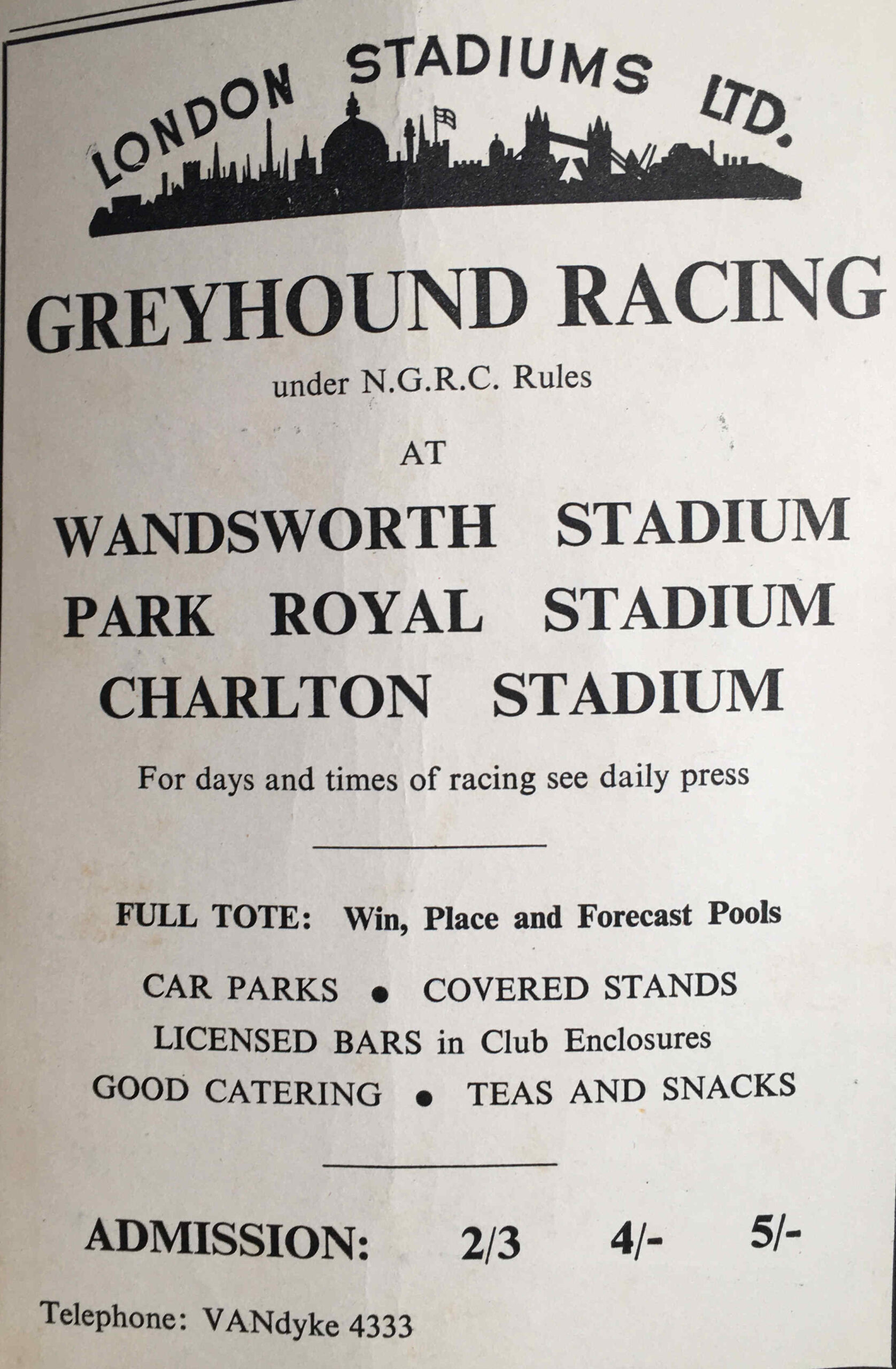
The following graph shows population numbers for inner (blue line) and outer (red line) London from 1961 to 2015.

Blogs

The graph shows that for inner London there was a fall in population of almost 1 million from 1961 (3.481 million) to 1983 (2.517 million), a fall of around 27%.

The fall across outer London was less dramatic, declining from 4.496 million to 4.202 million in 1988.

A number of factors contributed to such a significant decline across inner London, including:

  • slow rebuild of housing lost during the war
  • closure of industry, and the move of industry outside of inner London
  • slow down in trade on the Thames, containerisation and eventual closure of the inner docks
  • migration to new towns such as Harlow and Basildon

We can see the areas included in the ONS definition of inner London, as well as their individual population movements by graphing each individual area over time as shown in the following graph.

Inner London Population – 1961 to 2015

Blogs

The City of London should be at the bottom of each column, however the population of the City is so low compared to the rest of inner London that it is does not show based on the vertical population scale. The population of the City changed from 5,000 in 1961 to 8,760 in 2015, with a low of 4,000 for most of the 1960s.

Whilst many areas of inner London returned to a similar population in 2015 that they had in 1961, there are some variations.

The populations of Hammersmith & Fulham and Kensington & Chelsea are still below their 1961 levels. Tower Hamlets and Newham are both above their 1961 levels.

One of the reasons that the population of the City is so low, as well as the City being mainly a business area, it is also the smallest of the areas classed as inner London. The following graph shows the area in square kilometers for each area of inner London.
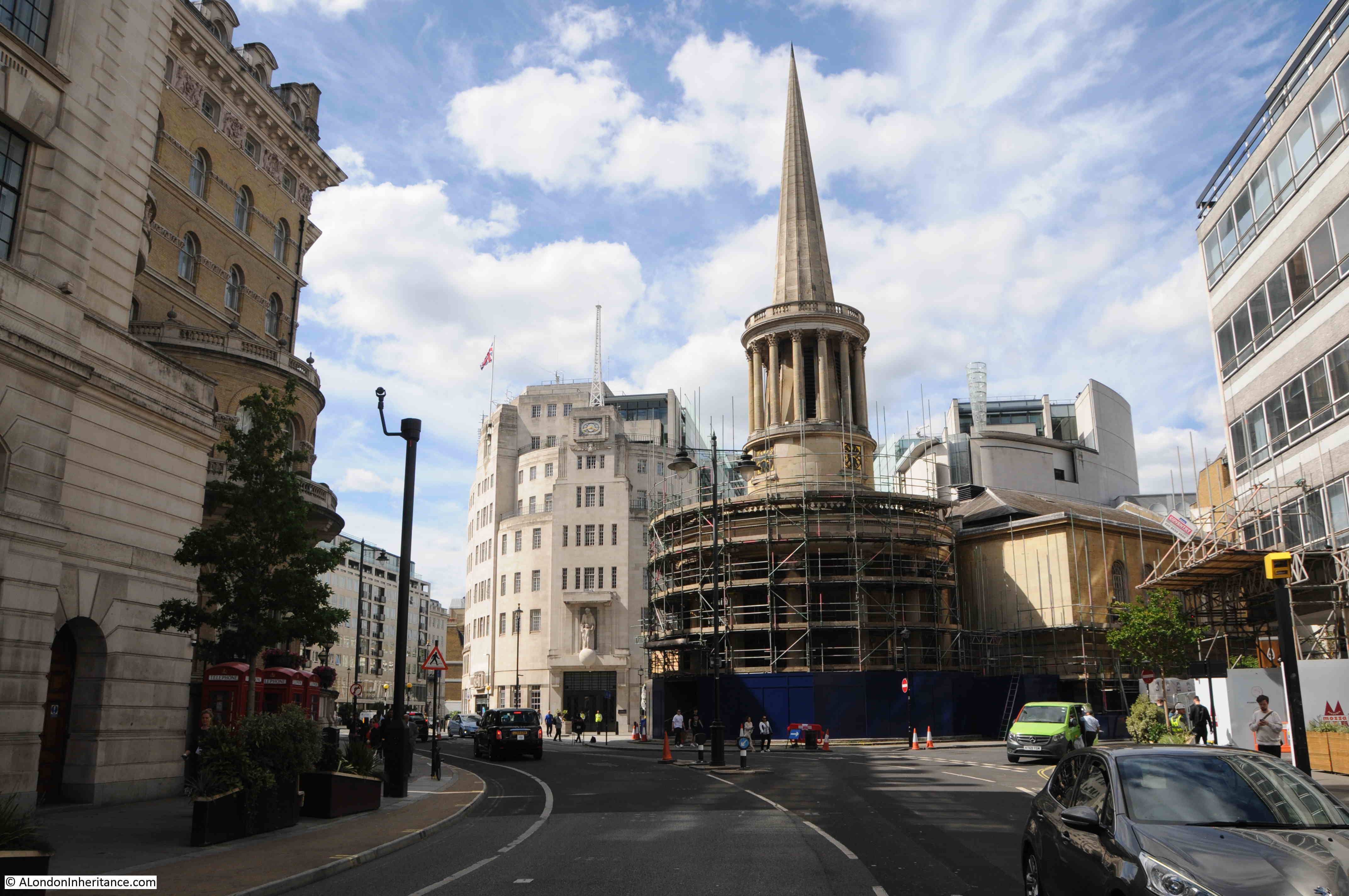
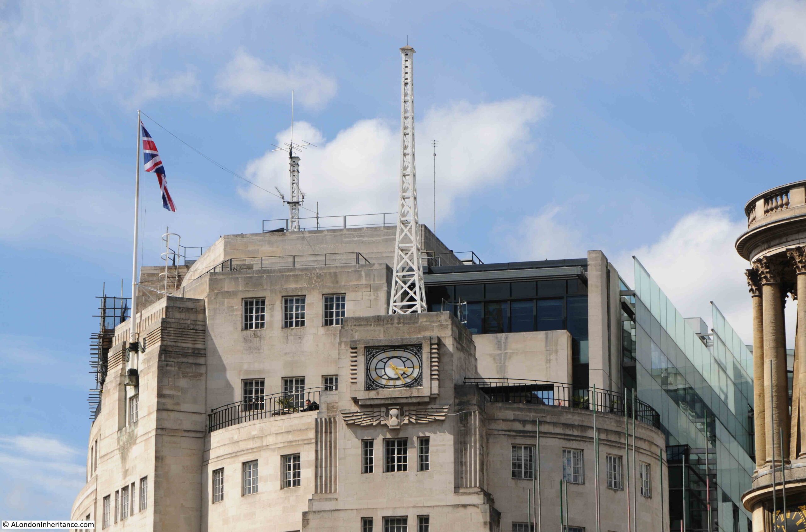
Inner London – Size of each Borough in 2016

Blogs

By comparing the population with the area, we can see the population density of each area of inner London, as shown in the following graph which illustrates the number of people per square kilometer.

Inner London – Population Density in 2015

Blogs

In inner London in 2015, Islington was the most densely populated area, with Tower Hamlets not far behind.

Inner London – Changes in Population Density between 1961 and 2015

What is really interesting is to compare the change in population density for each area of inner London between 1961 and 2015, as shown in the following graph where the blue column represents people per square kilometer in 1961 and the brown column represents 2015.

Blogs

Islington, whilst being the most densely populated borough in 2015, was more densely populated in 1961.

The highest reduction is in Kensington & Chelsea, which in 1961 was the most densely populated borough, but this had reduced considerably by 2015. Possibly a result of housing policy in the borough, changes in multiple occupancy, housing treated as an investment rather than a home and often left empty etc.

The borough which has increased population density the most is Tower Hamlets. Possibly due to reconstruction after the war, land once occupied by industry and docks now occupied by housing, and that east London has long been the traditional initial destination for immigration into London.

Whilst the population of outer London reduced after 1961, it did to a much smaller degree than inner London, reflecting the different industrial and commercial mix in inner than outer London, as well as a gradual move of population from inner to outer London.

What is marked is the increase in the population of outer London, so that whilst inner London had recovered to 1961 levels by 2015, outer London has seen an increase of over 700,000.

The following graph shows the population changes in outer London from 1961 to 2015.

Outer London Population – 1961 to 2015

Blogs

As with inner London, the geographic size of the outer London boroughs varies considerably with Bromley being by far the largest. This does not mean that population size follows geographic size as Bromley has a similar population to the much smaller Ealing.

The following graph compare the size of each outer London borough (in square kilometers):

Outer London – Size of each Borough in 2016

Blogs

We can compare population density in the following graph, which charts the number of people per square kilometer for each borough.

Outer London – Population Density in 2015

Blogs

Compare the above two graphs. Bromley is by far the largest in land area, but the smaller when defined by population density. Brent has the highest population density with almost 7,500 people per square kilometer.

The following graph compares population density of the outer London boroughs in 1961 (blue column) with 2015 (brown column).

Blogs

Where a number of inner London boroughs population density has reduced from 1961 to 2015, all outer London boroughs have increased their population density, reflecting a migration of people from inner to outer London, and perhaps those moving to London preferring to live in the outer rather than the inner London boroughs.

The cost of housing will also drive this change with housing costing slightly less the further from the centre of the city (although still very expensive).

All the above ONS data is from 2015. Numbers have almost certainly increased since then, and it will be interesting to see what happens in the coming years.

Will changes to working patterns influence where people want to live, and will the loss of jobs in the entertainment and service industries result in a long term contraction, or will coffee shops, restaurants, bars and shops return to their former numbers.

Will Brexit have any impact on the businesses that make London their base?

The themes of today’s post may be very different, but they are really about the same thing – exploring and recording how London changes, and the individual experiences of those who come into contact with the city. Whether that is through a long life in the city, having been part of a key period of London’s cultural life, or being part of the counties surrounding London. Individual experiences recorded in a blog or book, or the experience of large populations recorded in the ONS data.

Can I wish all readers a very happy New Year, and hopefully 2021 will turn out to be much better than 2020 and London returns to being the busy, dynamic and diverse city that makes it in my totally unbiased view, the best city in the world.

alondoninheritance.com