To help research London’s history, I have a collection of London maps, built up from when my father purchased his first map of London in 1941, along with collecting maps issued to mark special events in the city over the years.
Maps provide not only street plans, they also show how the city has developed, what is important at the time and how the approach to map-making has changed over the centuries.
As well as being functional, many London maps are also a work of art, with some fantastic design being used to also make the map a pleasure to look at and use.
I also find it fascinating to take some of these old maps out when walking London, to try and follow the streets on these maps, to understand the changes and the London we see today.
For this week’s post, I present a sample of the maps I use which I hope you will find of interest.
If you click on any of the following maps on the blog, a much larger version of the map should open.
My first map is a reproduction of the 16th century map of London by Ralph Agas, included in the 1904 book “London In The Time Of The Tudors” by Sir Walter Besant.

The Agas map is the most comprehensive map of London in Tudor times, drawn probably between 1553 and 1559 when the population of London was not more than 100,000. The map is rich in detail and shows a city still bounded by the city walls with mainly fields beyond. There is a single bridge over the Thames leading to the south of the river which was a place of entertainment.
To the west of the city the Fleet River extends a considerable way in land with the Fleet Bridge at the bottom of Ludgate and further upstream a Holburne Bridge over the Fleet.
Although named the Ralph Agas map, there is no certainty that he was the artist who drew the map. Agas was a map-maker, originally from Suffolk where he was also a land-surveyor. Born in the mid 16th century he died in 1621. The period of his birth also being around or slightly before the assumed period when the map was drawn would also argue against Agas being responsible.
Despite the uncertainty of who created the map, it is a superbly detailed view of London from a time when London had yet to expand in any degree beyond the original city walls.
The next map is the Ogilby and Morgan map from 1676. My copy is again from Sir William Besant, but this time from “London In The Time Of The Stuarts”.
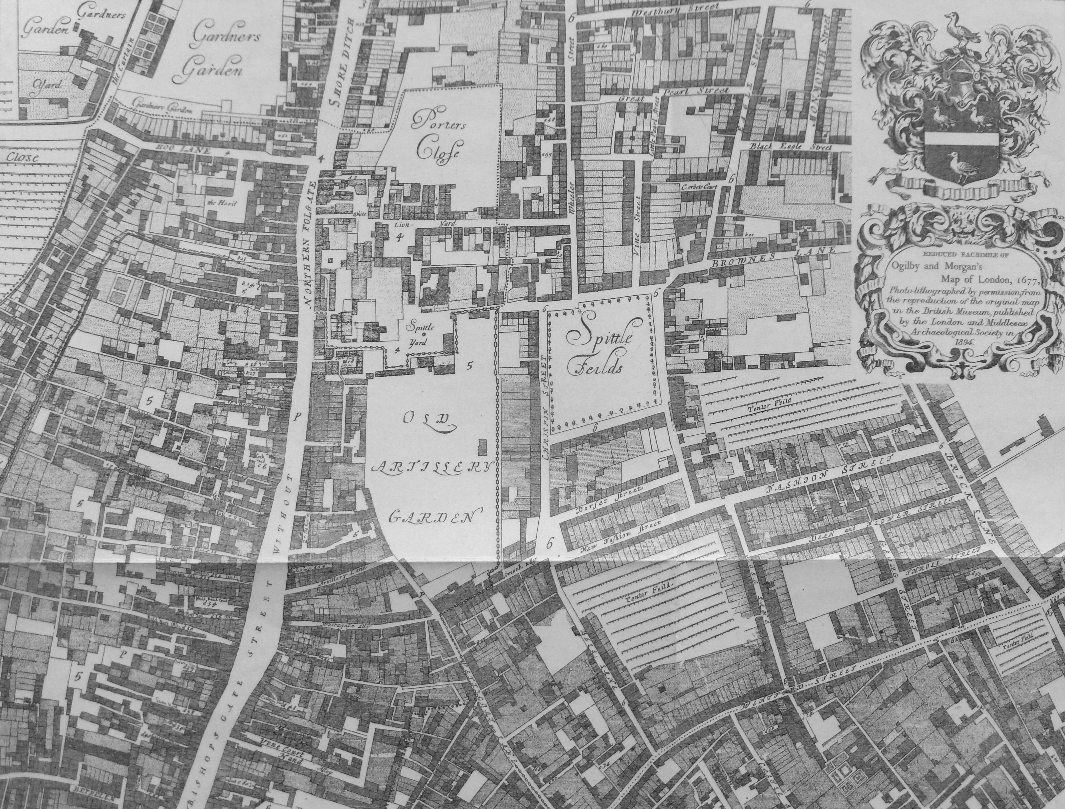
This map shows in considerable detail the city rebuilt after the Great Fire which had occurred 10 years earlier. The section shown above is centred on Spittlefields with the Old Artillery Garden to the left below which is Petticoat Lane. The wide street running from bottom to top starts off as Bishops Gate Street Without, then becomes Northern Folgate (note the difference in name from Norton Folgate as it is now), and then becomes Shore Ditch.
John Ogilby was born in 1600, originally from Scotland he moved to London and had an unusual career, first as a dancer, then running a dance school, a theatre and a publisher in Whitefriars which was lost during the Great Fire. It was at the age of 69 that his short career as a map-maker started, although he died in 1676, just before the map was published.
Ogilby worked with William Morgan who drew each house and garden on the map. It is this level of detail which makes the map so interesting.
In the late 17th Century Richard Blome produced a series of maps of the City Wards. These were published with the 1720 edition of John Stows Survey of London. My example below is Tower Street Ward.
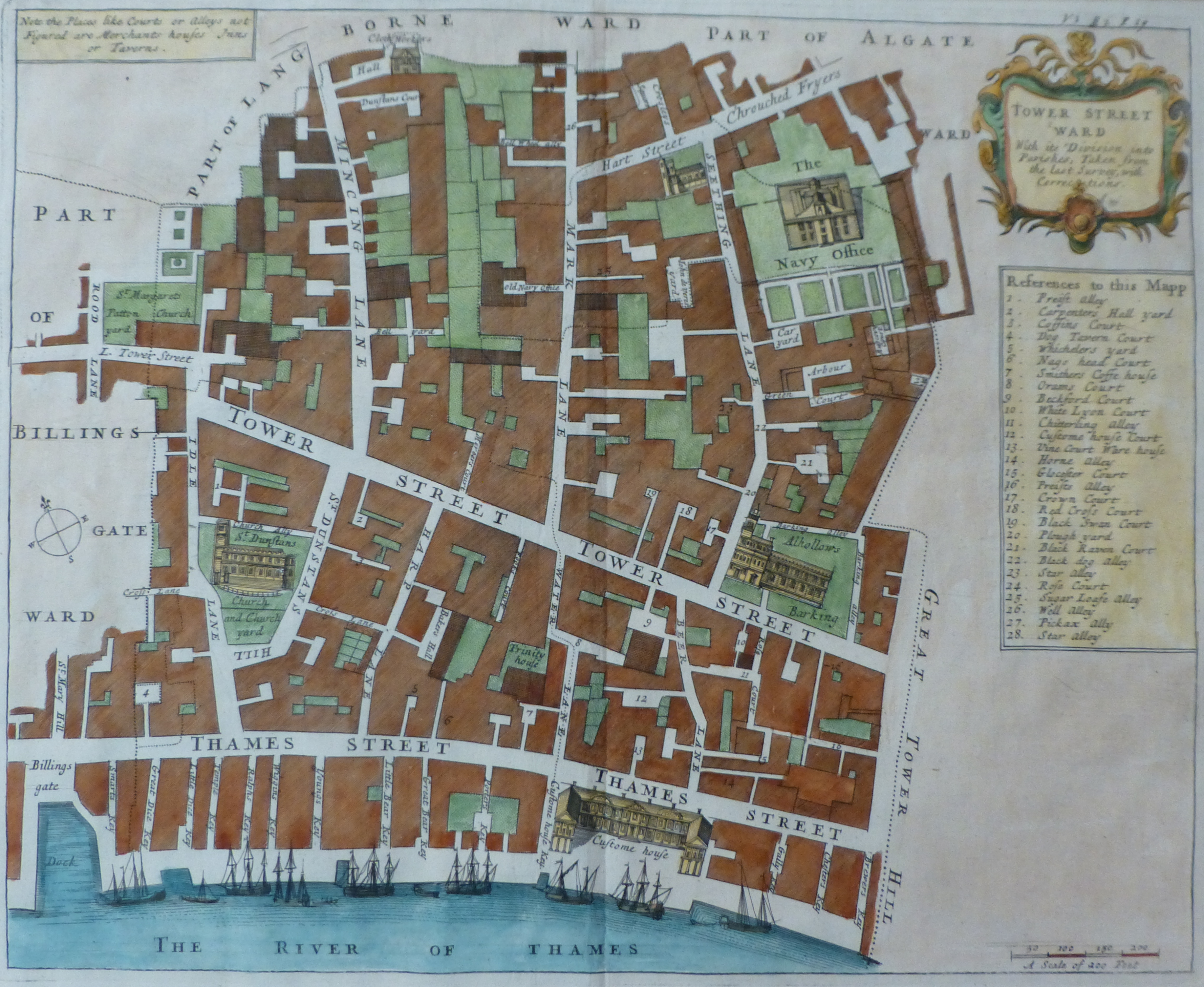
Originally published in black and white, many examples were later hand coloured. They provide a detailed view of each individual ward as it appeared at the end of the 17th century.
In the map above, the Customs House is lower right with Billingsgate Dock to the lower left. The church of St. Dunstan’s is to the centre left and Allhallows Barking to the centre right with the Navy Office to the top right.
It is fascinating to walk around the London Wards with these maps, trace the outlines of the wards and see how much remains from the time they were drawn.
A series of Ward maps were also drawn for William Maitland’s History of London published in 1756. My following example is the map of Cordwainer Ward.
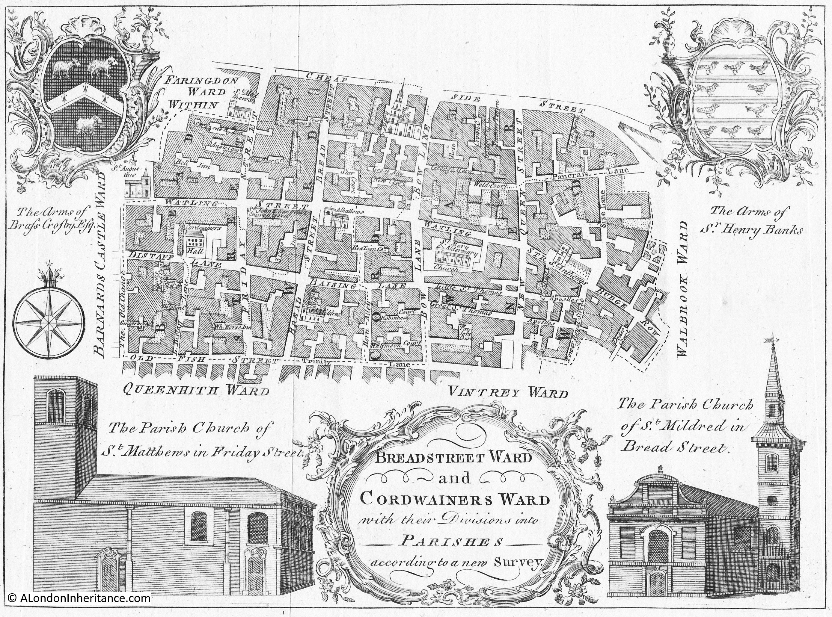
Drawn by Benjamin Cole who was an engraver working near Snow Hill. As well as providing a detailed street map, Cole’s maps are also illustrated with pictures of important buildings within the wards (mainly churches) along with the Coat of Arms of prominent inhabitants.
We now move forward to a series of maps published between 1744 and 1746 by John Rocque which covered a very wide area of London, including much that was still mainly agricultural.
Two examples from John Rocque’s map. The first shows London north of London Wall, the street running left to right along the lower part of the following map.
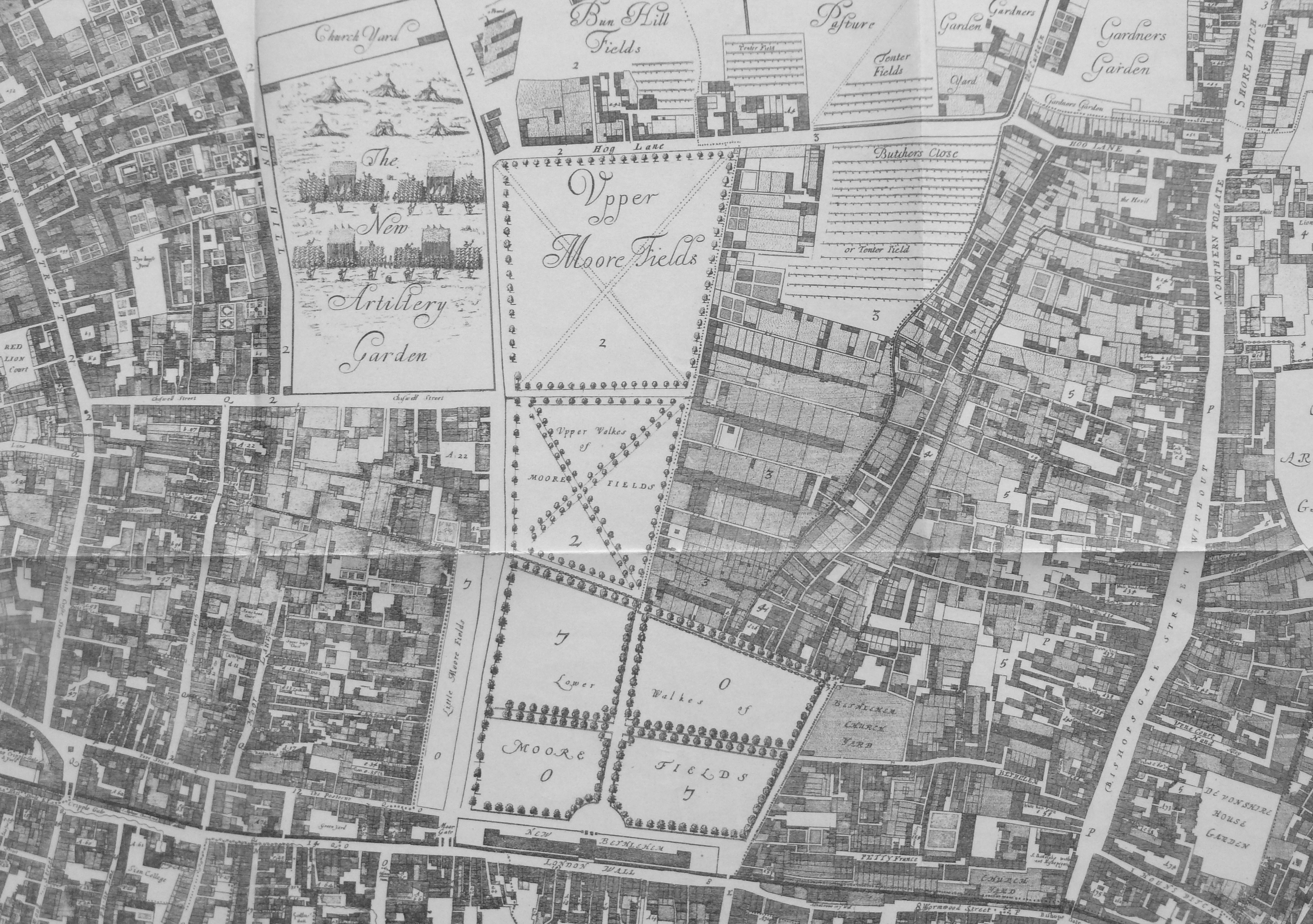
Above London Wall are the Lower and Upper Walks of Moore Fields, with to the left of the Upper Fields is the New Artillery Garden which contains ranks of Artillery Men and Tents.
John Roque was of Huguenot ancestry. He lived in Soho where he practised his career as a surveyor. For the time, his map of London was a massive undertaking. It was not just drawing the streets and ground plans of the buildings, but measuring these as accurately as possible.
The streets were measured with chains or with a surveyor’s wheel, an instrument which can still be seen in use today and consists of a wheel of known circumference on the end of a handle. The distance walked is simply the number of turns of the wheel multiplied by the circumference.
Roque also used a theodolite to measure the angles of street corners (again an instrument still in use today).
The map took nine years to complete and was partly funded by Hogarth.
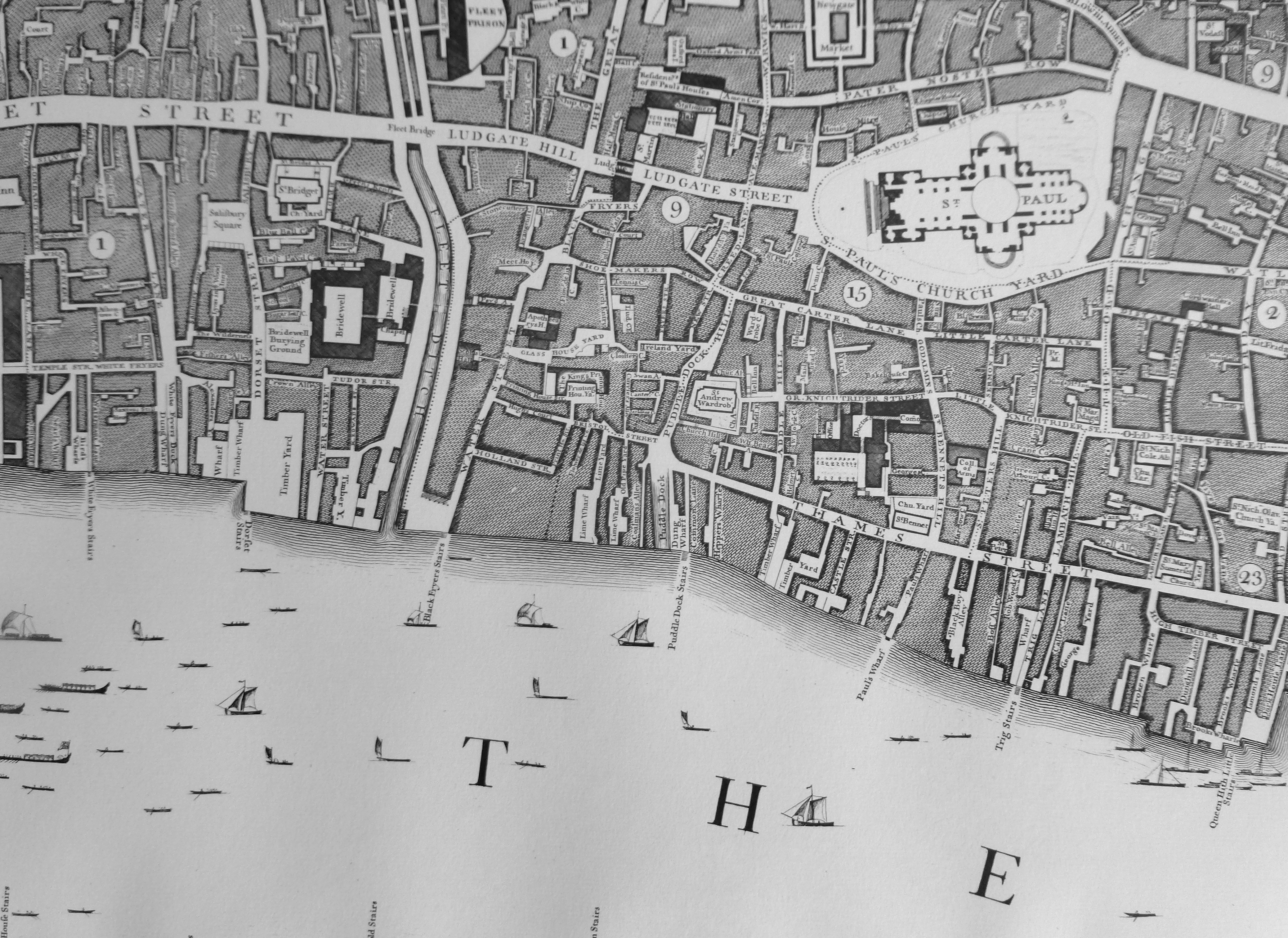
The following extract shows St. Paul’s Cathedral with to the left the Fleet still running up past Ludgate at the Fleet Bridge, although the name in Roque’s map has now been relegated to Fleet Ditch rather than river. A sign of the decreasing importance of this waterway and that it was probably considered a nuisance rather than an asset to the city.
My next map is from the 19th century and is Cruchley’s New Plan Of London Improved to 1835 and shows the advance of London to the east. The extract shows the Isle of Dogs.
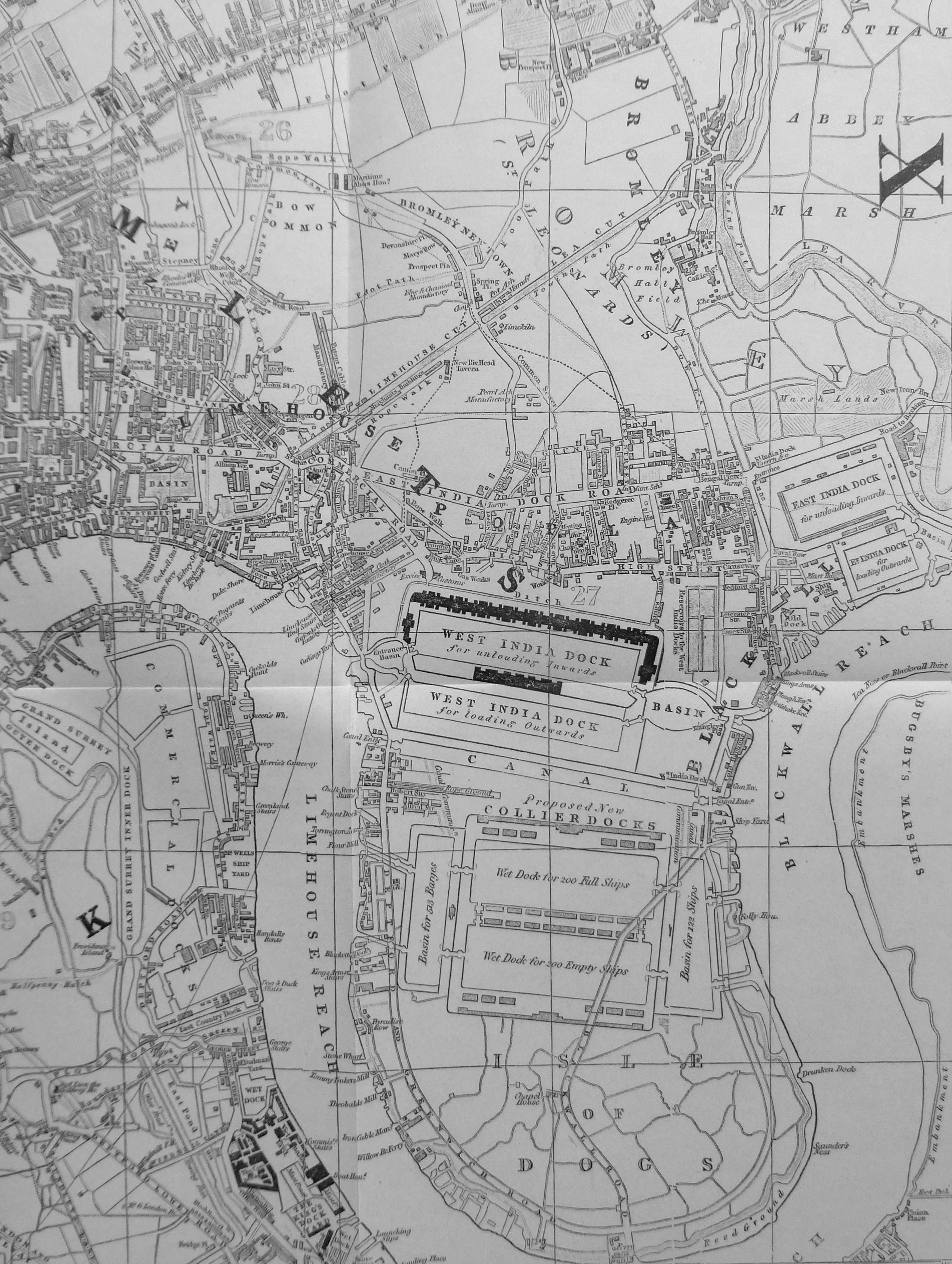
This was at a time when much of East London, north east of Limehouse was unbuilt. The two West India Docks had been built and below these are shown the proposed Collier Docks which was probably a mistake for Cruchley to include as these did not get built, the South Dock and Millwall Dock being constructed instead.
The Lea River is to the top right with Westham Abbey Marsh alongside (note also the “marsh land” just above the East India Dock) which gives an indication of the condition of the land in this area at the time.
The next map comes from the atlas which, although not that old, is my personal favourite. This is Bartholomew’s Reference Atlas of Greater London, this edition published in 1940. It is my favourite as this is the one my father purchased during the war from Foyles in Charing Cross Road. He was about 13 when he got hold of this copy and he had to get a neighbour who was in the Home Guard to purchase the atlas as only those in uniform could purchase maps.

I use the Bartholomew’s Atlas as a reference to compare London as it was just before the last war with the redevelopment after. Significant bomb damage, along with future reconstruction resulted in the loss of many streets. In the above extract, the area between St. Paul’s and Newgate Street (consisting of the area around Paternoster Row and Square) was obliterated by bombing, mainly the fires created by incendiary bombs on the 29th December 1940. These streets were not rebuilt and a whole historic area was lost.
Along with street maps, there are also many maps for special events that have taken place across London. The following map is of the British Empire Exhibition at Wembley in 1924. A work of art as well as a map, created by Kennedy North in 1923.
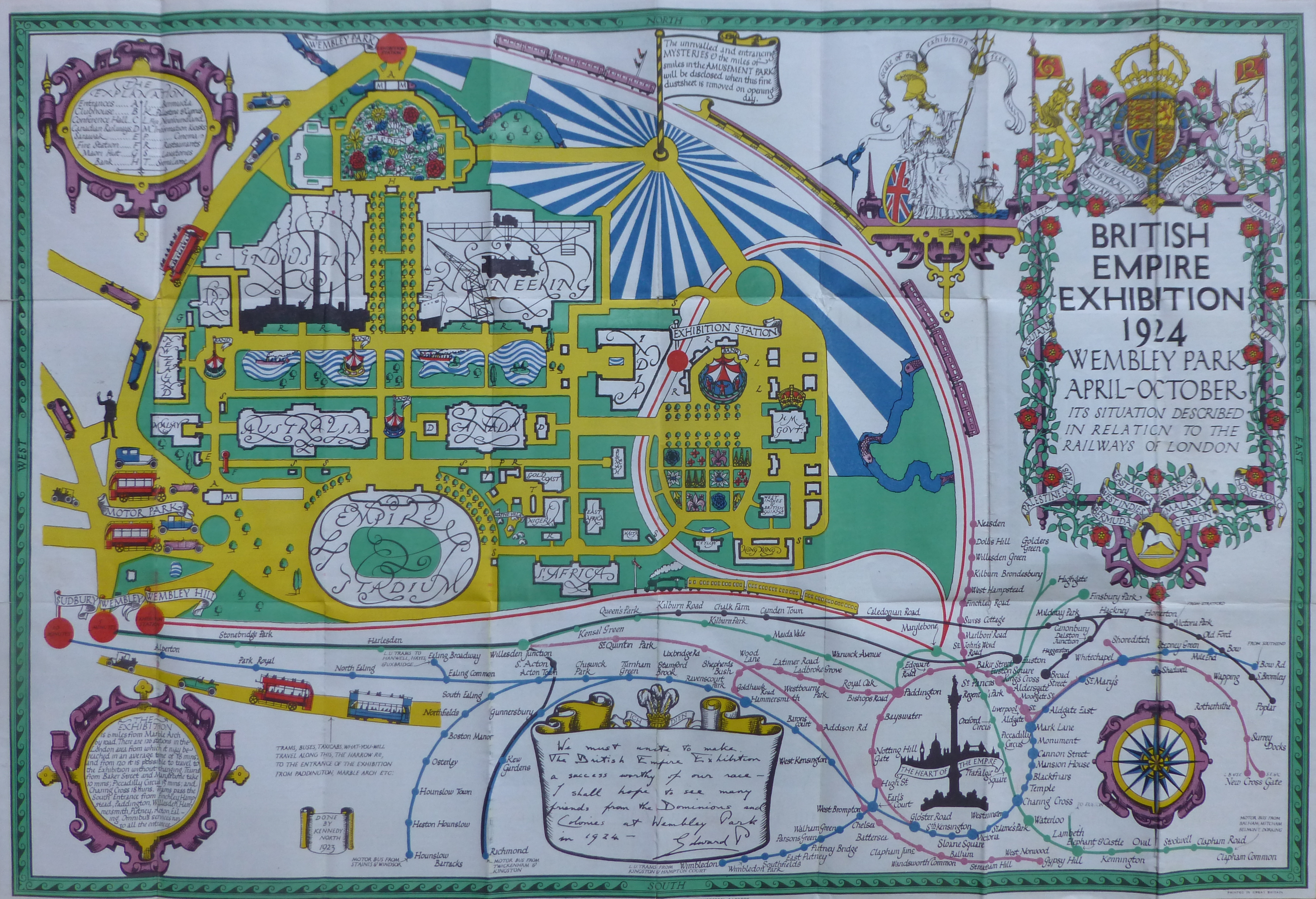
As well as providing a plan of the exhibition, the map also shows Motor Bus and Rail routes to the Exhibition, with a ring of stations centred (stations and lines which would form the Circle Line) around Nelson’s Column, described as “The Heart Of The Empire”
The next map shows the locations across London for the 1951 Festival of Britain.
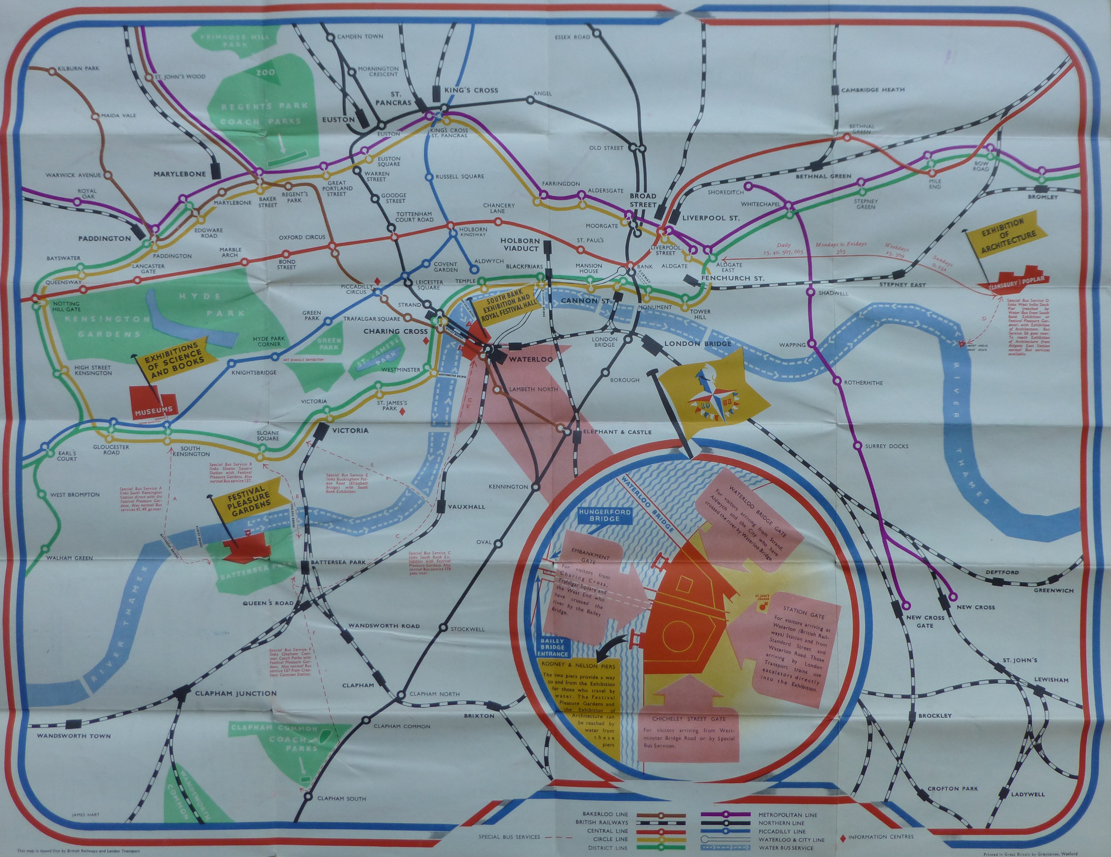
As well as the main site on the South Bank, the map also includes;
– the Festival Pleasure Gardens at Battersea
– the Exhibitions of Science and Books at Kensington
– the Exhibition of Architecture at Poplar
A functional map, but also with some artistic design with the flags showing the location of the festival sites, the colours, and the border extending around the plan of the South Bank site.
Maps were also produced for many of the major ceremonial events during the first half of the 20th century. The following map was produced jointly by the London Transport Executive and the Commissioner of Police of the Metropolis for the Coronation of Elizabeth II on Tuesday 2nd June 1953.
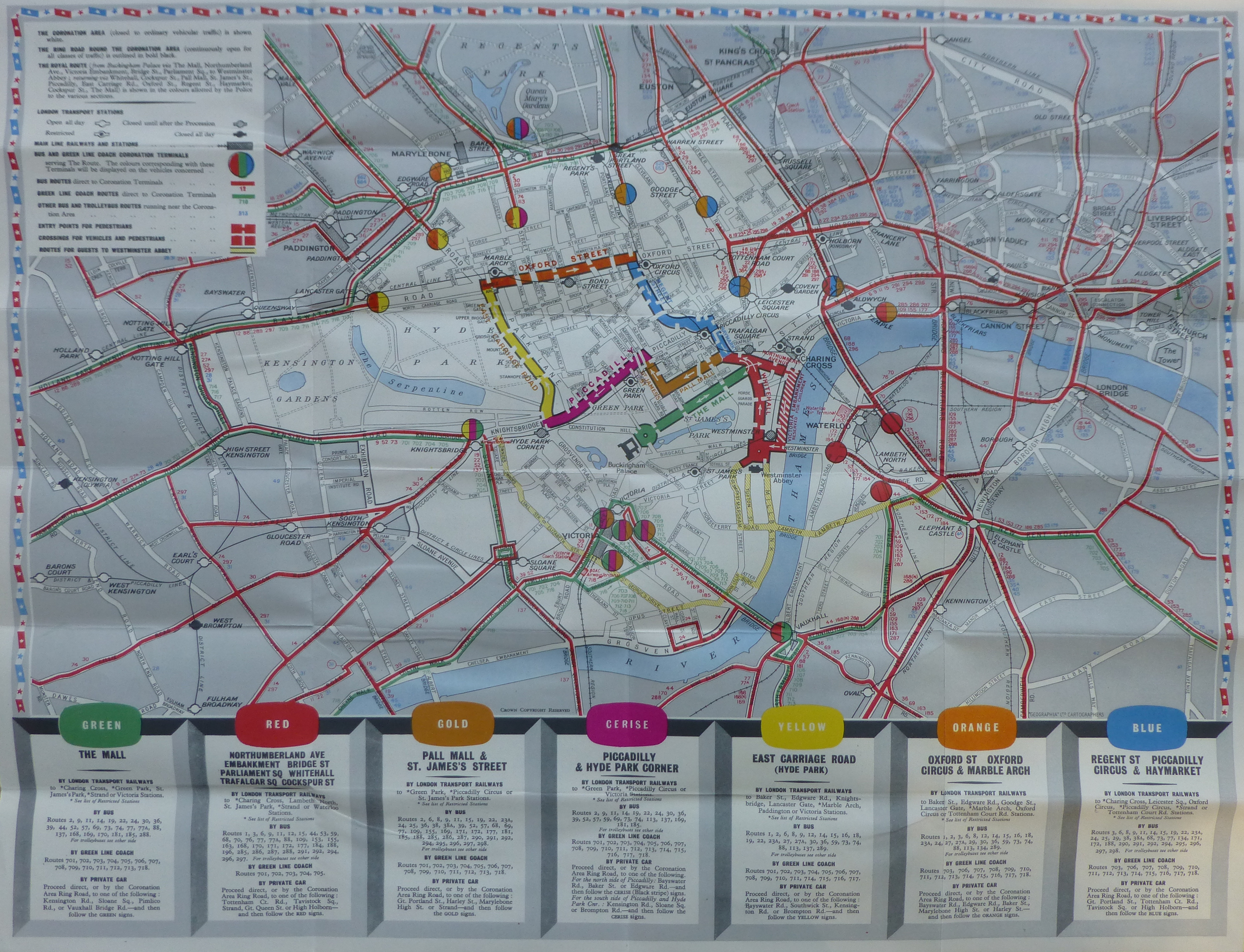
The map shows the route of the royal procession, bus and coach routes, entry to viewing points, which stations are open all day and which will be closed until after the procession, or closed all day etc.
The colour coded Processional Route has individual boxes at the bottom of the map to show the best way to get to that part of the procession.
The other side of the map contains detailed written instructions and advise for travelling in London, a map of the London Underground and details of interchange stations.
The map was issued free and shows the degree of planning that went into the event.
I always pick up new editions of the London Underground maps, but in the past there have been maps showing other forms of transport across the city. The following is the Trolleybus and Tram Map of London issued in 1940 by London Transport.
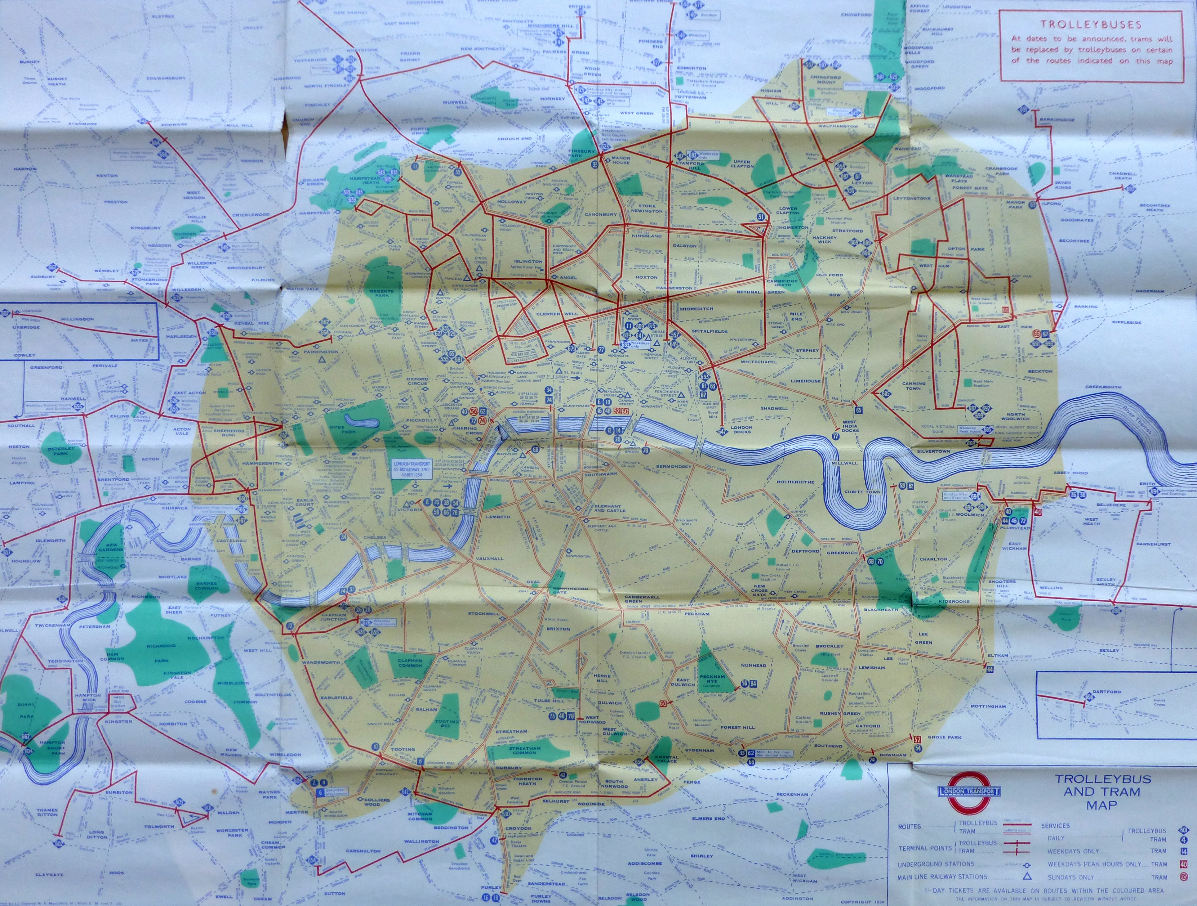
A detailed map showing Trolleybus and Tram routes across central London and also out into the suburbs, also showing Underground and Mainline Rail Stations.
The reverse of the map has a timetable including details of all night trams and trolleybuses.
This is one of my father’s maps and when going through his map collection the following ticket fell out:
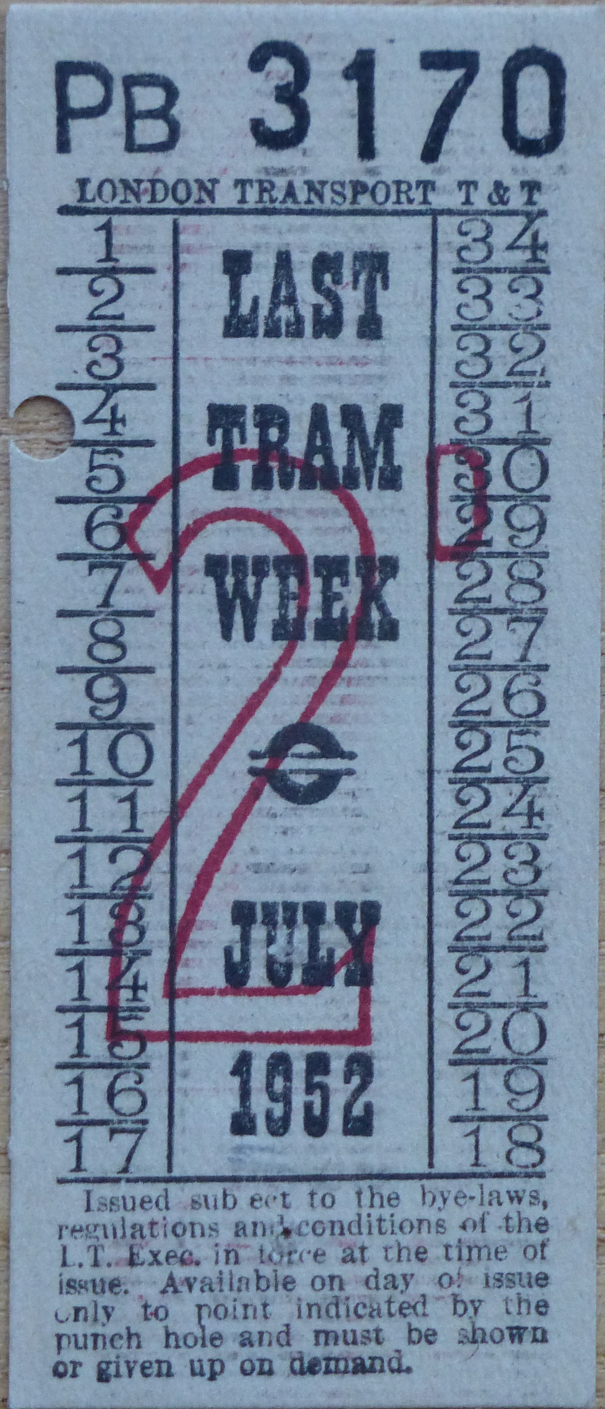
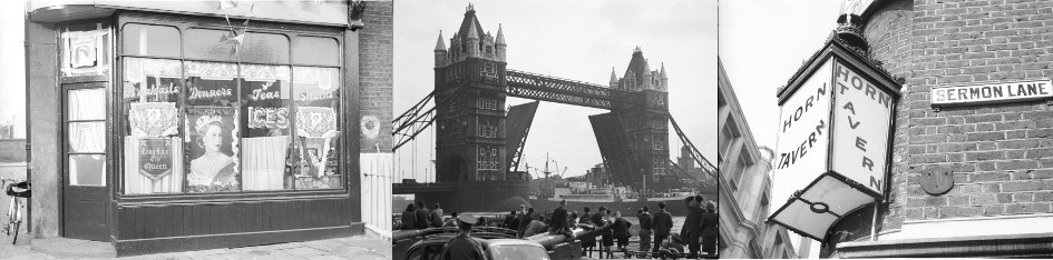
His ticket from the Last Tram Week in July 1952. (See the photos he took of the event here).
London is constantly changing and maps provide a snapshot of the city at a point in time. They show how London has expanded out from the original walled city, they show the significant development of the London Docks, they show how transport has been provided across the city and they show how London has marked significant events.
It will be interesting to see how long paper maps continue to be published with the growth in on-line mapping and the easy availability of a map on a smart phone. Whilst they are, I will continue to collect them to keep a record of a changing city.